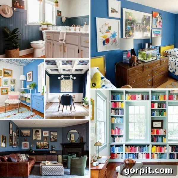
Blue is an undeniably captivating color, universally cherished for its calming presence and incredible versatility. For interior design enthusiasts and homeowners alike, blue stands out as an exceptional choice, transforming spaces with an elegance that few other hues can match. It’s often likened to a neutral, much like a favorite pair of blue jeans that effortlessly complements any outfit. This unique quality makes blue a more engaging and sophisticated alternative to traditional neutrals, offering depth and character without overwhelming a space. From serene pale blues that evoke the tranquility of a summer sky to rich, inky navies that exude drama and sophistication, the spectrum of blue offers endless possibilities for crafting a truly personalized and inviting home environment.
However, navigating the vast world of blue paint colors can be daunting. With countless shades, undertones, and finishes, selecting the perfect blue for your walls, cabinets, or furniture requires careful consideration. That’s why we’ve curated a definitive list of designer-favorite blue paint colors, handpicked for their beauty, versatility, and lasting appeal. Whether your aesthetic leans towards cool and understated blue-grays, bold and dramatic dark blues, refreshing vibrant blues, or tranquil blue-greens, you’ll find inspiration here to guide your next decorating project. Each carefully selected shade promises to add a touch of professional polish and timeless charm to any room in your home.
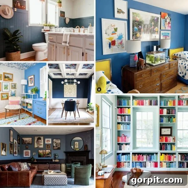
As you’ll discover throughout this guide, blue has been a foundational color in many of my own design projects, both in my current home and previous residences. Its incredible adaptability allows it to be used in countless ways, from creating a subtle backdrop to making a dramatic statement. I genuinely believe blue functions as a fantastic neutral; just as blue denim pairs with virtually everything, so too can blue walls. It brings a sense of calm and collectedness, making any space feel more inviting and thoughtfully designed.
My exploration of blue paint colors has spanned the entire spectrum. I’ve embraced vibrant blues for striking features like a DIY modern plank wall in an old house, and gravitated towards the profound depth of dark navy blue in a dining room in my current home. This journey through various blue hues has taught me that there’s no need to shy away from experimenting. The key is to be open to trying different shades and seeing how they interact with your unique home environment. The endless possibilities mean you can truly find a blue that resonates with your personal style and aesthetic.
To assist you in this exciting quest, I’ve meticulously categorized my top designer-approved blue paint colors into distinct groups: sophisticated blue-grays, rich dark blues, energetic vibrant blues, and refreshing blue-greens. Each section highlights specific paint colors, complete with their color numbers and LRV (Light Reflectance Value). LRV is a crucial metric, measuring the percentage of light a color reflects from 0 (absolute black) to 100 (pure white). A higher LRV means the color reflects more light, making a room feel brighter and more open, while a lower LRV creates a more intimate and saturated ambiance. Understanding LRV will empower you to make informed decisions, ensuring the blue you choose achieves the desired mood and brightness in your space.
Blue Gray Paint Colors
Blue-gray paint colors offer the best of both worlds: the calming influence of blue infused with the sophisticated subtlety of gray. These muted shades are incredibly versatile, acting as a refined neutral that can adapt to various design styles, from modern farmhouse to coastal chic or minimalist contemporary. They provide a softer alternative to stark blues, delivering color and character without overwhelming the senses. Often described as complex and evolving, blue-grays can shift in appearance throughout the day, revealing more blue in certain lights and more gray in others, adding an intriguing dimension to your interiors.
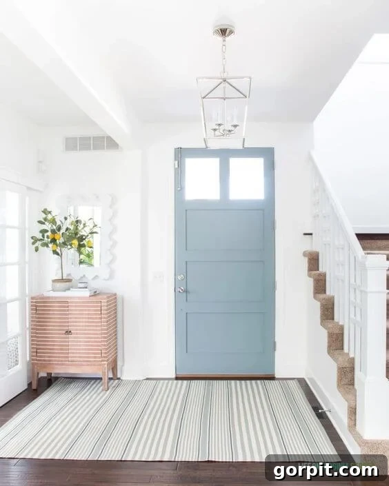
Water’s Edge by Benjamin Moore (1635) LRV 31.48
Benjamin Moore’s Water’s Edge is a refreshing and delicate blue-gray that beautifully revitalizes any space it graces. Its moderate LRV of 31.48 indicates it will reflect a good amount of light while still providing a noticeable depth of color. The subtle gray undertones are key to its appeal, preventing the blue from appearing too vibrant or juvenile. Instead, it maintains a mature, sophisticated presence. As seen on this welcoming front door, Water’s Edge offers a delightful pop of color that remains grounded and neutral, creating an inviting first impression. This shade pairs exceptionally well with crisp whites, natural wood tones, and even metallic accents, allowing it to seamlessly integrate into diverse design palettes while always feeling fresh and airy.
Adirondack Blue by Behr (N480-5) LRV 23
Behr’s Adirondack Blue, with its LRV of 23, offers a deeper, more saturated blue-gray experience. This shade beautifully demonstrates how a “farmhouse” feel can be elevated to new heights of sophistication. When paired with striking black wainscoting, as creatively executed by Brianna, it transforms a room into a modern traditional masterpiece. The grayish undertones provide a rich, moody quality without making the space feel heavy or somber. Instead, Adirondack Blue serves as a dramatic yet refined backdrop, allowing carefully curated elements like an eclectic gallery wall and modern decor to truly shine. It’s an excellent choice for those seeking a distinguished blue that combines classic charm with contemporary edge, creating an atmosphere of cultivated elegance.
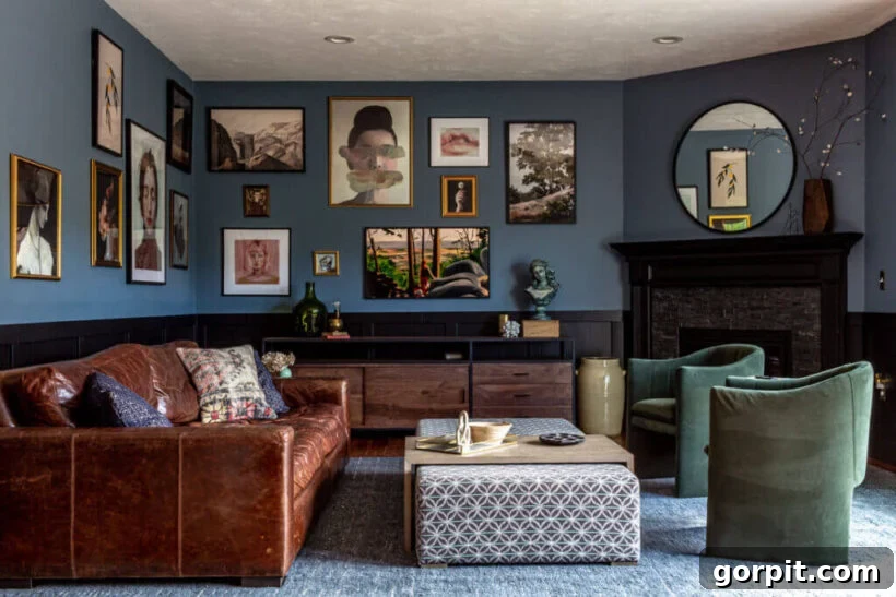
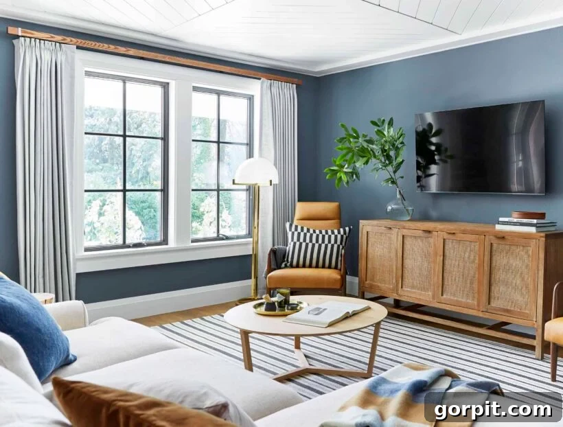
Waterloo by Sherwin-Williams (SW 9141) LRV 13
Sherwin-Williams’ Waterloo is a captivating blue-gray that brings significant depth and character to any room. Its low LRV of 13 means it absorbs more light, resulting in a rich, saturated hue that feels both inviting and grounded. The pronounced gray undertones ensure that while it’s a bold color, it retains a sophisticated crispness, preventing it from appearing overtly vibrant or cold. Waterloo truly comes alive when contrasted with natural wood elements and bright white accents, as demonstrated in this inviting family room. This balance creates a harmonious and serene atmosphere, making it a perfect choice for spaces where you desire a strong color presence that still feels soft and livable. It’s ideal for creating a focal point or enveloping a room in a deeply comforting embrace.
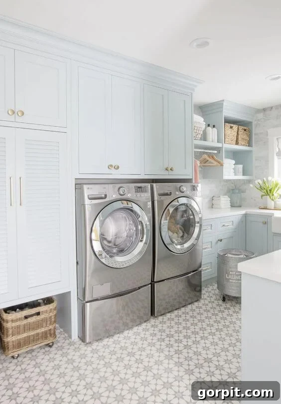
Smoke by Benjamin Moore (2122-40) LRV 56
Benjamin Moore’s Smoke is a beautifully ethereal blue-gray that leans heavily on the pale side, boasting a high LRV of 56. This makes it an excellent choice for those who desire a hint of color without sacrificing brightness. It’s a testament to bold design when Jillian chose this shade for all the cabinetry in a laundry room, transforming a utilitarian space into a serene and elegant sanctuary. The touch of cool gray in Smoke ensures it reads as super neutral, offering a refreshing departure from traditional whites while still maintaining a bright, clean aesthetic. Its soft, airy quality pairs impeccably with the warm gleam of brass hardware and intricate tile work, proving that even the palest blues can make a significant impact. Smoke is a winner for creating a sophisticated and uplifting atmosphere.
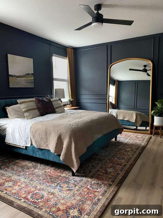
Ink Black by Behr (N490-7) LRV 7
Despite its intriguing name, Behr’s Ink Black (N490-7) is, in fact, a deeply moody and captivating dark blue with just the right touch of gray to soften its intensity. Its very low LRV of 7 signifies it will create a highly intimate and immersive environment, making it perfect for spaces designed for relaxation. Amanda skillfully used Ink Black in her bedroom to cultivate a calming, serene vibe, ideal for sleep and unwinding. The subtle gray undertone prevents it from feeling stark or cold, instead imbuing it with a velvety richness. When accented with striking elements like a giant gold mirror, this dark blue transforms the bedroom into a luxurious retreat, proving that bold color choices can lead to incredibly tranquil and stylish results. It’s a sophisticated pick for anyone wanting to craft a truly dramatic and cozy haven.
Dark Blue Paint Colors
Dark blue paint colors are synonymous with sophistication, drama, and an enveloping sense of calm. These deep hues, ranging from classic navy to nearly black, add incredible depth and luxuriousness to any room. Far from being gloomy, a well-chosen dark blue can create an intimate and cozy atmosphere, making spaces feel both grounded and exceptionally stylish. They serve as powerful backdrops, allowing lighter furniture, vibrant artwork, and metallic accents to pop with striking contrast. Whether you’re aiming for a dramatic statement wall, a plush bedroom retreat, or a commanding dining room, dark blues offer an unparalleled sense of elegance and timeless appeal that designers frequently leverage to elevate interiors.
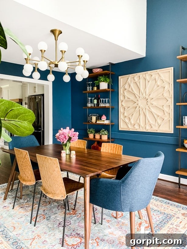
Midnight in the Tropics by Behr (S480-7) LRV 7
Behr’s Midnight in the Tropics is a magnificent dark blue, an exemplary choice for creating a dining room that exudes eclectic charm and profound sophistication. With a low LRV of 7, this color absorbs most light, giving walls a rich, almost velvety appearance that truly transforms a space into an inviting, intimate setting. During my kitchen renovation, which opened into our dining area, this shade allowed me to craft the eclectic navy dining room of my dreams. Its allure lies in its profound depth and a subtle hint of green, which beautifully plays with natural light from windows, revealing nuanced character throughout the day. Against crisp white trim, Midnight in the Tropics creates a stunning contrast, making the architectural details sing and proving that a dark, bold choice can be the foundation for an exquisitely balanced and beautiful room.
Polo Blue by Benjamin Moore (2062-10) LRV 5.6
Benjamin Moore’s Polo Blue is a deeply immersive dark blue, boasting an LRV of 5.6, which makes it an ideal choice for creating spaces that feel like a true escape. Brianna masterfully elevated this moody hue in her bedroom by adding a delicate, lighter blue stencil, demonstrating how texture and pattern can enhance a dark palette. Polo Blue creates an immediate sense of calm and tranquility, transforming the bedroom into a private sanctuary, perfect for relaxation and restorative sleep. The unexpected addition of the stencil prevents the deep color from feeling too enclosed, instead introducing a playful and artistic element that adds dimension and lightness. This elegant dark blue, with its profound depth, is perfect for those who desire a luxurious, cocoon-like atmosphere that still feels creatively styled and uniquely personal.
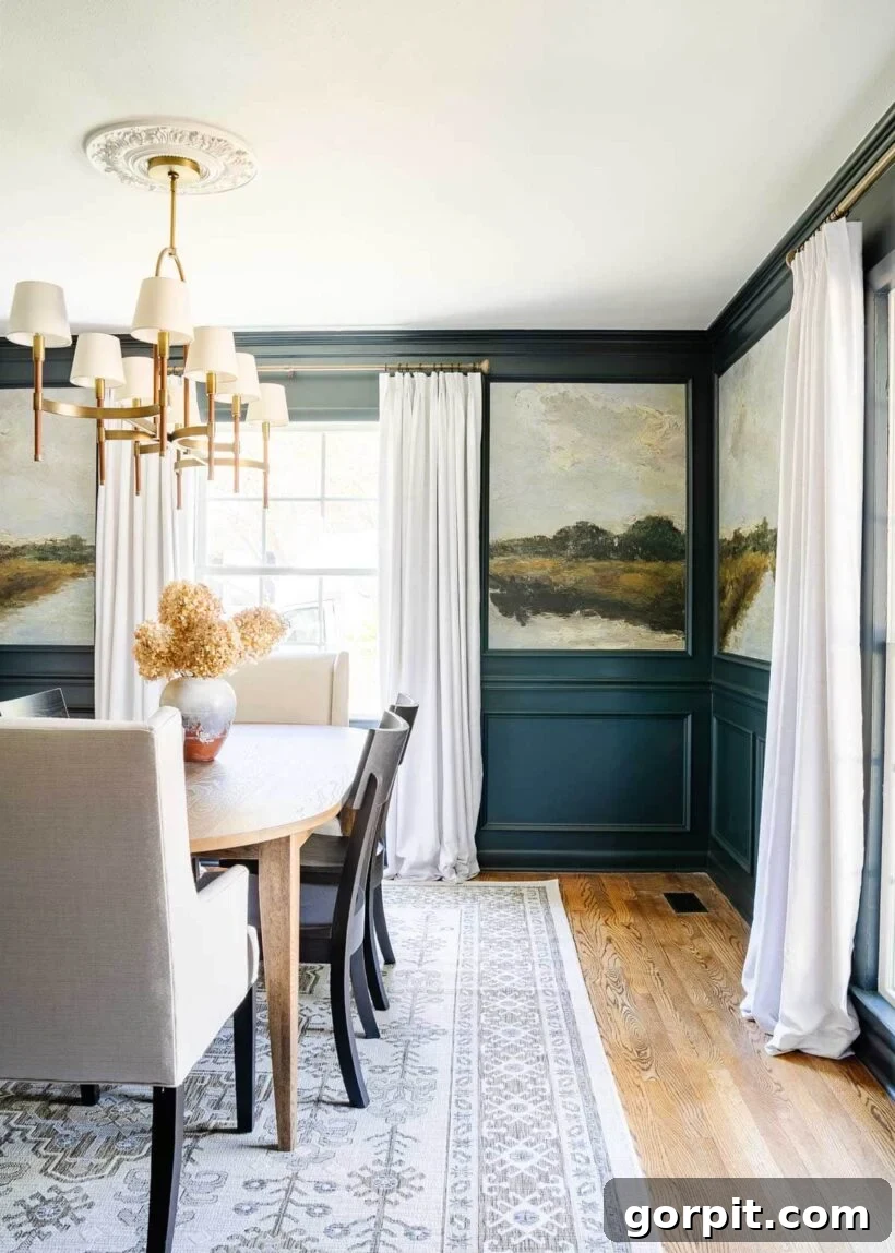
Blue Ridge Parkway by RomaBio Mineral Paints
RomaBio Mineral Paints’ Blue Ridge Parkway is an exquisite dark blue that embodies a natural, organic depth, thanks to its mineral-based composition. Lauren brilliantly utilized this paint to give her dining room a stunning, high-end designer makeover. Paired with captivating peel-and-stick landscape murals and elegant molding, Blue Ridge Parkway serves as the perfect foundation, creating a rich and sophisticated backdrop. The inherent characteristics of mineral paints, which often offer a softer, more matte finish, enhance the mural’s visual texture, making the entire composition feel cohesive and luxurious. This dark blue is not just a color; it’s a statement that evokes the serene grandeur of its namesake, bringing a dramatic yet harmonious touch to a formal dining space. It’s an impeccable choice for those seeking a unique, artisanal finish that merges seamlessly with sophisticated decorative elements.
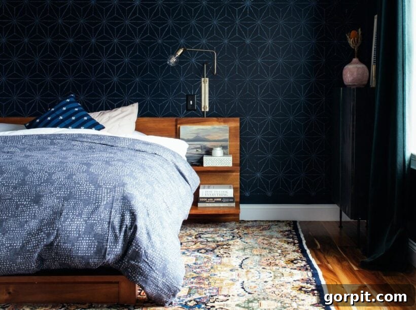
Moscow Midnight by Sherwin-Williams (SW 9142) LRV 5
Sherwin-Williams’ Moscow Midnight (SW 9142) is a profoundly deep blue, with an exceptionally low LRV of 5, pushing it almost to the edge of black. This dramatic shade is a designer’s dream for creating spaces imbued with a luxurious, almost velvet-like ambiance. Zoe at Pine and Poplar skillfully selected Moscow Midnight as a contrasting canvas for the natural wood tones of her decor and bed. The striking interplay between the dark blue walls and the warm wood creates a cozy, cave-like bedroom that feels incredibly inviting and chic. This rich, enveloping hue adds an unparalleled sense of opulence, making furniture and accents truly “pop.” Moscow Midnight is perfect for those who dare to embrace intense color, transforming an ordinary bedroom into a sophisticated haven of relaxation and style.
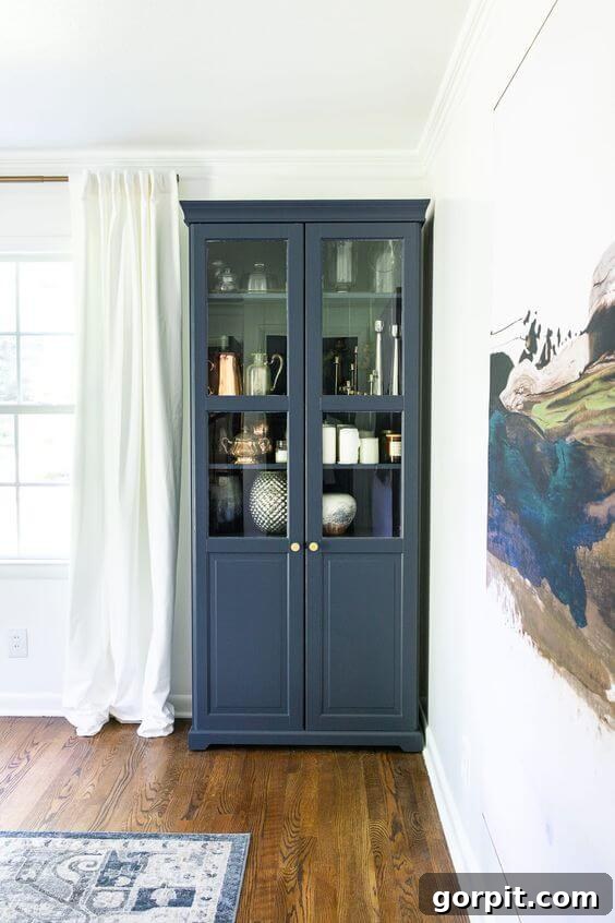
Hale Navy by Benjamin Moore (HC-154) LRV: 6.3
Benjamin Moore’s Hale Navy is a classic, widely beloved dark blue, celebrated for its perfect balance of richness and softness. With an LRV of 6.3, it offers substantial depth without feeling overwhelming, thanks to its subtle gray undertones. This versatility makes Hale Navy an excellent choice not just for walls, but also for revitalizing furniture. Lauren brilliantly applied this elegant shade to an IKEA cabinet in her dining room, transforming a standard piece into a custom-looking statement. The softer, more muted quality of Hale Navy allows it to seamlessly tie together various design elements, complementing the blue tones in artwork and rugs. Its ability to elevate budget-friendly furniture, combined with its timeless appeal, makes Hale Navy a perennial designer favorite for adding a sophisticated touch to any interior.
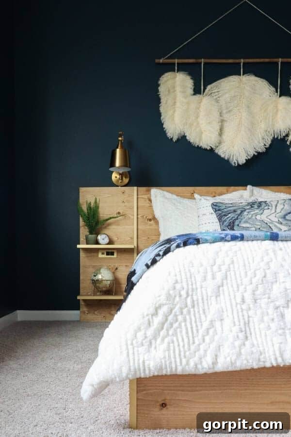
Gale Force by Sherwin-Williams (SW 7605) LRV 6
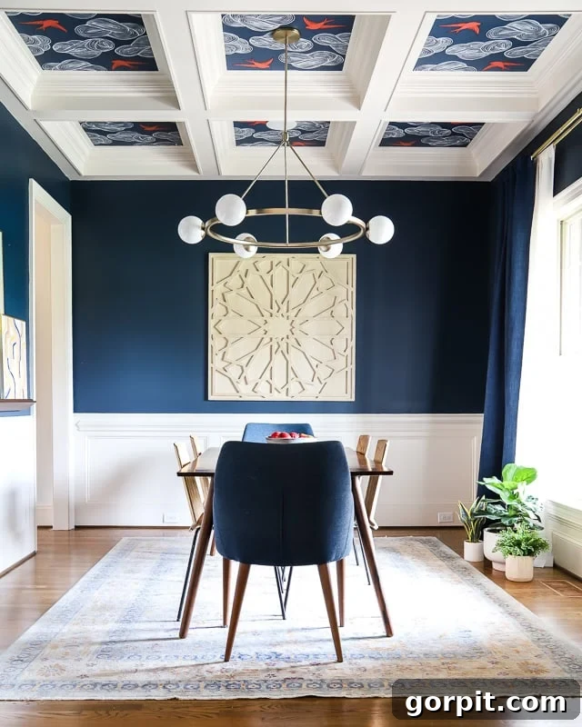
When searching for the quintessential deep, true navy blue for our dining room, Sherwin-Williams’ Gale Force (SW 7605) emerged as the clear winner. Its LRV of 6 signifies a profound saturation, delivering the rich, commanding presence I envisioned for this space. Gale Force is a beautifully intense blue that makes an undeniable statement, evoking the power and tranquility of a stormy sea without feeling cold. Its strong pigment holds up exceptionally well in various lighting conditions, maintaining its true navy character. We meticulously tested several paint samples, and this particular hue stood out for its ability to provide significant depth and drama, perfectly framing the room’s features and creating a truly sophisticated and inviting dining experience. It’s a bold and timeless choice for those desiring a true, unadulterated navy.
Indigo Batik by Sherwin-Williams (SW 7602) LRV 8
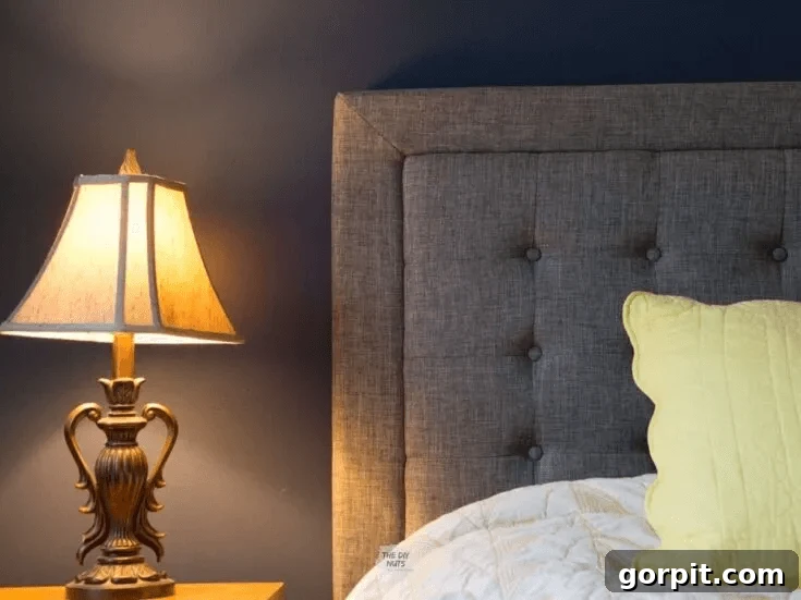
Sherwin-Williams’ Indigo Batik (SW 7602) presents a slightly lighter take on navy, making it an excellent bridge for those who desire a dark blue aesthetic without the full intensity of deeper shades. With an LRV of 8, it still provides ample depth and a luxurious feel, but its slightly higher reflectance value means it appears a bit softer and less dramatic. This makes it a fantastic go-to for enveloping an entire room in a dark blue hue, especially if you’re venturing into darker colors for the first time. Indigo Batik offers a substantial contrast with lighter elements, yet feels less imposing than a very deep navy. It harmonizes beautifully with an upholstered gray headboard, creating a serene and sophisticated bedroom atmosphere that is both inviting and timeless. It’s the perfect choice for a comfortable, chic, and subtly dramatic space.
Stiffkey Blue by Farrow and Ball (281) LRV 10
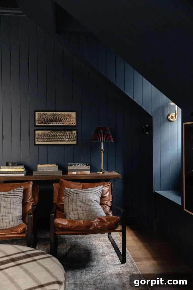
Farrow and Ball’s Stiffkey Blue (281) is a truly exquisite dark blue, celebrated for its rich pigment and profoundly moody character. With an LRV of 10, it offers an immersive experience, transforming rooms into luxurious, atmospheric havens. Chris Loves Julia embraced this daring shade, painting every surface of their bonus room—walls, trim, and ceiling—in Stiffkey Blue. This bold decision paid off spectacularly, highlighting the intricate architecture of the paneling, dormers, and window nooks. The monochromatic application creates an enveloping sensation, making the space feel both intimate and sophisticated. Stiffkey Blue’s depth beautifully complements natural textures and neutral furnishings, allowing the rich color to be the star. It’s a testament to how a single, powerful color can create an unforgettable, high-impact design that’s both dramatic and endlessly chic.
Vibrant Blue Paint Colors
Vibrant blue paint colors are perfect for injecting energy, joy, and a playful spirit into your home. These lively shades are far from shy, making bold statements and becoming instant focal points. Ranging from bright ceruleans to electric indigos, vibrant blues can transform any space into a cheerful and invigorating environment. They are particularly effective in areas that benefit from an uplifting burst of color, such as entryways, kids’ rooms, or creative home offices. While undeniably striking, the right vibrant blue can still feel balanced and sophisticated when paired with clean whites, natural textures, and thoughtful decor. They are ideal for designers and homeowners who aren’t afraid to embrace color and want to create interiors that are truly memorable and full of personality.
Blueprint by Behr (S470-5) LRV: 20
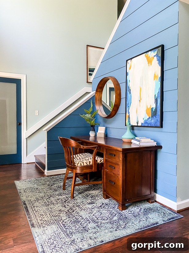
Behr’s Blueprint (S470-5) is a vivid and inspiring blue that I consider a personal favorite, cherished for its ability to infuse spaces with brightness and character. With an LRV of 20, it reflects enough light to feel lively and energetic, without being overly intense. This vibrant hue famously revitalized our old foyer, particularly as the central element of a modern plank wall. Bathed in abundant natural light, the interplay between Blueprint and crisp white trim created an exceptionally cheerful and welcoming entrance. This shade masterfully strikes a balance between vibrant and soothing, proving that a bold color choice can feel both dynamic and utterly livable. I’m still on the lookout for the perfect spot in my current home to reintroduce Blueprint, a testament to its enduring charm and transformative power. It’s a fantastic choice for making a stylish, positive statement.
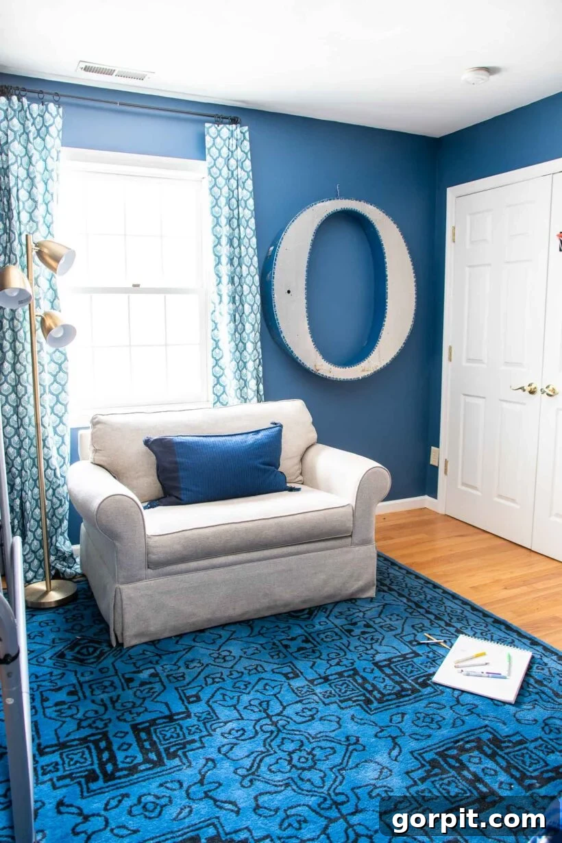
Hyperlink by Clare
Clare’s Hyperlink is a masterclass in achieving a vibrant blue that transcends the typical “primary color” feel often found in children’s rooms. This expertly formulated shade strikes a sophisticated balance, offering a bright and energetic blue without resembling a crayon. Charlotte skillfully utilized Hyperlink in her son’s room, demonstrating how a lively color can be integrated into a stylish, yet kid-friendly, interior design. The nuanced depth of Hyperlink allows it to feel both playful and refined, pairing beautifully with cool interior design elements that elevate the overall aesthetic. It’s a fantastic solution for parents seeking a captivating blue that fosters creativity and imagination, while still maintaining a chic and contemporary look. Hyperlink is the perfect choice for a room that needs a burst of cheerful color with an undeniable sense of style.
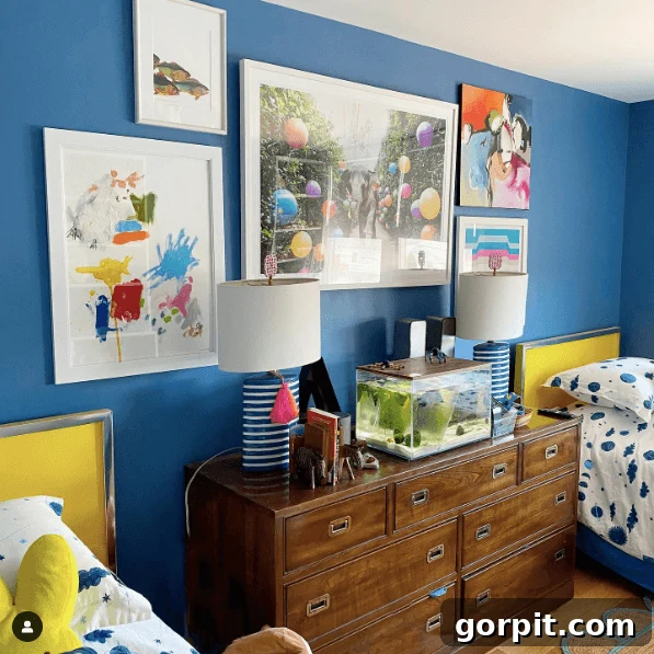
Ultra Marine Blue by Farrow and Ball (29)
Farrow and Ball’s Ultra Marine Blue (29) takes the concept of an “ocean blue” to an entirely new level of high style and sophistication. While blue is a traditional choice for boys’ rooms, Camilla expertly transforms this vibrant shade into a dream kids’ room by integrating an abundance of colorful accents. The result is a space that feels both wonderfully bright and profoundly rich, capturing the exhilarating essence of the sea with an artistic flair. Ultra Marine Blue serves as a dynamic backdrop, allowing playful pops of color to truly sing, fostering an environment that stimulates imagination and joy. This gorgeous vibrant blue possesses a depth and luminosity that ensures it never feels flat, making it an exceptional choice for creating memorable, high-energy rooms that are brimming with personality and style.
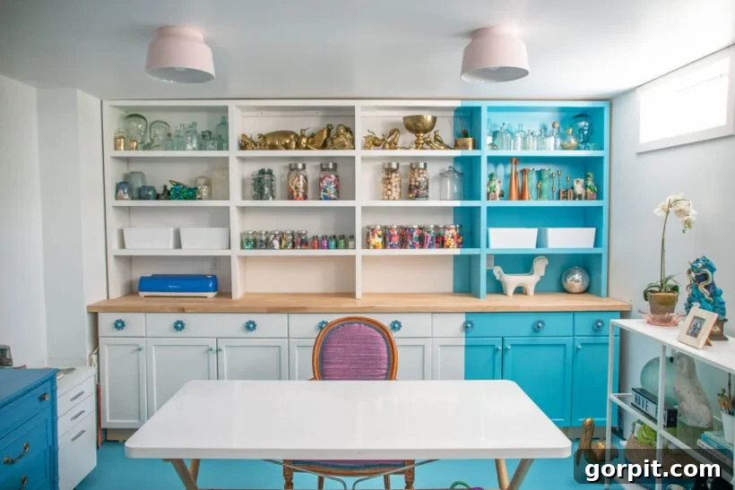
Custom Mixed from Leftover Paint
Sometimes, the perfect color isn’t found on a swatch; it’s created through ingenuity! Charlotte’s home office is a brilliant example of how a custom-mixed vibrant blue can utterly transform a space. Frustrated by commercial options, she took leftover paints and blended them to achieve a truly unique, bright blue that quite literally illuminates her basement office. This resourceful approach yielded a fun, energetic hue that breathes life into the room. She ingeniously extended this custom color from the floor up the built-ins, creating a distinctive offset section that adds incredible visual interest and modernity. This personalized blue proves that the most impactful design choices can sometimes stem from creative problem-solving, resulting in a space that is not only functional but also bursts with one-of-a-kind character and vibrant personality.
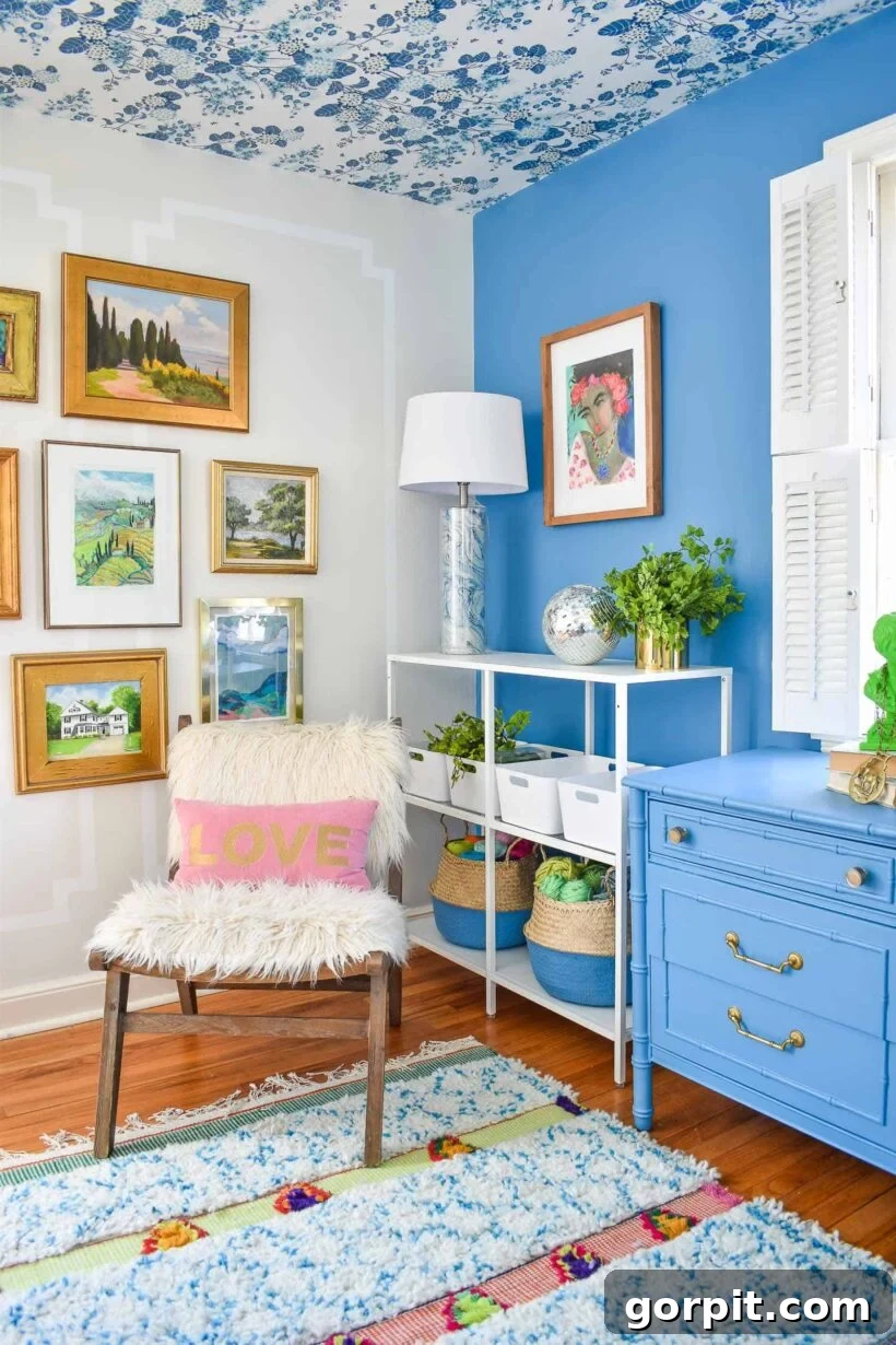
Jet Ski by Behr (M490-5) LRV 26
Behr’s Jet Ski (M490-5) is a radiant and joyful blue, ideal for creating lively and layered spaces, as expertly showcased by Charlotte. With an LRV of 26, this shade offers a bright, refreshing feel while maintaining a commendable level of depth and pigment, ensuring it doesn’t appear washed out. Charlotte strategically used Jet Ski for an accent wall in her office, transforming it into a focal point that is both invigorating and stylish. The brilliance of her design lies in her cohesive approach, incorporating similar, lighter blue tones throughout her decor to tie the entire scheme together. This thoughtful layering ensures that the vibrant blue accent feels perfectly integrated and harmonious, rather than isolated. Jet Ski is a fantastic option for infusing a room with a playful, yet sophisticated, burst of color.
Blue Green Paint Colors
Blue-green paint colors are renowned for their soothing and restorative qualities, seamlessly blending the calming essence of blue with the refreshing vibrancy of green. These chameleon-like shades can transform dramatically depending on the light and surrounding decor, often revealing more blue in one setting and leaning greener in another. From soft aquas and seafoam tones to rich teals and deep peacock blues, the blue-green spectrum offers an incredible range of moods. They are perfect for creating serene retreats, adding a touch of coastal charm, or bringing an earthy, organic feel to contemporary spaces. Designers love blue-greens for their ability to evoke nature, inspire tranquility, and introduce complex, captivating color that always feels fresh and inviting.
Midnight in NY by Behr (N440-7) LRV 10
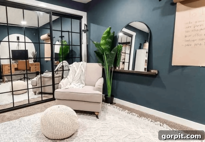
Behr’s Midnight in NY (N440-7) is a profoundly rich and moody blue-green, carrying an LRV of 10 that creates an intimately enveloped atmosphere. While painting a windowless room a dark color might seem audacious, this shade proves that bold choices can lead to stunning results. The deep greenish-blue provides a sense of drama and sophistication that, when balanced with crisp white trim, light-colored carpets, and reflective mirrors, prevents the room from feeling confined. Instead, it becomes a cozy, elegant retreat. Midnight in NY is a versatile backdrop that beautifully complements light neutrals and striking black accents, creating a contemporary and refined aesthetic. It’s an excellent option for those seeking to infuse a space with deep, sophisticated color that fosters a sense of calm and understated luxury.
Wythe Blue by Benjamin Moore (HC-143) LRV 48
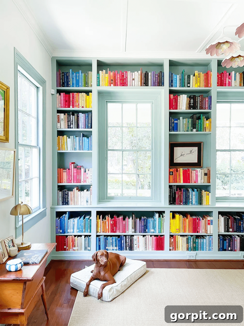
Benjamin Moore’s Wythe Blue (HC-143) is truly a blue-green chameleon, celebrated for its captivating ability to shift its appearance based on lighting and surrounding elements. With a mid-range LRV of 48, it offers a soft, airy quality that can lean anywhere from a pale, watery blue to a light aqua-teal. This nuanced flexibility makes it an endlessly intriguing color. While it didn’t quite capture the desired effect in my own home, its stunning application on these painted bookshelves, where the green undertones truly shine through, is undeniable. Wythe Blue excels at creating a serene and sophisticated atmosphere, reminiscent of gentle sea breezes and clear skies. Its delicate balance allows it to pair beautifully with both warm and cool palettes. This color underscores the critical importance of testing large paint swatches in multiple areas of your room to truly understand how it will interact with your specific lighting and decor. When it works, it’s magic!
Smoky Blue by Sherwin-Williams (SW 7604) LRV 15
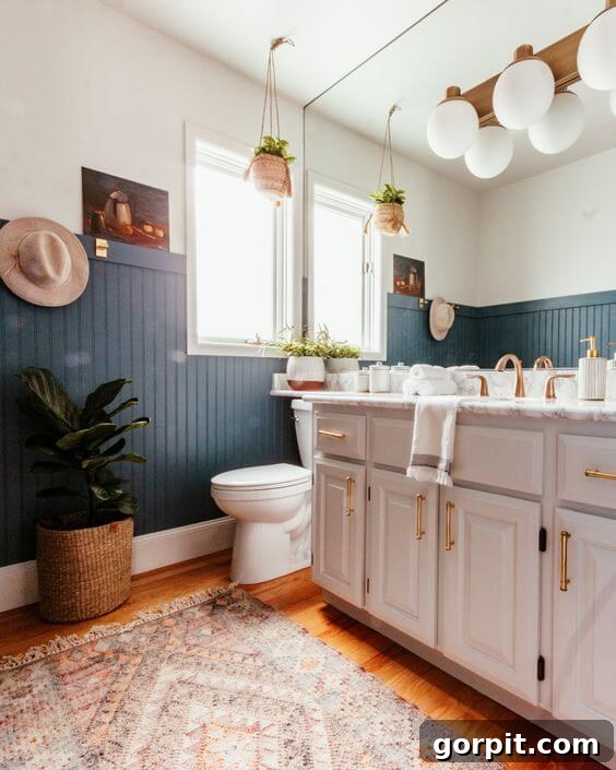
Sherwin-Williams’ Smoky Blue (SW 7604) is a gorgeously deep and dramatic blue-green that flirts with the intensity of dark teal, distinguished by its prominent smoky green undertone. With an LRV of 15, this color creates a rich, enveloping atmosphere without feeling overwhelmingly dark, thanks to the inherent freshness of its green leanings. It serves as an exquisite dramatic backdrop, particularly stunning in a bathroom where it beautifully frames crisp whites and earthy neutrals. The depth of Smoky Blue allows fixtures and tilework to truly pop, elevating the entire space with a sophisticated, spa-like feel. This hue is perfect for those seeking to infuse their home with a bold yet tranquil color, creating a sense of serene luxury that is both captivating and incredibly inviting. It’s a versatile shade that adds character and depth to modern and traditional designs alike.
Seaside by Fusion Mineral Paint
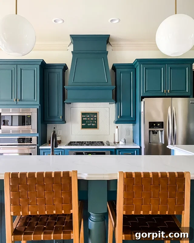
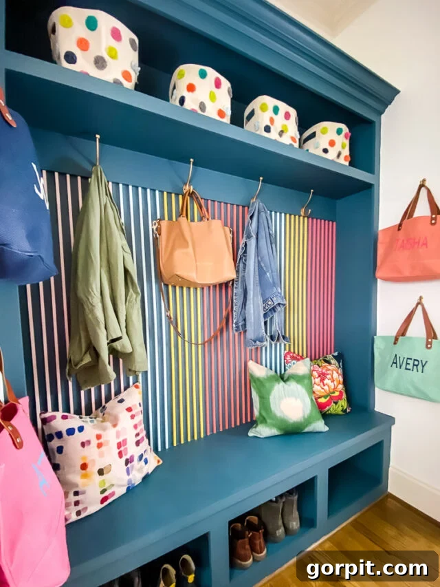
Fusion Mineral Paint’s Seaside is a delightful blue-green that has garnered consistent adoration, frequently being queried after my budget-friendly kitchen makeover. This enchanting color offers a perfect blend of soothing blue and refreshing green, creating a balanced and inviting atmosphere. Its unique mineral paint formulation lends a beautiful, durable finish that makes it ideal for cabinets and furniture. I loved Seaside so much that I also incorporated it into the built-ins of our mudroom, where it serves as a stunning backdrop for the vibrant and dynamic DIY slat wall treatment. Seaside possesses a charming versatility, making it suitable for both farmhouse aesthetics and more contemporary designs. Its ability to evoke a tranquil, coastal vibe while offering robust performance makes it a top choice for transforming key elements in your home, providing both beauty and practicality.
Refuge by Sherwin-Williams (SW 6228) LRV 19
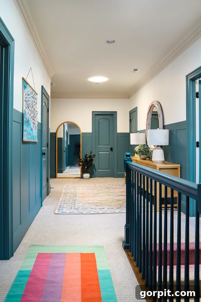
Sherwin-Williams’ Refuge (SW 6228) is a wonderfully balanced blue-green that strikes an ideal chord between cool and refreshing. With an LRV of 19, it’s a color that provides significant presence and depth without feeling overpowering. When we undertook the DIY board and batten project in our upstairs hallway, I knew I wanted a blue-green that felt both clean and invigorating. After exploring several hues, Refuge proved to be the perfect selection. Its harmonious blend of blue and green lends itself beautifully to accent walls, making architectural details pop with a fresh, contemporary appeal. This color has an inherent ability to make a space feel bright and airy, even with its lower LRV, due to its crisp and clear undertones. Refuge is an excellent choice for adding a touch of serene sophistication to transitional spaces or any room craving a vibrant yet balanced natural feel.
Summer Friday by Clare
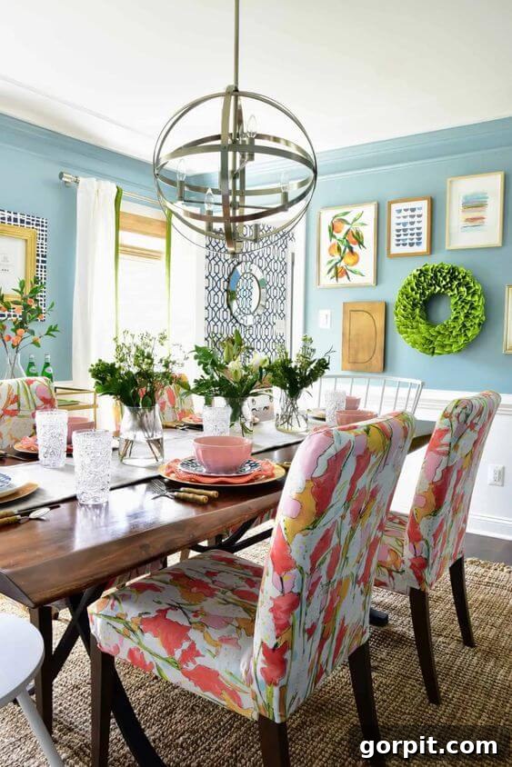
Clare’s Summer Friday is a delightful sky blue with a subtle hint of green, capturing the very essence of a vibrant and airy springtime feel. Kate masterfully chose this enchanting shade for her dining room walls, creating the perfect botanical backdrop for her preppy and refreshing makeover. The beauty of Summer Friday lies in its ability to be both a strong, captivating color and a harmonious complement to intricate art and patterns. It holds its own without overpowering the room’s carefully curated elements, allowing each design choice to shine. This light yet impactful blue-green instills a sense of openness and joy, making any space feel lighter and more expansive. Summer Friday is an ideal choice for those who desire a cheerful, uplifting atmosphere with a sophisticated touch of natural freshness, perfect for rooms meant for gathering and celebration.
Dragonfly by Behr (PPU12-03) LRV 26
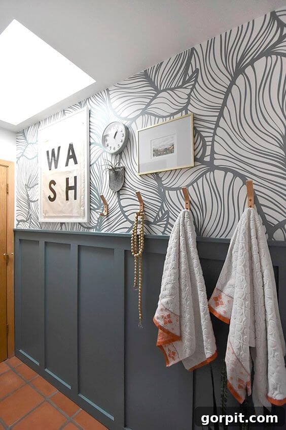
Behr’s Dragonfly (PPU12-03) is a captivating teal that brilliantly merges the tranquility of blue with the earthy undertones of green. This gorgeous color, a trending shade in 2020, proved to be the perfect match for Amy’s existing wallpaper, demonstrating its exceptional versatility in blending with diverse patterns. With an LRV of 26, Dragonfly provides a noticeable depth while retaining a fresh, inviting quality. Its inherent boho and earthy vibe harmonized impeccably with the warm terracotta tiles that were a permanent fixture in her design. This ability to integrate seamlessly with strong, existing elements makes Dragonfly an invaluable choice for renovation projects. It’s an excellent option for creating spaces that feel grounded, serene, and subtly exotic, injecting a unique character that is both calming and creatively inspiring.
Inspired yet? These designer-approved blue paint options truly showcase the immense potential and beauty of this beloved hue. From the palest, barely-there sky blues to the deepest, most inky midnight navies, and all the captivating shades in between, there’s a blue for every mood, style, and design vision. Adding blue to your decor is more than just a color choice; it’s an invitation to infuse your home with a profound sense of calm, elegance, and unexpected versatility. It provides a reliable and sophisticated neutral option that can adapt to changing trends while always retaining its timeless appeal.
Don’t be afraid to think outside the box when incorporating your favorite blue! I’ve personally embraced daring blue applications, from DIY painted kitchen cabinets that became an instant focal point, to a welcoming blue front door, and even navy interior doors in our old house. Each of these projects transformed the look and feel of our home, proving that blue is incredibly adaptable and can be applied in countless creative ways. The key is finding the right shade that truly resonates with your unique style and complements your overall home design.
Before you commit to any of these stunning blue paint colors, please take a moment to review my essential guide on How to Choose Paint Colors for Your Home: 6 Simple Tips to Follow. The most critical advice I can offer is to ALWAYS test your chosen paint colors in your own home first! Observe them on every wall, at different times of day, and under various lighting conditions. For an incredibly easy and mess-free way to test, I highly recommend peel-and-stick paint samples. Alternatively, small sample pots are a great option. Learning from my own past mistakes—like rushing a paint purchase without testing and having to repaint my kitchen three times—I can assure you that this small step will save you immense heartache, stress, and money. Remember, a paint color might look absolutely breathtaking in a designer’s photo, but its appearance can drastically change in your home with your unique furniture, lighting, and existing decor. Always try before you buy!
More Paint Inspiration
Explore more expert guides and reviews to help you make informed decisions for your next paint project:
- The Best Neutral Paint Colors for Kitchen Cabinets
- Benjamin Moore Swiss Coffee: Is it Right For You?
- Samplize Peel & Stick Paint Samples: An Unbiased Review
- Sherwin Williams Pure White SW7005 Paint Review With Pictures
- Navy Blue Paint Colors Designers Love
- Beautiful Blue Paint Colors Designers Love & Use
Other helpful paint resources:
- A Paint Sheen Guide & Reference Chart
- 5 Tips to Decorate With Color (Even When It Scares You)
- How to Choose Paint Colors for Your Home: 6 Simple Tips to Follow
- How to Match A Paint Color That’s Already On A Wall
Wondering how I approach transforming rooms and spaces in our home? Check out Designer in a Binder®.
And if you want exclusive content and behind-the-scenes sneak peeks, be sure to subscribe to our newsletter before you head out!