Benjamin Moore Swiss Coffee OC-45: The Ultimate Guide to This Popular Warm White Paint Color
Embarking on the quest for the perfect white paint color for your home can feel like searching for a needle in a haystack. With countless shades available, each carrying its own unique nuances, the choice can be overwhelming. Among the myriad options, Benjamin Moore Swiss Coffee OC-45 consistently rises to the top as a beloved choice for designers and homeowners alike. If you’ve landed on this guide, chances are you’re considering this highly popular warm white for your space, and you’re keen to understand if it truly is the ideal fit.
While Swiss Coffee possesses an undeniable charm, creating serene and inviting interiors, there are crucial factors to consider before committing to it. The interplay of light, existing decor, and surrounding colors can dramatically alter how a paint color appears on your walls. This comprehensive review will delve deep into Benjamin Moore Swiss Coffee OC-45, exploring its unique characteristics, undertones, and how it performs in real-world settings. Read on to discover if this celebrated shade will be the perfect foundation for your home’s aesthetic, complete with insights and comparative analyses to help you make an informed decision.
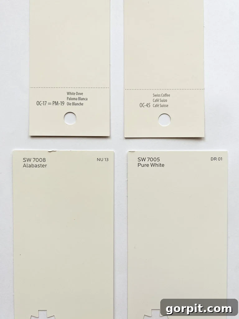
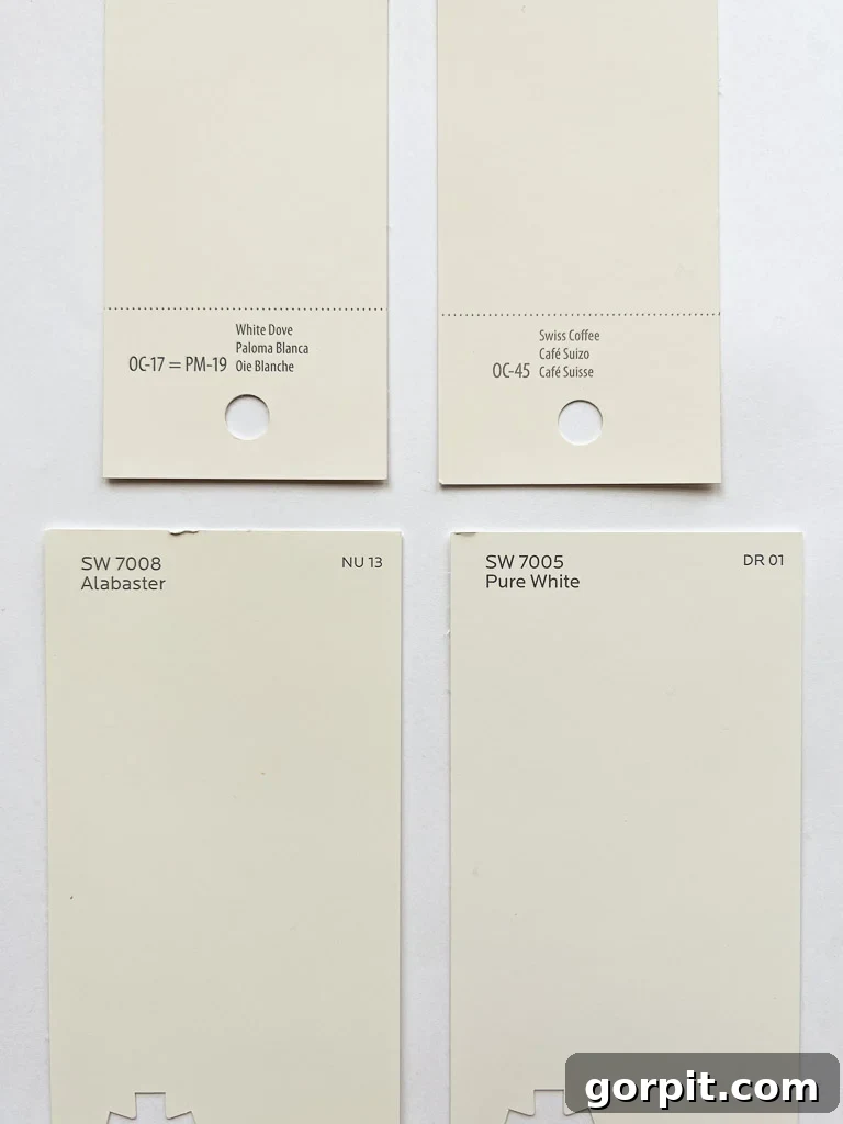
As a passionate advocate for white walls, I understand the transformative power a perfectly chosen white can have on a living space. White shades offer a clean canvas, enhancing natural light and making rooms feel more expansive and serene. While the options are vast, four particular shades frequently dominate the conversation:
- Sherwin-Williams Pure White (my personal choice throughout our current home)
- Sherwin-Williams Alabaster
- Benjamin Moore White Dove
- Benjamin Moore Swiss Coffee
The Allure of Benjamin Moore Swiss Coffee OC-45
The popularity of Benjamin Moore Swiss Coffee OC-45 has soared in recent years, largely thanks to its frequent use by highly influential design professionals. Esteemed designers such as Shea McGee of Studio McGee have embraced this shade, showcasing its sophisticated appeal in their stunning projects. McGee, known for her light, airy, and inviting aesthetic, has even utilized Swiss Coffee at a reduced strength (75%) throughout much of her own home, a testament to its versatility and desirable effect.
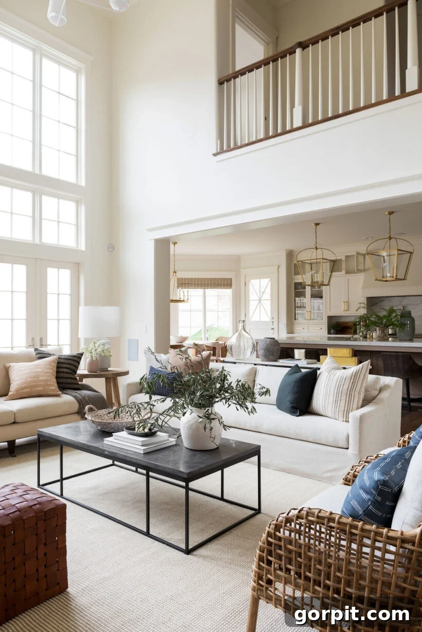
Additionally, legendary designer Nate Berkus has publicly named Swiss Coffee as one of his favorite paint colors, further cementing its status in the design world. These endorsements from highly respected figures undoubtedly carry weight, making Swiss Coffee a compelling option for anyone seeking a chic, designer-approved look. However, it’s crucial to remember that a paint color’s appearance is profoundly influenced by unique environmental factors within your own home, including natural and artificial lighting, existing furnishings, and even geographical location. What looks spectacular in a designer’s portfolio might translate differently in your living room, which is why personalized testing is paramount.
Deciphering Swiss Coffee’s Undertones: Warmth and Subtle Hues
Understanding paint undertones is a critical step in selecting the right color for your home. Undertones are the subtle colors beneath the primary hue, often only revealing themselves in certain lighting conditions or when contrasted with other colors. These hidden nuances can drastically impact the overall feel of a room, creating a cohesive palette or, conversely, an unexpected clash. If you’ve ever pondered, “Is Swiss Coffee warm or cool?” you’re essentially exploring its undertones.
Benjamin Moore Swiss Coffee OC-45 is unequivocally a warm white. Its formula incorporates discernable yellow undertones, contributing to its creamy, inviting character. However, what truly sets Swiss Coffee apart, and for some, makes it a more challenging choice, is the presence of slightly green undertones. These green nuances, though subtle, can become more pronounced depending on the light exposure in a room, leading the color to sometimes appear with a faint greenish cast on the walls. This unique combination of yellow and green undertones makes Swiss Coffee distinct among popular warm whites.
In particular lighting, especially in rooms with less natural light or specific exposures, these green undertones can become quite evident. While some homeowners might find this adds an organic, earthy quality to their space, others, like myself, might find it less appealing when seeking a pure, warm white. The dining room pictured below, for instance, subtly illustrates how these green undertones can manifest, influencing the perception of the color on the walls.
It’s important to note that these elusive undertones are rarely apparent on small paint chips from the store. These chips are often printed rather than made with actual paint, providing only an approximation of the color. This inherent inaccuracy underscores the vital importance of testing paint colors directly within your own home environment. Using substantial, real paint samples, such as those offered by Samplize peel-and-stick samples, allows you to observe how Swiss Coffee truly behaves throughout the day, under various lighting conditions, and alongside your existing decor, ensuring there are no unpleasant surprises.
Swiss Coffee: A Warm White or More? An Exploration of Its Character
For those wondering, “Is Swiss Coffee too white?” the simple answer is no. Benjamin Moore Swiss Coffee is firmly categorized as a warm white, characterized by its subtle infusion of yellow pigment. However, in many settings, it reads less as a pure white and more as an off-white, or even a soft beige. This is precisely why it is included in Benjamin Moore’s “Off-White Color Collection,” which features shades that offer nuanced alternatives to stark white. Benjamin Moore eloquently describes this collection as “inherently sophisticated and endlessly versatile, offering subtle nuances of whites that suit tranquil, serene environments as well as creating color-enhancing accents for dynamic spaces.”
The visual perception of Swiss Coffee as a “whiter” shade, as seen in some of Studio McGee’s designs, is often a direct result of abundant natural light streaming through expansive windows. Such ideal conditions allow the color to appear brighter and more pristine. In homes with less generous natural light, or in rooms with north-facing windows that tend to cast a cooler light, Swiss Coffee will almost certainly lean more into its creamy, beige-like qualities, and its green undertones may become more prominent. While I personally might not choose it for expansive walls, I believe Swiss Coffee could be a beautiful option for trim work, especially when paired with a brighter white wall color, adding a subtle touch of warmth and dimension without overpowering the space. It’s an excellent choice if you’re exploring trim ideas that aren’t pure white, offering a soft contrast that feels both intentional and inviting.
Pairing Colors with Benjamin Moore Swiss Coffee: Creating Harmonious Palettes
The undertones of Benjamin Moore Swiss Coffee are key to understanding its best color pairings. A significant indicator of its compatibility lies in Benjamin Moore’s own suggested “matching colors” on their website, which prominently feature various shades of beige and green. This aligns perfectly with its inherent slightly green and yellow undertones, signaling that Swiss Coffee thrives when complemented by earthy and natural palettes.
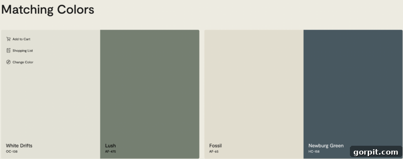
Swiss Coffee harmonizes beautifully with a range of warm, muted colors. Think natural wood tones, soft terracotta, deep olives, muted sages, and rich creams. It can also serve as an excellent backdrop for furnishings and textiles in linen, jute, and other organic materials, enhancing a relaxed, nature-inspired aesthetic. This particular characteristic makes it a strong contender for farmhouse, rustic, or Mediterranean-inspired interiors. Conversely, due to its warm yellow and green leanings, Swiss Coffee typically does not pair as effectively with cooler colors such as blues, grays, or stark blacks. These cooler tones can inadvertently emphasize Swiss Coffee’s green undertones, making the walls appear sickly or out of place rather than warm and inviting.
A compelling example of Swiss Coffee’s successful application can be seen in Blesser House’s living room. Here, the paint works seamlessly within a space rich with earthy tones and natural textures, creating a cohesive and welcoming atmosphere. Notice how the generous amount of natural light in this particular room helps to diminish the intensity of the yellow and green undertones, allowing Swiss Coffee to present as a softer, creamier white. In rooms with less natural illumination, the warmth and subtle undertones would undoubtedly be more pronounced, leaning more towards a distinct beige.
Understanding Swiss Coffee’s Light Reflectance Value (LRV)
The Light Reflectance Value (LRV) is a crucial metric when choosing paint colors, indicating the percentage of visible light that a paint color reflects from a surface. LRVs range from 0 (absolute black, reflecting no light) to 100 (pure white, reflecting all light). A higher LRV suggests a brighter, more light-enhancing color, while a lower LRV indicates a darker, more light-absorbing shade.
While some sources may inaccurately report the LRV of Benjamin Moore Swiss Coffee as close to 84, the official data from Benjamin Moore confirms its LRV to be 81.91. This relatively high LRV signifies that Swiss Coffee is an effective light reflector, contributing to a sense of brightness and openness in a room. However, it’s noteworthy that its LRV is slightly lower than some of its widely popular white counterparts, such as Sherwin-Williams Pure White, Sherwin-Williams Alabaster, and Benjamin Moore White Dove. This subtle difference in LRV contributes to Swiss Coffee’s softer, creamier character, preventing it from appearing stark or overly crisp, and instead lending it a gentle, inviting glow. Understanding this LRV helps to contextualize its warmth and its performance in various lighting conditions within your home.
Benjamin Moore Swiss Coffee vs. Other Popular Whites
To truly appreciate Benjamin Moore Swiss Coffee, it’s beneficial to compare it against other leading white paint colors. This allows for a clearer understanding of its unique characteristics and helps pinpoint which “white” might best suit your personal aesthetic and home’s environment.
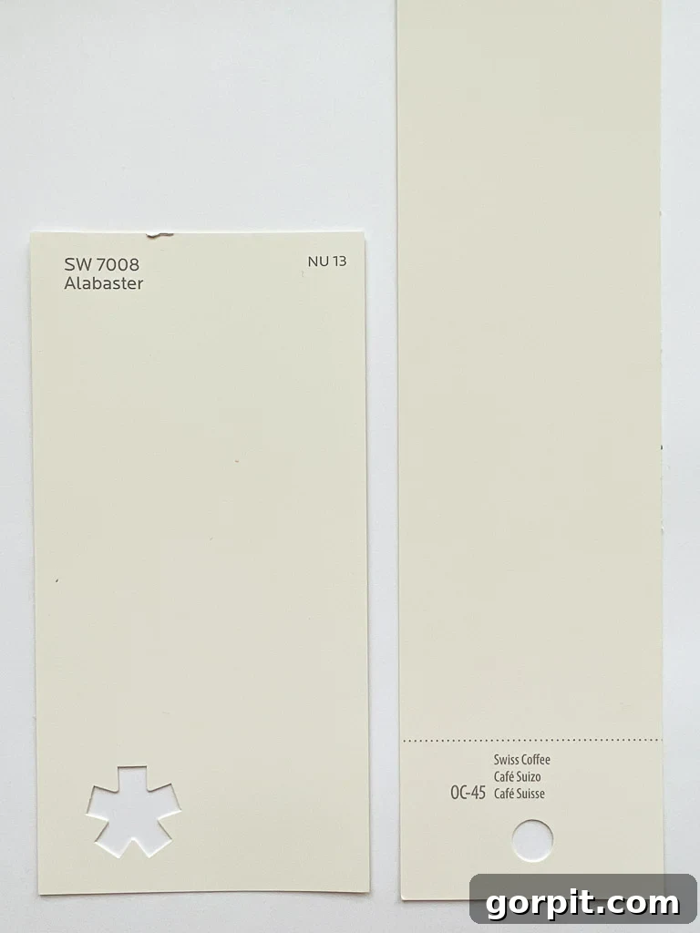
Swiss Coffee vs. Sherwin Williams Alabaster (SW 7008)
Sherwin-Williams Alabaster is another highly popular warm white, often lauded for its soft, inviting glow. While both Swiss Coffee and Alabaster are considered warm, the primary distinction lies in their undertones. Swiss Coffee carries noticeable yellow undertones, often accompanied by those subtle green hues. Alabaster, on the other hand, presents a creamy warmth without the prominent green, offering a cleaner, more neutral warmth. Its LRV is very similar to Swiss Coffee, typically around 82. If your goal is a creamy, inviting warm white that avoids any hint of green, Alabaster would generally be the preferred recommendation. It offers a gentle softness that feels timeless and widely adaptable.
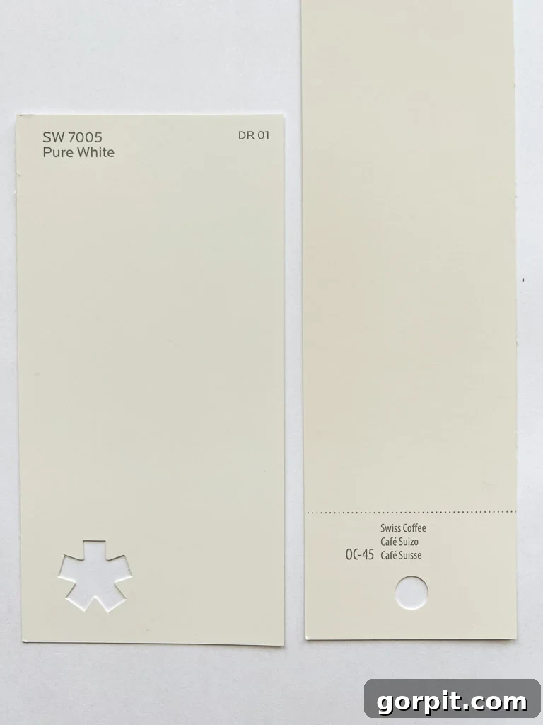
Swiss Coffee vs. Sherwin Williams Pure White (SW 7005)
When comparing Swiss Coffee to Sherwin-Williams Pure White, the difference in warmth is quite pronounced. Swiss Coffee, with its stronger yellow and green undertones, is noticeably warmer and creamier than Pure White. In fact, among the three, Swiss Coffee is typically the warmest and most yellow-leaning. Pure White, by contrast, is a more neutral white, sitting comfortably between a warm and cool tone. It possesses a slightly higher LRV of 84, meaning it reflects a bit more light, contributing to a brighter, crisper feel without appearing stark. Pure White’s versatility stems from its lack of obvious undertones, allowing it to look beautiful in almost all lighting conditions and complement a vast array of decor styles. For these reasons, Pure White remains my personal go-to white wall color and the one I most frequently recommend for its universal appeal and consistent performance.
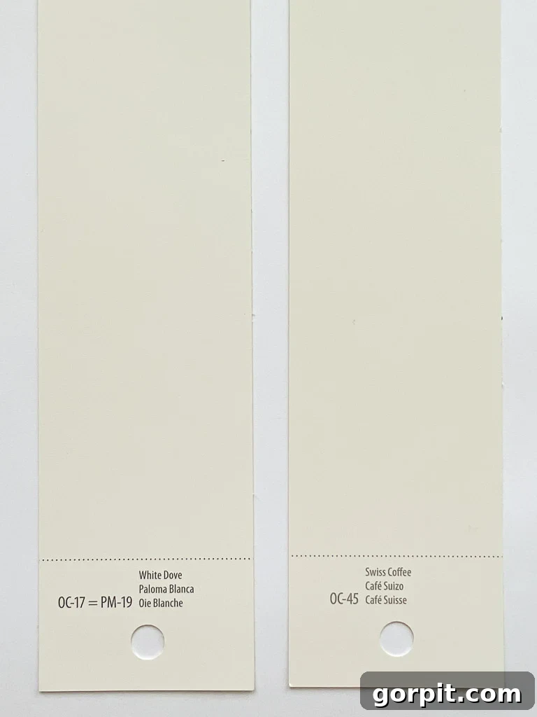
Swiss Coffee vs. Benjamin Moore White Dove (OC-17)
Benjamin Moore White Dove is another highly acclaimed soft white that often finds itself in comparison with Swiss Coffee. While both are considered warm, Swiss Coffee is distinctly creamier and leans further into its warmth than White Dove. White Dove offers a touch more brightness, reflected in its slightly higher LRV of 83.16 compared to Swiss Coffee’s 81.91. White Dove has a softer, less pronounced yellow undertone, giving it a cleaner, more ‘off-white’ feel that still reads as true white in many settings. If your preference is for a white that is undeniably off-white with a creamy, almost beige quality, Swiss Coffee is likely the better choice. However, if you desire walls that convey a sophisticated, slightly softer version of true white without leaning too heavily into cream or yellow, White Dove would be a more suitable option.
Is Benjamin Moore Swiss Coffee OC-45 The Right Choice for Your Home?
After a thorough exploration, it’s clear that Benjamin Moore Swiss Coffee OC-45 is a beautiful and widely admired paint color, but it’s not a one-size-fits-all solution. This warm off-white can be an exceptional choice for your home, especially if your design aesthetic leans towards earthy, natural tones, and you frequently incorporate greens, beiges, and warm wood finishes into your decor. If the matching color palettes suggested by Benjamin Moore resonate with your taste, Swiss Coffee could provide the perfect harmonious backdrop.
Furthermore, if your goal is to achieve an off-white look rather than a crisp, bright white, Benjamin Moore Swiss Coffee will likely exceed your expectations. Its creamy depth creates a cozy and inviting atmosphere that a purer white might not achieve. However, if your vision for your home involves bright, clean, or stark white walls, you should continue your search among other white paint options. Swiss Coffee’s distinct undertones and inherent warmth would likely disappoint if a truly neutral or cool white is what you desire.
Beyond the Color Swatch: Essential Paint Testing Tips
Regardless of how much research you conduct or how many beautiful photos you admire online, the absolute golden rule of paint selection remains: never make a final decision based solely on paint chips or digital images. Your home’s unique characteristics—its orientation to natural light, the type of artificial lighting you use, your existing flooring, furniture, and even your geographic location—will profoundly influence how any paint color appears on your walls. A shade that looks bright and airy in one home might appear dull or heavily tinted in another.
To avoid the costly and frustrating experience of repainting, I strongly advocate for a methodical approach to testing paint colors. Here are 5 simple, yet incredibly effective tips I use and recommend to ensure you make the right choice:
- Invest in large, real paint samples: Forget tiny paper chips. Opt for large peel-and-stick samples (like those from Samplize) or paint large swatches directly onto poster board.
- Test in multiple locations: Place your samples on different walls in the room you intend to paint. Observe them in areas with direct sunlight, shaded corners, and next to existing finishes.
- Observe throughout the day: Natural light changes dramatically from morning to evening. Watch how the color shifts under cool morning light, bright midday sun, and warm afternoon glow.
- Consider artificial lighting: Turn on your interior lights. Different light bulb temperatures (warm white, cool white, daylight) will affect the paint color. Ensure the color looks good with the lighting you typically use.
- Compare with existing elements: Hold your paint samples next to your furniture, window treatments, and flooring. Does it create harmony or an unwelcome contrast?
Following these steps will provide you with invaluable insights, helping you select a paint color that looks spectacular and feels just right for your unique space.
More Inspiring Paint Color Resources
SEE ALL paint color posts
-
The Best Neutral Paint Colors for Kitchen Cabinets
-
Benjamin Moore Swiss Coffee- Is it Right For You?
-
Samplize Peel & Stick Paint Samples: An Unbiased Review
-
Sherwin Williams Pure White SW7005 Paint Review With Pictures
-
Navy Blue Paint Colors Designers Love
-
Beautiful Blue Paint Colors Designers Love & Use
Final Thoughts and Next Steps
I sincerely hope this deep dive into Benjamin Moore Swiss Coffee OC-45 has provided you with clarity and confidence as you navigate your paint color journey. Understanding its unique blend of warm yellow and subtle green undertones, its LRV, and how it performs in various settings is crucial for making a choice you’ll love for years to come. Remember, the perfect paint color is one that feels authentic to you and enhances the beauty of your specific home.
If you’re eager to streamline your approach to transforming rooms and creating cohesive spaces within your home, I invite you to explore Designer in a Binder®. This resource is designed to simplify the decorating process, empowering you to make informed decisions with ease.
For exclusive content, behind-the-scenes glimpses into design projects, and even more expert tips on creating a home you adore, be sure to subscribe to my newsletter before you go. Happy painting!