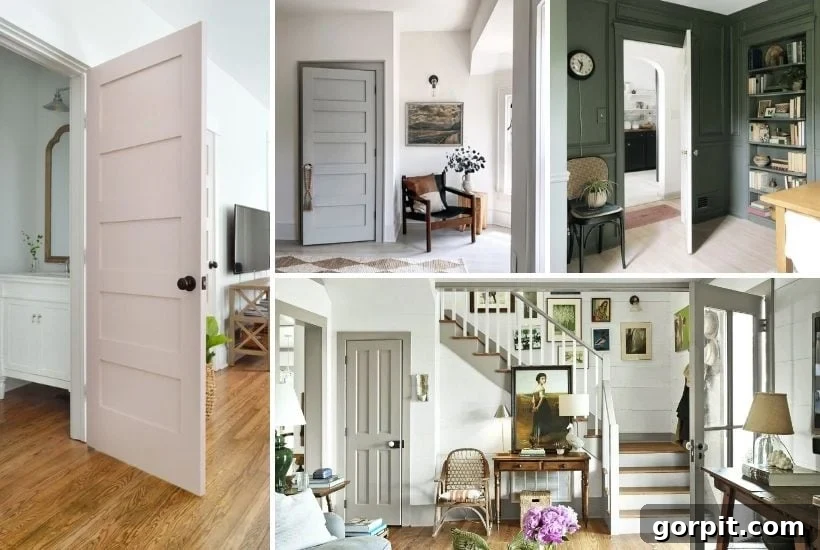
Beyond White: Exploring Trendy & Timeless Interior Trim Color Ideas
For too long, interior trim has been relegated to a singular, often sterile, role: pure white. But design paradigms are shifting, and smart homeowners and designers alike are discovering the transformative power of contrast trim. It’s more than just a passing trend; it’s a statement, a way to add depth, character, and sophistication to any space. If you’re ready to break free from the traditional and infuse your home with unique personality, these inspiring interior trim color ideas are guaranteed to spark your imagination.
The journey to embracing non-white trim began for us recently when we faced a significant design challenge in our new home. As many of you know, we are embarking on a new chapter in a new house. Our beloved previous home, which we meticulously transformed room by room, is now under contract, and the keys to our next adventure are almost in hand.
While we’re holding off on sharing a full “before” reveal of our new abode until after the closing – a little superstition never hurt anyone – we have offered a few tantalizing glimpses. We addressed numerous questions about our move and the new house in this candid podcast episode, and even shared the very first photos here. But what we haven’t explicitly detailed is one of the most unexpected design conundrums we encountered: the trim color.
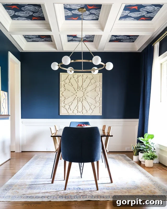
Our new home boasts a beautiful, traditional style, characterized by an abundance of intricate trim work. Seriously, it’s everywhere! The dining room ceiling alone, with its exquisite coffered design, serves as a prime example of the extensive molding throughout the house (and yes, that’s officially the third photo of our new home I’ve shared!).
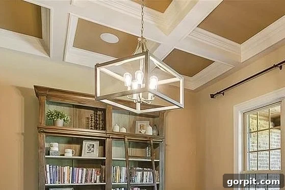
As you might have observed from that image, the trim in our new house isn’t the crisp, pure white that has always been our go-to choice. Instead, it’s painted in Divine White by Sherwin-Williams, a warm, inviting off-white shade that you can see detailed below.

Initially, this revelation sent me into a minor panic. First, because pure white trim has been our consistent preference. Second, the sheer volume of intricate molding in this house meant that repainting all the trim was simply not a feasible option – neither budget-wise for hiring professionals, nor time-wise for us to tackle ourselves. It was a daunting prospect. However, after discussing our vision to paint nearly every room in the new house a neutral white, a thought began to take root. “You know,” I mused to Joe, “I think this off-white trim might actually look quite cool against crisp white walls.” Joe, to put it mildly, was unconvinced. But in my mind’s eye, I could already see the potential.
Embracing the Unexpected: Surprising Interior Trim Color Ideas Beyond Pure White
Determined to prove to Joe that stunning interior trim designs don’t always demand pure white, I dove into extensive research. And in doing so, I had a bit of an “aha!” moment, feeling a tad foolish for not connecting the dots sooner. I’d read countless times about the rising popularity of contrast trim. Yet, it wasn’t until I stumbled upon a wealth of inspiring images that I truly considered an off-white shade serving as a sophisticated contrast color for interior trim.
Cream and Ivory Interior Trim: A Soft, Elegant Contrast
It turns out my intuition was spot on! I absolutely fell in love with the sophisticated charm of ivory and cream trim paired with pure white walls. These images quickly became the primary inspiration for the color schemes in the majority of rooms in our newly settled home.
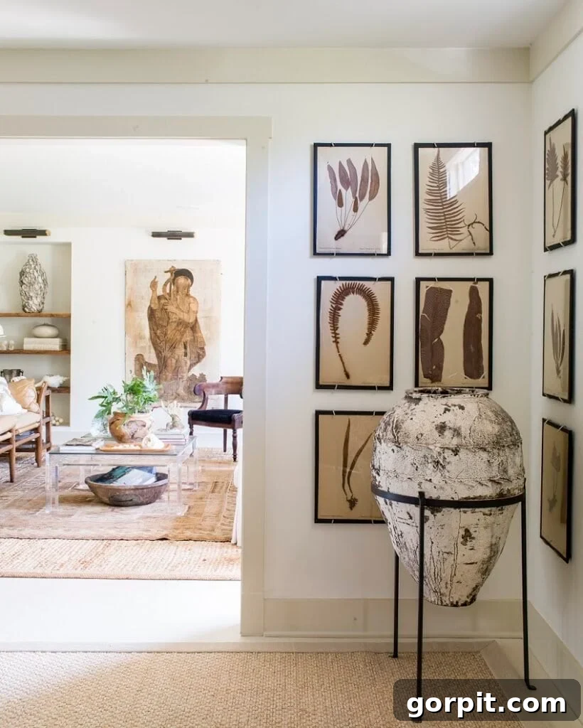
The beauty of cream or ivory trim lies in its ability to introduce warmth and depth without starkness. Unlike pure white, which can sometimes feel cold or clinical, these softer, warmer off-white tones create a gentle delineation between walls and architectural features. They highlight molding and doorframes, allowing their details to stand out in a subtle, sophisticated manner. This approach yields a timeless aesthetic, perfect for homes aiming for a relaxed yet refined ambiance. It’s a classic choice that offers visual interest and a sense of calm, effortlessly blending with various decor styles from traditional to modern farmhouse.
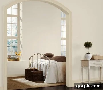
Notice how the subtle warmth of the trim in the examples above enhances the architectural elements, drawing your eye to the details rather than just the color contrast. This is especially effective in spaces with abundant natural light, where the interplay of pure white and off-white creates beautiful shadows and highlights throughout the day.
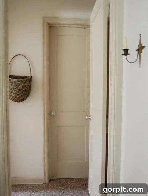
Inspired by these captivating visuals, we moved forward with ivory trim and white walls in our home, and the outcome is nothing short of delightful! Our walls are painted in Pure White by Sherwin-Williams, providing a crisp, clean backdrop, while our trim is the aforementioned Divine White by Sherwin-Williams. This pairing offers a subtle, inviting contrast that feels both fresh and classic. You can see how beautifully this combination works in our bonus room and master bedroom, pictured below. The soft difference between the two whites creates an almost ethereal quality, enhancing the architectural features without overpowering the space.
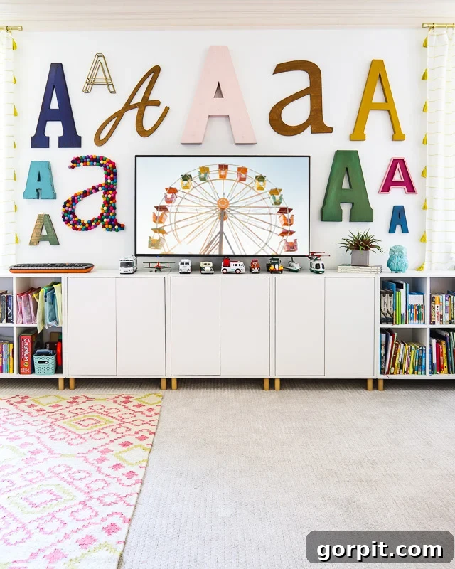
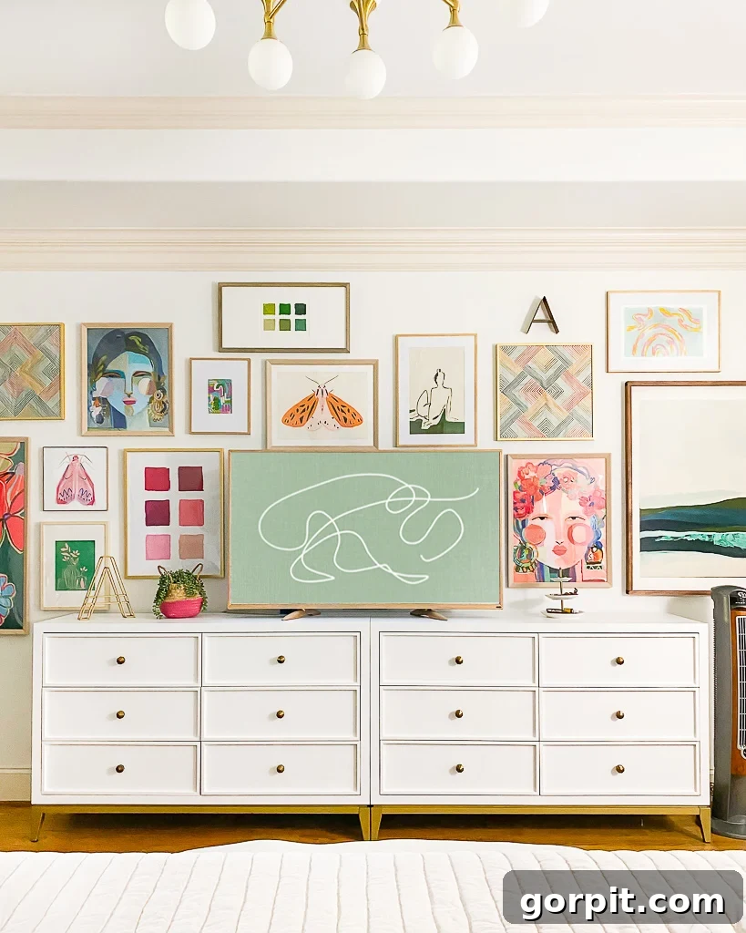
Beyond its application in creating subtle visual interest, this ivory-white pairing also served as the foundation for the striking color palette in our dining room. I was particularly captivated by the idea of combining ivory trim, white walls, and a rich navy blue paint color all within a single space, believing it would create a dramatic yet cohesive look.
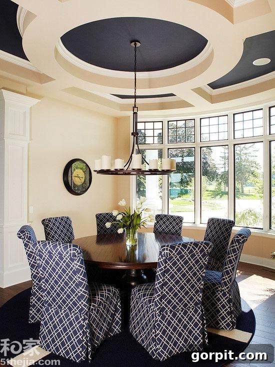
And here’s how that very same sophisticated color palette translates into our actual navy blue dining room. Every piece of trim in this room, from the extensive crown molding to the baseboards, is painted in Divine White by Sherwin-Williams, providing a beautiful continuity and warmth against both the vibrant navy and the subtle white wall sections. This harmonious blend showcases how ivory trim can anchor a diverse color scheme, bringing elegance and coherence to even the most dynamic spaces.
While our personal choice for the new house leaned towards the soft elegance of ivory, the world of interior trim offers a vast spectrum of options far removed from traditional white. If budget and the monumental task of painting every piece of molding weren’t factors (or if we were designing from a blank canvas), I would absolutely consider some of these other incredible and often unexpected choices that bring undeniable style and personality to a home.
Gray and Greige Interior Trim: The Modern Neutral
It’s hardly a revelation that gray and greige (a versatile blend of gray and beige) have become darlings in the world of interior design, and their appeal extends beautifully to trim work. These colors offer a nuanced neutrality that is anything but bland, providing a sophisticated backdrop or a subtle contrast that truly elevates a room. Gray and greige trims excel at creating a sense of calm and modernity, allowing other design elements to shine while maintaining a polished, cohesive look. They can range from cool, crisp grays that lend a contemporary edge to warmer greiges that provide a soft, welcoming feel. Here are some of my favorite examples of how gray and greige interior trim can transform a space, discovered during my extensive research.
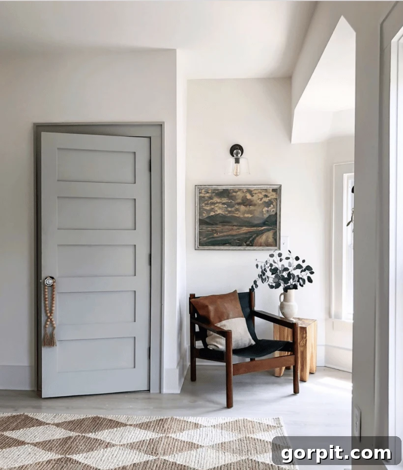
Observe how the gray trim in the image above provides a grounding effect, delineating the architectural features with a quiet strength. It’s a choice that speaks to understated elegance, pairing effortlessly with a multitude of wall colors from pure white to soft pastels or even deeper tones for a more dramatic effect. Greige trim, on the other hand, offers a slightly warmer alternative, bridging the gap between cool grays and warm beiges, making it incredibly adaptable to various lighting conditions and decor styles. It’s perfect for creating an inviting atmosphere that still feels current and refined.
Black Interior Trim: A Bold and Sophisticated Statement
There’s no denying the powerful impact of black trim. It’s a choice that exudes confidence and sophistication, instantly elevating a space with its dramatic contrast and crisp definition. We ourselves opted for black trim on the exterior of our home, understanding its ability to make a bold, timeless statement. That same undeniable elegance and architectural impact translate seamlessly to interior spaces. Black trim frames windows and doorways like works of art, drawing the eye and emphasizing the lines and structure of a room. It pairs beautifully with light, airy walls for a stark, modern contrast, or with deeper hues for a moodier, more enveloping feel. Just take a moment to admire this stunning design, showcasing the undeniable allure of black trim.
In this example, the black trim grounds the space, providing a strong visual anchor that complements the room’s design elements. It’s a daring choice that ultimately creates a sense of luxury and contemporary flair, proving that sometimes, the boldest decision yields the most beautiful results.
Other Inspiring Interior Trim Color Options: Unleashing Your Inner Color Lover
As a self-proclaimed “hard-core color lover,” it’s probably no surprise that these more adventurous, “non-neutral” options truly captivate my imagination. Moving beyond the conventional, colored trim injects personality and creates truly memorable spaces. When executed thoughtfully, these vibrant choices can transform a room from ordinary to extraordinary, reflecting the homeowner’s unique style and daring spirit. Let’s explore some incredibly gorgeous examples.
Consider the allure of green trim. It’s a color that inherently connects us to nature, bringing a sense of calm and freshness indoors. From muted sages that offer a sophisticated, earthy feel to vibrant emeralds that make a luxurious statement, green trim is incredibly versatile. Each shade evokes a different mood, capable of creating a serene retreat or a lively, invigorating space. Look at these distinct green trim options below. They are all so different, yet each one is absolutely gorgeous and perfectly integrated into its respective design.
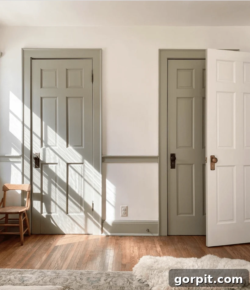
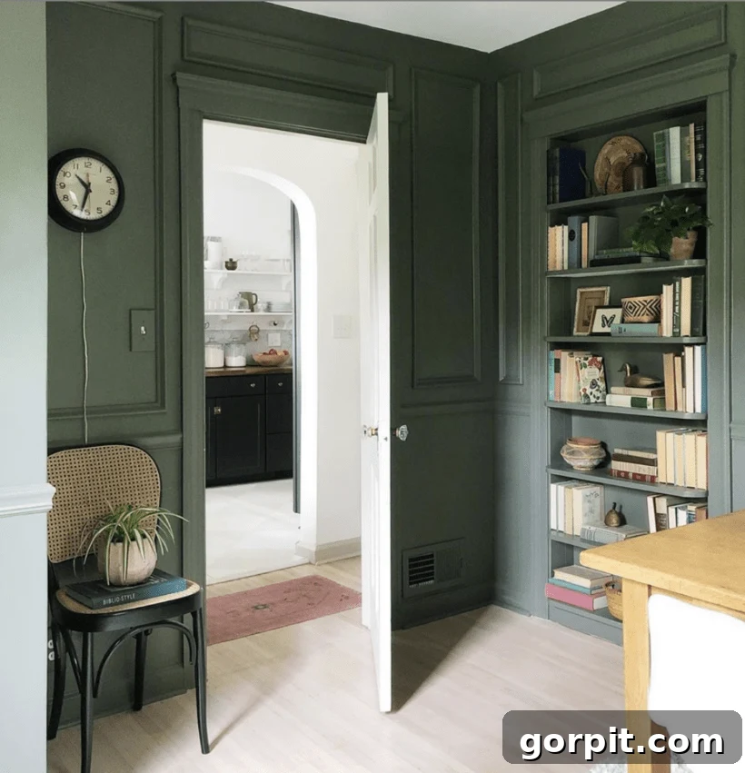
And what about the tranquil beauty of blue trim? You might already know I’m a massive fan of navy on interior woodwork, given that I painted all the interior doors in our old home navy blue! More recently, in our current house, I brought a touch of vibrant teal into our upstairs hallway, painting the DIY board and batten accent wall, doors, and baseboards in Refuge by Sherwin-Williams. Blue, in its myriad shades, from soft sky to deep navy, offers versatility and a sense of calm or dramatic flair, making it an excellent choice for trim.
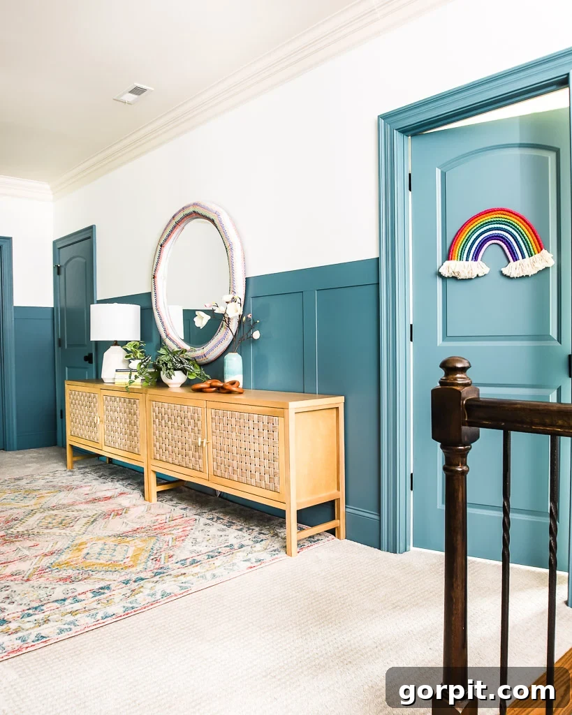
I also particularly adore how a rich, dark navy blue trim provides a striking, yet classic, contrast against pristine white walls. It’s a sophisticated pairing that feels both timeless and fresh, reminiscent of coastal elegance or a refined library.
While blues and greens, though not neutral, are somewhat expected and widely loved, how about venturing into the truly unexpected? Imagine pink trim! If I thought Joe would ever entertain the idea, I would jump at the chance. It’s an incredibly sophisticated and utterly special choice, offering a soft, playful elegance that defies convention and creates a uniquely charming atmosphere. Pink trim, when chosen carefully, can feel incredibly high-end and design-forward, especially when paired with complementary wall colors like muted grays or even other pastels.
And then there’s the sheer joy and vibrancy that yellow trim can bring to a space. The yellow featured on this cabinetry and crown molding is just so incredibly fun and invigorating! It instantly brightens a room, injecting warmth and a playful energy that is simply infectious. Yellow trim can range from soft buttercreams that offer a subtle glow to bold, sunny hues that make a cheerful statement, proving that color has the power to entirely transform the feel of your home’s architectural elements.
I could continue showcasing an endless array of stunning examples, but I believe the message is clear! When it comes to selecting a color for the interior trim in your home, pure white is definitively not the sole option. The possibilities are boundless, limited only by your imagination and willingness to experiment. I sincerely hope these diverse interior trim color ideas have inspired you to reconsider and explore alternative, more personalized options for your own living spaces.
I am certainly thrilled to be fully immersed in the exciting world of contrast trim within our new home and promise to keep you updated on every step of our design adventure! This entire new house journey is proving to be quite the thrilling and creative undertaking.
Other posts you may enjoy:
- How to Make a Small Room Look Bigger: 9 Simple Tricks
- Sherwin-Williams Alabaster Color Review With Pictures
- How to Choose Paint Colors for Your Home: 6 Simple Tips to Follow
- A Paint Sheen Guide & Reference Chart
- 8 Interior Design Mistakes You Don’t Even Know You are Making (and How to Fix Them)
- How to Choose An Area Rug: Rug Placement & Size Guide
- Benjamin Moore Swiss Coffee- Is it Right For You?
- Sherwin-Williams Pure White Color Review with Pictures
Curious about my systematic approach to transforming rooms and spaces in our home? Be sure to explore Designer in a Binder® – your ultimate guide to affordable and simple home decoration.
For exclusive content, behind-the-scenes sneak peeks, and more design inspiration delivered straight to your inbox, don’t forget to subscribe before you go!