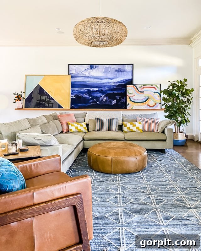
Transitioning from a world of soothing neutrals to embracing the vibrant spectrum of colors in your home can often feel like a leap of faith. For many, the comfort of subdued whites, beiges, and grays provides a sense of calm and order. However, the prospect of introducing lively hues, or even subtle pastels, holds the exciting potential to transform a living space from merely functional into a dynamic, joyful, and truly personalized sanctuary. This journey doesn’t have to be daunting; in fact, it can be an incredibly rewarding exploration of personal style.
If you’ve longed to infuse your home with more personality but hesitate to commit to bold changes, you’re in the right place. This comprehensive guide offers six actionable tips for decorating with color confidently, without requiring significant financial investment or major, permanent alterations. You’ll discover how to seamlessly integrate colorful decor into your existing neutral scheme, preserving the harmony and balance you initially cherished while adding layers of depth and visual interest. Prepare to unlock the transformative power of color, making your home a truer reflection of you.
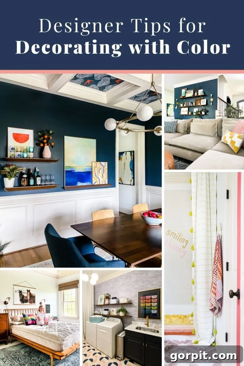
Table of Contents
For those who follow my interior design journey on Instagram or read my blog, it’s no secret that I have a deep passion for decorating with vibrant pops of color. My home is a testament to embracing a rich palette, and I certainly don’t shy away from integrating bold hues into every corner. Yet, I frequently receive messages and comments from my wonderful audience, expressing a shared admiration for colorful rugs, lively gallery walls, and bright textiles, often followed by a hesitant confession: “I love the color in your home, but I wish I were brave enough to decorate with color myself!” or “Do you have any tips for decorating with bright colors? I adore them but I’m truly terrified to incorporate them into my own space!”
This common sentiment reveals a widespread desire to move beyond purely neutral aesthetics but also a significant apprehension about where and how to begin. That’s precisely why I’ve curated this guide, filled with practical, budget-friendly strategies that empower you to experiment with colorful decor without the pressure of major commitments or the fear of making costly mistakes. The goal here is to make the process of adding color to your home not just achievable, but genuinely enjoyable and, most importantly, less scary. These tips are designed to build your confidence gradually, allowing you to discover what truly resonates with your style and brings joy to your living environment. Let’s dive in!
This post contains affiliate links for your convenience. Click here for my full disclosure policy.
6 Tips for Decorating With Color Even When It Scares You
Embracing color in your home decor is an art that improves with practice and experimentation. The beauty of the tips I’m about to share is their inherent flexibility: you can implement them without feeling overwhelmed, and crucially, without draining your wallet. This low-risk approach means that if, after experimenting with splashes of color, you find yourself yearning for your monochromatic past or a more subdued aesthetic, you won’t be burdened by expensive purchases you regret. You’re free to evolve your style, knowing each step is a manageable investment in discovering what truly makes your home feel right to you.
Tip 1: Choose colorful artwork.
While my love for color is undeniable, you might notice a consistent backdrop in much of my home: walls painted in Pure White by Sherwin-Williams. This deliberate choice isn’t a contradiction; rather, it’s a strategic canvas that allows colorful artwork to truly pop and take center stage. A significant portion of the vibrant energy in my home emanates directly from the art adorning our walls, creating focal points that draw the eye and infuse personality.
For those just beginning to explore the world of color, the idea of investing heavily in expensive artwork can be intimidating. Thankfully, incorporating impactful, colorful art doesn’t have to break the bank. I frequently source affordable posters and art prints from fantastic online platforms like Minted and Society6, which offer a diverse range of styles to suit any taste. I even design and sell unique and colorful art prints in my Kaleidoscope Living shop, making vibrant decor accessible to everyone.
Beyond traditional prints, I encourage you to think creatively about what constitutes “art.” For instance, two striking pieces in the gallery wall in our bedroom are actually repurposed throw pillow covers that cost a mere $10 each! Framed, they instantly transformed into compelling, large-scale art. This approach proves that inspiration can come from unexpected places and that a keen eye for potential can yield remarkable results.
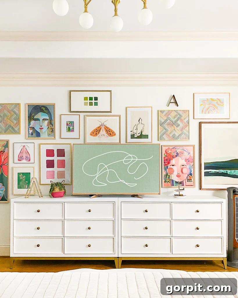
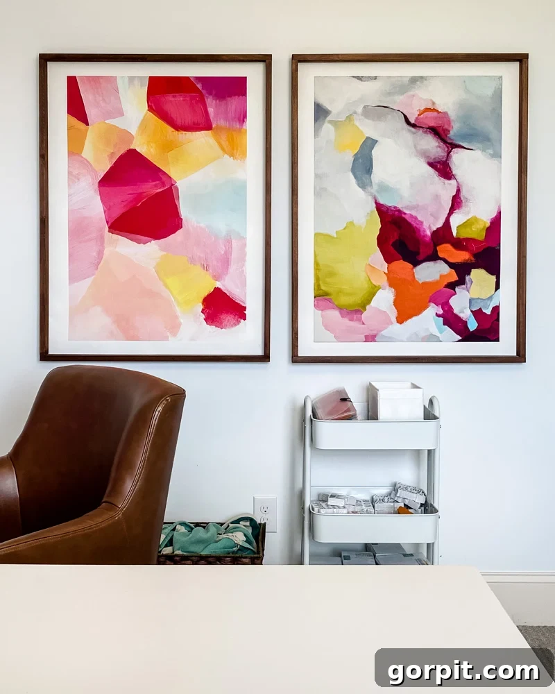
To achieve the visual impact of large-scale art while adhering to a strict budget, consider printing digital designs as engineering prints at an office supply store. These can cost less than $10 each and, when paired with inexpensive frames, create an impressive statement. Furthermore, a truly effective way to stretch your art budget is by building your own frames. We almost always DIY our picture frames for under $20 each, which is an ideal solution for experimenting with bold colors and making a significant visual impact without a hefty price tag. This strategy allows you to easily swap out pieces as your confidence grows and your style evolves.
Tip 2: Toss in some colorful throw pillows.
Adding colorful throw pillows is perhaps one of the easiest and most effective ways to introduce vibrant hues into your home decor. These versatile accessories are typically inexpensive, making them a perfect, low-commitment tool for experimenting with color. If you’re hesitant about integrating bright colors into a predominantly neutral space, simply tossing in a few colorful throw pillows allows you to test the waters and gauge your comfort level with minimal risk. Their impact is immediate, and their changeability offers unparalleled flexibility.
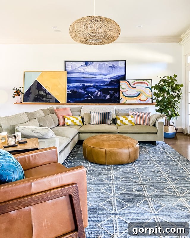
Even for those of us who deeply appreciate color, striking a balance with neutrals is crucial for preventing a space from feeling overwhelming. Our family room serves as a prime example: we deliberately chose our West Elm Harmony sectional sofa in a sophisticated, neutral shade. The bursts of color I crave come entirely from the selection of vibrant throw pillows. This approach allowed me to avoid spending thousands of dollars on a sofa in a bold color that I might eventually tire of. The beauty of throw pillows is their impermanence; if my taste shifts or I desire a fresh look, I can easily swap them out, instantly refreshing the entire room’s aesthetic. You can clearly see how the artwork on our DIY art ledge and these carefully chosen throw pillows are the primary sources of color in an otherwise serene, neutral environment.
Tip 3: Play with wallpaper in small spaces.
Wallpaper stands out as an incredibly effective medium for injecting significant color and pattern into a space, creating instant visual drama. This might sound surprising coming from someone who once found wallpaper truly terrifying! The thought of committing to a bold, colorful pattern across an entire wall or room can be overwhelming. However, the secret lies in starting small. Applying wallpaper to a less prominent area, like a closet or a powder room, drastically reduces the perceived risk and investment.
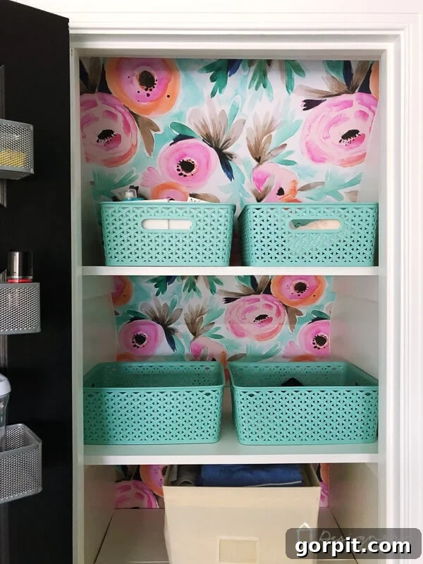
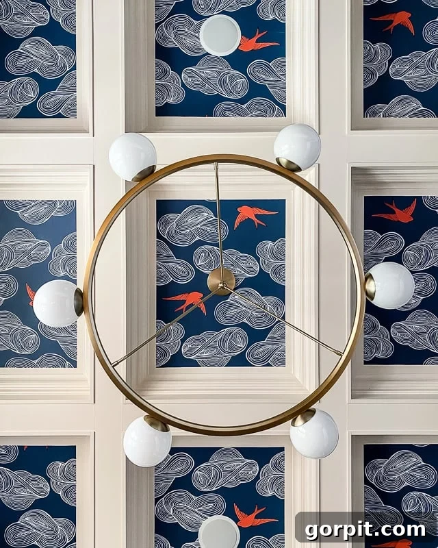
My first foray into wallpapering was our linen closet. To further ease my apprehension, I opted for removable wallpaper. This innovative solution meant that if we disliked the result, it could be easily removed without damage, and the small scale of the project meant a minimal financial outlay. As it turned out, we absolutely adored the transformation. This small success provided the confidence boost needed to tackle more visible areas of our home. It wasn’t long before I dared to wallpaper our dining room ceiling, creating an unexpected and elegant design feature!
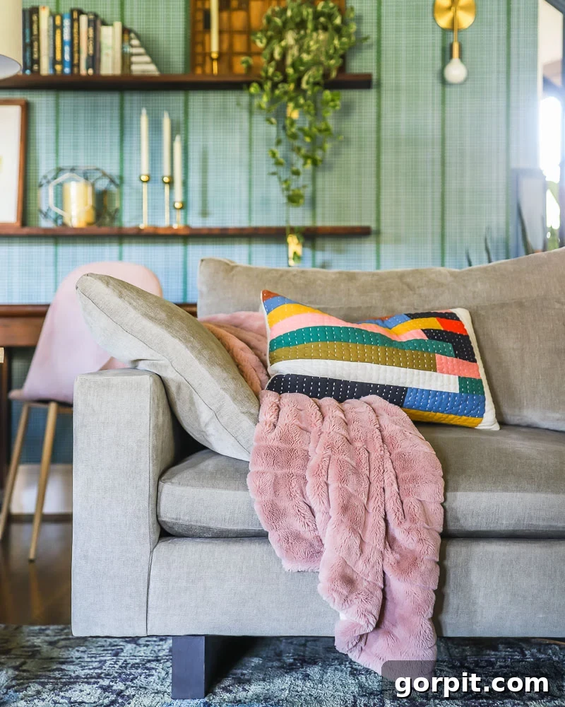
Remarkably, even after these projects, I still haven’t wallpapered an entire room! Instead, I opted to wallpaper the staircase wall that serves as a backdrop to our family room using a simple DIY renter-friendly wallpaper method. This technique allows for easy removal whenever we desire a change. It’s a relatively small area, and it’s the only wall in our family room that isn’t a plain white, yet the vibrant color and captivating pattern it introduces dramatically enhance the space. This strategic use of wallpaper proves that even a modest application can deliver immense visual impact, making it a powerful tool for injecting personality into your home.
Tip 4: Some colors can be used as neutrals.
When we think of neutrals, shades like white, gray, and greige immediately come to mind. These foundational colors are undeniably versatile and calming. However, it’s a common misconception that the world of neutrals stops there. In reality, certain colors, particularly blues and greens, possess an incredible ability to function as neutrals within your home’s design scheme. This concept can be a game-changer for those who are hesitant to embrace brighter, more overt colors but still desire a sense of calm and versatility.
I wholeheartedly embrace blue as a neutral in my own home, and many people often ask, “How can blue be neutral? It’s so different from beige or gray!” To understand this, consider some everyday analogies. Your favorite pair of jeans, often blue, pairs effortlessly with almost any color in your wardrobe, right? Similarly, think about the natural world: the vast blue sky and lush green grass serve as the perfect backdrop for all the myriad colors we see in nature, from vibrant flowers to earthy tones. These colors inherently possess a grounding and versatile quality.
If the thought of bold, bright colors makes you nervous about decorating, starting your color journey with natural blues and greens is an excellent strategy. These hues, often inspired by landscapes and seascapes, tend to feel inherently soothing and familiar, making them far less intimidating than a fiery red or an electric yellow. You may discover that they integrate so seamlessly into your home that they feel entirely “neutral” rather than “scary.” For example, I painted our kitchen cabinets a beautiful blue-green color, and they consistently evoke a sense of calm and versatility, functioning perfectly as a neutral foundation for the rest of the room’s decor.
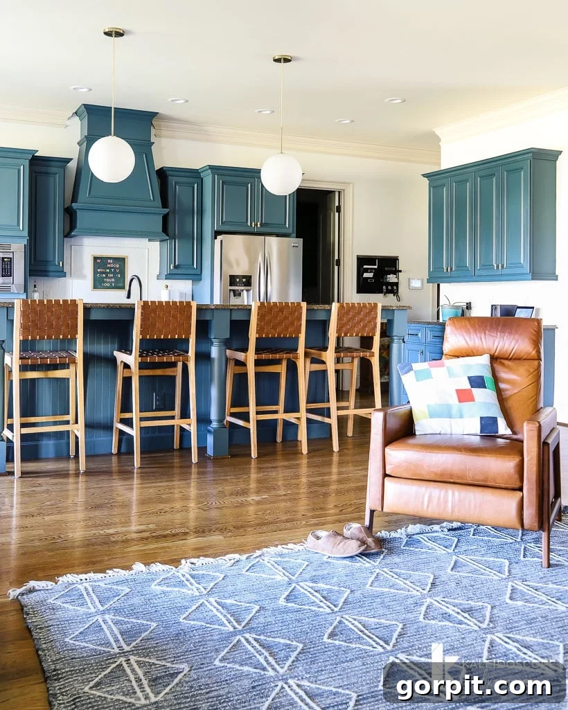
Tip 5: Never underestimate the power of colorful rugs.
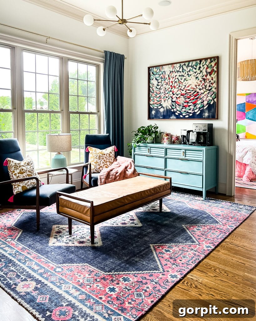
Rugs are far more than just floor coverings; they are powerful design elements that can instantly anchor a room, define distinct zones, and infuse a space with an abundance of color, pattern, and texture. Throughout our home, we’ve incorporated numerous colorful rugs, and each one undoubtedly makes a significant statement. The remarkable thing about modern home decor is the increasing affordability of high-quality rugs. This means you can introduce a bold, colorful rug into almost any space without having to spend a fortune, making it an accessible option for those new to decorating with color.
Consider the vibrant rug showcased in our bonus room below. With its rich hues and intricate pattern, it’s undeniably the focal point of the space, drawing the eye and setting the entire room’s mood. A rug can act as the foundation for your color palette, inspiring the selection of complementary artwork, pillows, and other decorative objects. When choosing a colorful rug, think about how its dominant colors can be subtly echoed in other elements around the room, creating a cohesive and well-designed aesthetic. This strategic use of rugs is an excellent way to introduce significant visual interest and personality with a single, impactful piece.
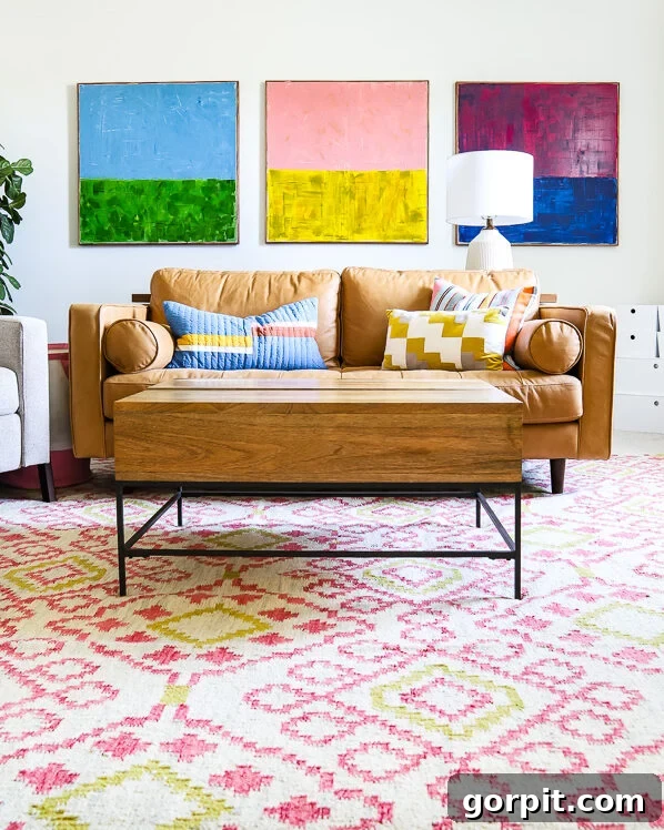
Tip 6: Colorful textiles and objects are your friend.
When it comes to introducing color into your home on a budget, look no further than an array of colorful textiles and decorative objects. Items such as vibrant kitchen towels, patterned placemats, cozy throws, and elegant tablecloths can make an enormous difference, adding layers of color and texture without demanding a significant financial outlay. Excellent places to discover these inexpensive yet impactful decor pieces include popular retailers like Target, Wayfair, Amazon, and World Market, where variety meets affordability.
Beyond store-bought items, consider the potential of DIY projects. For instance, the eye-catching DIY tassel curtains in my daughter’s room were incredibly simple to create, starting as plain, inexpensive white IKEA curtains. This demonstrates how a touch of creativity can transform basic items into custom, colorful statements. If you’re feeling more adventurous, there are countless simple ways to DIY curtains that look expensive and add a personalized splash of color to any room.
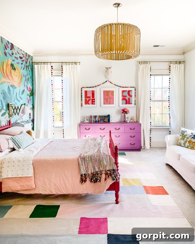
Colorful canisters, vases, and other small decorative items offer another delightful and low-risk avenue for adding pops of color. The cheerful canisters you see perched on the blue dresser in our home coffee bar area have been cherished pieces for nearly a decade, proving that thoughtful color choices have lasting appeal. These small accents, strategically placed, can inject immense character.
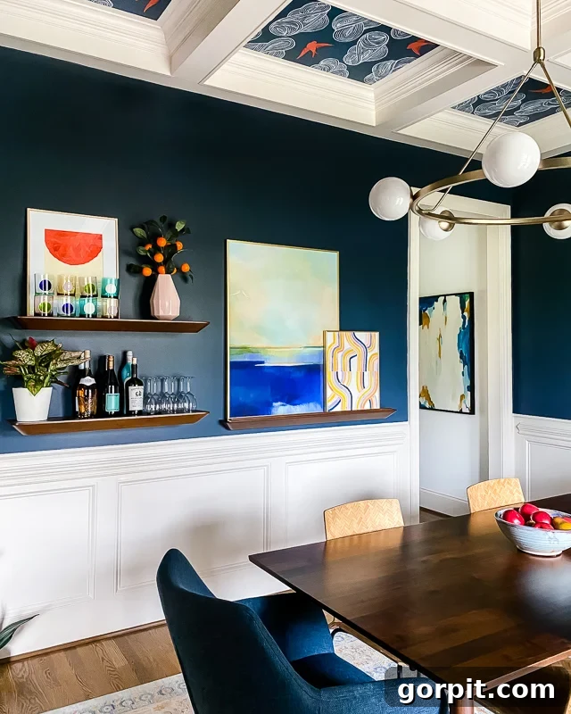
Our navy blue dining room is one of the few spaces in our home that deviates from white walls. As previously mentioned, I treat this deep navy as a sophisticated neutral, allowing it to provide a rich, grounding backdrop. Within this elegant setting, a delicate pink vase holding a faux orange blossom branch introduces a surprisingly impactful pop of color, considering its small size. The colored glass barware also adds an unexpected punch of vibrancy, demonstrating how even the minutest details can contribute significantly to the overall colorful scheme. These subtle, deliberate choices accumulate to create a home that feels both cohesive and wonderfully expressive.
It’s important to remember that my home, which now overflows with color, is the result of years of experimentation and gradual layering. Your journey to integrating color into your own space will likely unfold over time, just as mine did. The most crucial step is simply to start small. Introduce modest doses of color and observe how these additions make you feel. If you find yourself loving the newfound vibrancy, gradually layer in more color, allowing your confidence and vision to grow with each step. Continue this process until your home feels perfectly balanced and truly reflective of your personal style. Ultimately, you are the one living in your home, so as long as it brings you joy and comfort, that’s all that matters!
There you have it! I sincerely hope that the insights and practical tips shared in this post make the idea of decorating with color feel much less intimidating and far more achievable. By following these straightforward strategies, you can take confident, incremental steps toward creating a home you deeply love—a space filled with precisely the right amount of color that brings you happiness and truly expresses who you are. Embrace the process, trust your instincts, and enjoy the beautiful transformation!
MORE INTERIOR DESIGN TIPS
SEE ALL design & decorating posts
-
6 Tips for Decorating With Color When You Are Used to Neutrals
-
Space Planning Basics: How to Create a Space Plan
-
The Dos and Don’ts of Using Area Rugs on Carpet
-
How To Make a Mood Board: A Step-By-Step Guide
-
How to Choose Paint Colors for Your Home: 5 Simple Tips to Follow
-
Interior Trim Color Ideas (That Aren’t White)
Other posts you may enjoy:
- How to Choose Paint Colors for Your Home
- How to Choose the Perfect Paint Sheen
Curious about my unique approach to transforming rooms and spaces? Explore Designer in a Binder®, my signature system designed to simplify your decorating process.
For exclusive content, behind-the-scenes glimpses, and the latest design inspiration delivered straight to your inbox, be sure to subscribe before you go!