Mastering Your Home’s Art Collection: 3 Essential Tips for Cohesive & Colorful Artwork
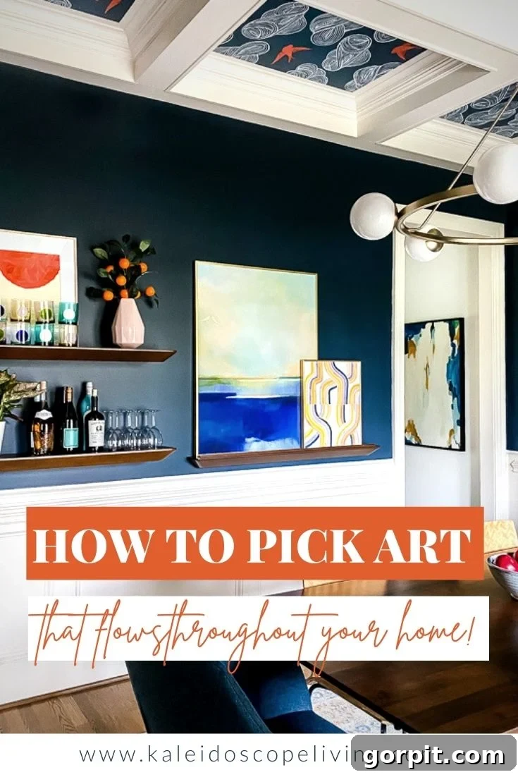
Creating a truly inviting and visually stunning home environment often comes down to the details, and few elements are as impactful yet as challenging as selecting the right art and wall decor. Many homeowners find themselves overwhelmed by the sheer volume of options, struggling to ensure that each piece not only stands on its own but also contributes to a harmonious flow throughout the entire home. The goal is to cultivate a collection where every painting, print, or sculpture feels like a natural extension of your personal style and the overarching aesthetic of your space.
However, achieving this seamless integration of artwork doesn’t have to be a daunting task. With a few simple yet powerful principles, you can confidently curate a collection that exudes personality, vibrancy, and cohesion. In this comprehensive guide, I’m excited to share my top three secrets to making art selection effortless and enjoyable. Beyond just explaining these principles, I’ll take you on an exclusive tour through our own home, showcasing how these strategies translate into a vibrant and unified display of colorful artwork in every room.
From lively gallery walls to impactful individual statements, you’ll see firsthand how a thoughtful approach to art can transform a house into a home filled with character and charm. Let’s dive in and unlock the potential of your walls!
Unlock Artistic Harmony: My Top 3 Secrets for Selecting Flowing Art
Tip #1: Cultivate a Cohesive Color Story for Your Entire Home
The foundation of a home filled with art that truly “flows” begins with a well-defined color story. This isn’t just about choosing a single paint color; it’s about establishing a consistent color palette that subtly, or boldly, weaves its way through every room. Think of it as the underlying melody that connects all the different instruments in an orchestra. When you have a clear color narrative, your art choices naturally align, creating an undeniable sense of cohesion, even if the styles or subjects of the art pieces vary.
To establish your home’s color story, start by identifying a few core colors that resonate with you and the overall mood you wish to create. These could be sophisticated neutrals, energetic brights, or serene pastels. Consider both dominant colors (like your wall hues or major furniture pieces) and accent colors that you want to repeat throughout your decor. For instance, if you’re drawn to cool tones, you might select various shades of blue and green, perhaps accented with crisp whites or warm grays. Conversely, if a warmer ambiance is preferred, earthy tones like terracotta, mustard yellow, and deep forest green could form your core palette.
In our home, for example, while many of our walls are a clean, crisp white – serving as a versatile canvas – our accent colors remain steadfast. Navy blue acts as my dependable dark neutral, providing depth and sophistication. This consistent presence of navy means that it plays a significant role in many of our art pieces, whether through bold abstract strokes, subtle background elements, or as a unifying color within a gallery wall. By consciously echoing these chosen colors in your art selections, you ensure that pieces in different rooms, though unique, still feel like part of a larger, harmonious collection. This thoughtful approach to a color story simplifies art selection and elevates your home’s aesthetic appeal.
Tip #2: Harmonize the Intensity and Vibrancy of Your Artwork
Once your color story is established, the next crucial step is to consider the intensity and vibrancy of your chosen artwork. All the art in your home should possess a similar “energy level” to maintain balance and visual harmony. Imagine walking from a room filled with soft, muted watercolors into another adorned with searingly bright, neon abstracts. The sudden shift in intensity would feel jarring and disconnected, disrupting the overall flow you’re striving to achieve.
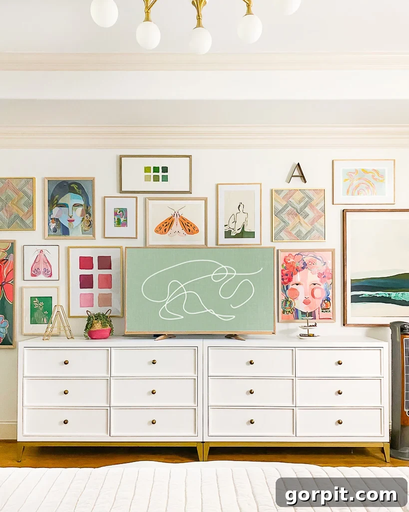
Intensity refers to the saturation and brightness of the colors used in a piece. Do they pop with electrifying vibrancy, or do they whisper with gentle, desaturated tones? To illustrate, take a look at the vibrant gallery wall in our bedroom, shown below. Each piece, despite its individual subject or composition, shares a similar bright and bold quality. This deliberate choice creates a sense of unity; no single piece overwhelms the others, and together they form a cohesive visual statement.
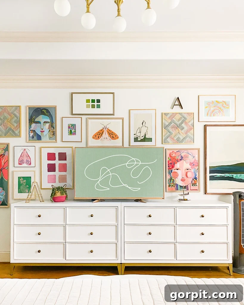
In our home, I lean towards art that features bright, highly saturated colors. These hues are chosen specifically because they “pop” vibrantly against our predominantly white walls, creating striking focal points that feel energetic and alive. This doesn’t mean I shy away from neutrals entirely. However, when I do incorporate neutral artwork, I ensure it still feels bold and impactful, often through compelling patterns, intricate textures, or strong graphic elements. A neutral piece can be just as dynamic as a colorful one if it possesses visual weight and interest.
By consciously curating art with a consistent intensity, you create a visual rhythm that guides the eye smoothly from one space to the next. This principle ensures that your home’s art collection feels thoughtfully curated and beautifully balanced, inviting appreciation rather than visual chaos. It’s about ensuring every piece feels like it belongs, contributing to a unified and impactful aesthetic.
Tip #3: Select Art That Beautifully Interacts and Complements Each Other
My third and final tip is perhaps the most nuanced: choose art that “plays nicely” and “talks to each other.” This metaphorical concept means avoiding a scenario where every piece is clamoring for attention, resulting in none of them truly shining. Instead, the aim is to create visual dialogues between your artworks, allowing them to enhance each other’s beauty without competition.
Think of it like assembling a well-balanced outfit; you wouldn’t wear multiple loud patterns and bold statement pieces simultaneously without careful consideration. Similarly, in art, grouping pieces that possess different energies, scales, or visual weights allows each to have its moment while contributing to a richer, more engaging whole. If all your art is intensely graphic or equally subtle, the grouping might fall flat or become overwhelming. The key is strategic contrast and harmony.
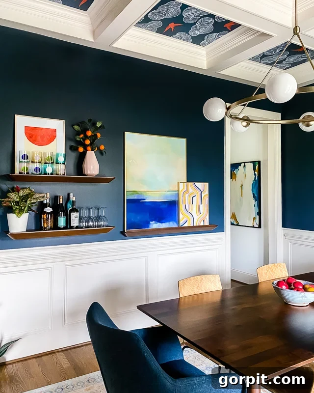
For example, in our dining room, I’ve masterfully layered a calmer, more serene abstract landscape with a vibrant, energetic graphic abstract. These two pieces, while distinct in their approach, work together seamlessly. They adhere to our established color story and intensity (Tips #1 and #2), ensuring they feel connected. However, their contrasting visual characteristics—one providing a sense of depth and tranquility, the other offering bold lines and dynamic color—prevent them from competing for the viewer’s eye. Instead, they create a captivating composition that offers both interest and repose.
This principle extends beyond just pairing two pieces. When creating gallery walls or curating art for a larger space, think about mixing the scale of your art (large with small), the style (abstract with figurative, photographic with painted), and even the medium (canvas with mixed media, prints with three-dimensional elements). This thoughtful layering creates depth and visual intrigue, inviting the eye to explore the collection. It’s about finding that sweet spot where individual pieces sing together in a beautiful chorus, rather than each trying to hit a solo note. By intentionally selecting art that complements rather than competes, you foster a sophisticated and dynamic art display throughout your home.
Now that we’ve covered the essential principles, it’s time to see them in action! Join me on a visual tour of the colorful artwork adorning our home. As we move from room to room, pay close attention to how these three tips—our consistent color story, the harmonious intensity, and the thoughtful interplay between pieces—come together to create a cohesive and joyful aesthetic. You’ll discover that while each space retains its unique identity, the artwork effortlessly guides the eye and maintains a beautiful flow throughout our entire house.
Please note: This post contains some affiliate links for your convenience. Your support through these links helps keep this content free. Click here to read my full disclosure policy.
A Colorful Journey: Tour Our Home’s Curated Wall Art Collection
The Foyer: Setting the Tone with Bold Dimension
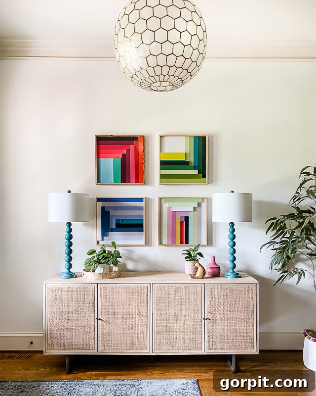
Let’s begin our tour in the foyer, the very first space guests encounter upon entering our home. Here, we’ve installed truly amazing three-dimensional art pieces that frequently capture attention and spark conversation. These aren’t just flat canvases; their sculptural quality adds an immediate layer of depth and intrigue, making a memorable first impression. They are the initial artistic statement, immediately setting the tone for the vibrant and dynamic wall art that flows throughout the rest of the house. The colors within these pieces instantly communicate our home’s dominant color story, welcoming visitors into a space that is clearly not afraid of joyful hues, all while maintaining a consistent intensity with the art that follows.
The Family Room: Grand Scale on a Custom Art Ledge
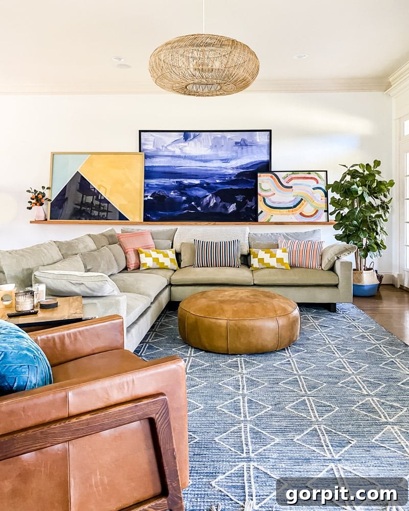
Moving into the heart of our home, the family room, you’ll find expansive prints proudly displayed on our DIY art ledge—a custom feature I’m still absolutely thrilled with. This ledge allows for flexible arrangement and layering, an essential aspect of creating dynamic displays. Here, the focus is on a collection of truly striking pieces: the serene Seascape I from Juniper Print Shop, paired with the captivating Sunriver and Continental by Minted. What truly stands out is the gigantic scale of these artworks. Despite their impressive sizes, they embody Tip #3 perfectly—they don’t compete. Instead, their varied compositions and complementary color palettes (adhering to our overall color story and intensity) ensure they harmoniously coexist, creating a powerful visual impact without overwhelming the space. If you’re intrigued by the transformative power of large-scale art, I highly recommend exploring this dedicated post on why bigger can indeed be better for your walls.
The Primary Bedroom: A Sanctuary of Curated Color
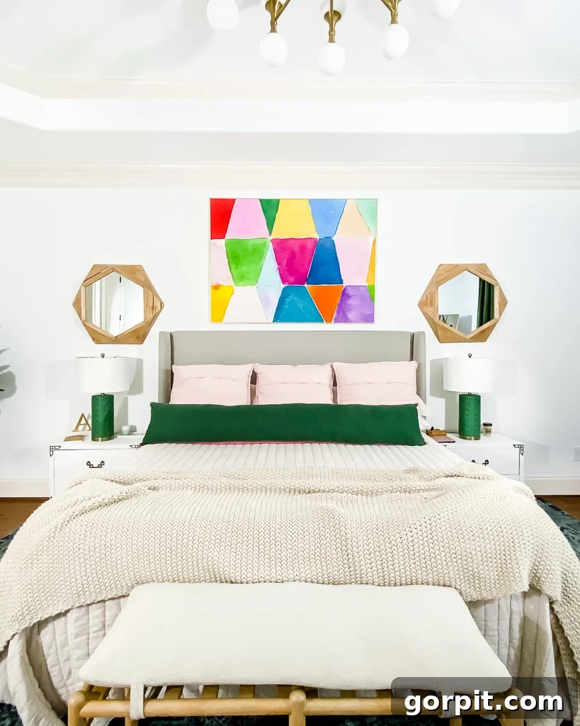
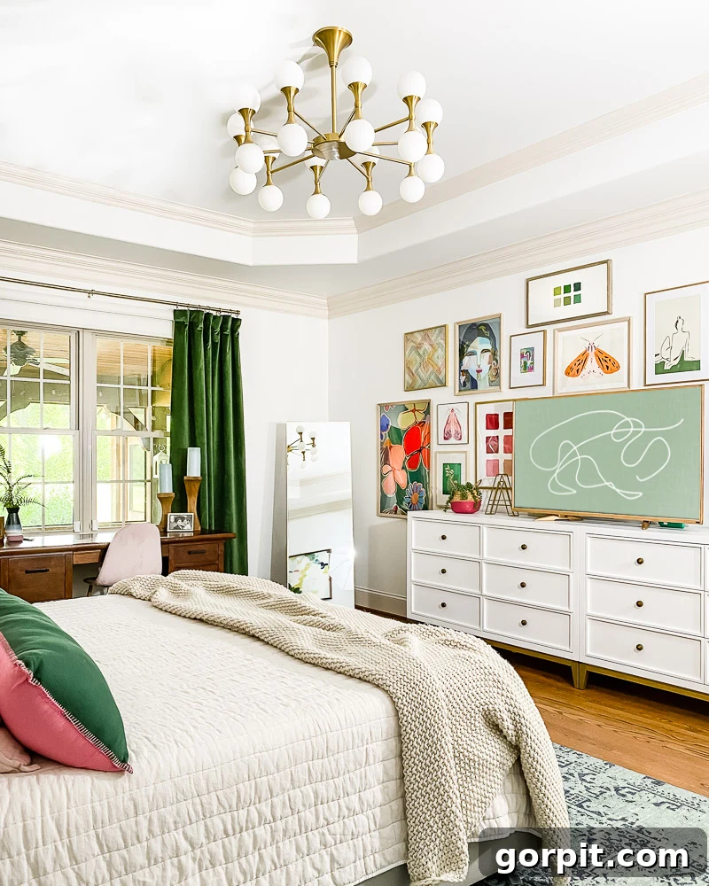
Our primary bedroom offers a serene retreat, yet it’s rich with carefully selected art prints that contribute to the home’s vibrant flow. Many of the pieces, like much of the art throughout our house, are sourced from Minted, a favorite resource for high-quality prints. Some are beautifully showcased in our own DIY art frames, adding a personal touch. We recently completed a refreshing makeover of our primary bedroom, and the artistic elements were central to bringing the vision to life.
You might recognize some of these pieces, as they’ve journeyed with us from the stairwell gallery in our previous home, proving how versatile and timeless good art can be when it adheres to a consistent aesthetic. Above our bed hangs a print that, along with several others in our extensive gallery wall, hails from my very own collection of colorful art prints. This gallery wall, a dynamic arrangement of various sizes, shapes, and styles, is truly one of my favorite “moments” in the entire house. It beautifully exemplifies Tip #3, demonstrating how diverse pieces—from abstract patterns to more subtle motifs—can interact and elevate each other without clashing, all while maintaining our established color story and vibrant intensity. For more inspiration on creating your own captivating displays, explore all my favorite gallery wall ideas and tips here.
The Dining Room: Layers of Complementary Elegance
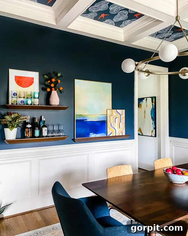
Our dining room, a space where meals and memories are shared, received a transformative makeover that truly highlights the art of layering. Here, I’ve thoughtfully combined purchased art with a unique, original piece I created myself—the striking orange half-circle painted to sit perfectly behind a display of glasses, adding an unexpected geometric pop. The art ledge on the right side of the room is a masterclass in Tip #3, showcasing how pieces can complement rather than compete. It gracefully holds Blue Waterfall positioned in the back, providing depth, while Dawnlight sits in front, its lighter tones dancing with the piece behind it. These layered artworks, with their shared color story and consistent intensity, interact beautifully, creating a rich visual tapestry.
Adding to this elegant display, a large, impactful piece from Minted is visible through the doorway, subtly connecting the dining room to adjacent spaces. This strategic placement offers a perfect illustration of how artwork can create a seamless flow from room to room, allowing glimpses of the cohesive palette and vibrant aesthetic to carry through the entire home. Each piece in the dining room, whether foreground or background, plays its part in a larger, harmonious design narrative.
The Mudroom: A Pop of Practical Artistry
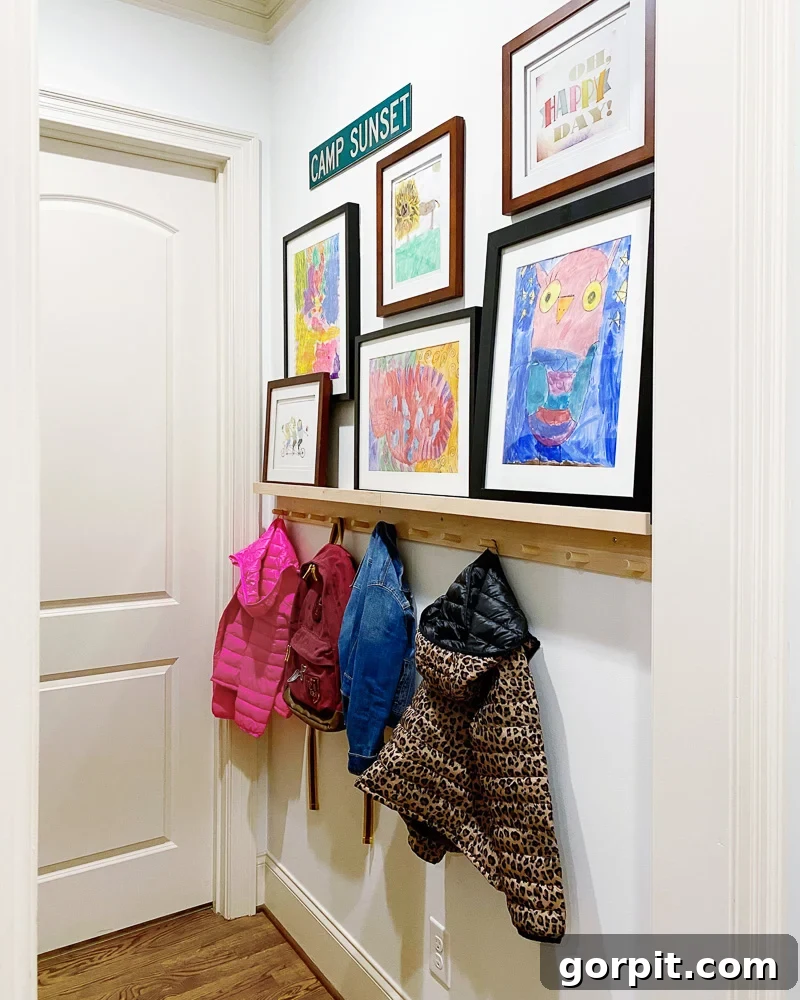
Though our mudroom is compact in size, it is undeniably bursting with personality and a strategic burst of color. The wall above our bag and coat hooks features a clever combination: a mini art ledge integrated within a gallery wall. This dynamic display showcases a charming mix of personal and curated pieces. Some of the artwork proudly displayed here consists of my girls’ delightful creations, thoughtfully framed to elevate them into cherished decor. Alongside these personal touches are prints I discovered in wonderful art books like Art for the Contemporary Home and Art for the Eclectic Home. Despite the diverse origins and styles, every piece in this mudroom gallery adheres to our home’s overarching color story and consistent vibrancy, proving that even small, functional spaces can be infused with artistic charm and cohesive design. It’s a testament to how even the most practical areas can benefit from thoughtful art placement.
The Coffee Nook & Laundry Room: Everyday Inspiration
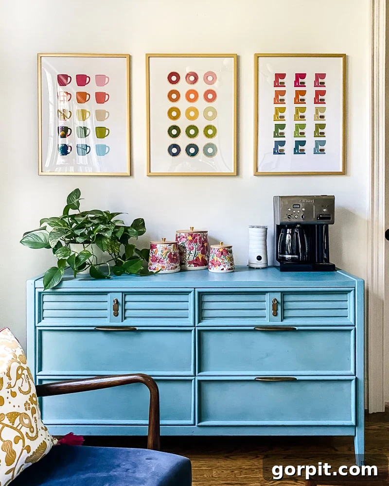
Recently, I embarked on an exciting project: creating my own collection of colorful art prints, and I am absolutely thrilled with how they turned out! These joyful pieces now bring an extra dose of cheer to two distinct areas of our home. In our cozy coffee nook, you’ll find prints that celebrate the simple pleasures of life—donuts and coffee for life, indeed! Their playful graphics and bright colors are the perfect complement to a morning routine. Similarly, in our impeccably organized laundry room, these prints add a touch of unexpected artistry to an often-overlooked utility space. I particularly love the generous size of these prints, which serves as an excellent example of why, as I often advocate, going bigger is better when it comes to wall art. Large-scale pieces make a significant impact, ensuring these everyday spaces feel intentional and aesthetically pleasing, all while staying true to our home’s vibrant color narrative.
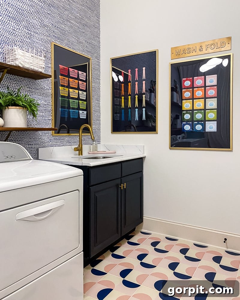
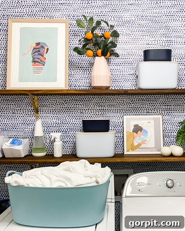
Also in the laundry room, perched on shelves, are these delightful prints from Society 6. Using horizontal surfaces to display smaller art is one of my favorite styling tricks—it adds personality and depth without requiring wall space, perfect for shelves or ledges. These particular pieces, aptly named Laundry Day and Dreaming of a Vacation, infuse a touch of whimsy and aspiration into a functional area. Their vibrant colors and engaging subjects perfectly align with our home’s art intensity and color palette, proving that even small artworks can contribute significantly to the overall aesthetic flow. For more expert guidance on incorporating smaller art pieces creatively into your home, be sure to check out all my tips in this dedicated post.
The Office: A Gallery of Creative Inspiration
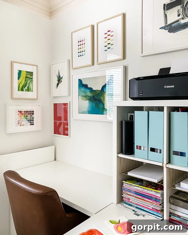
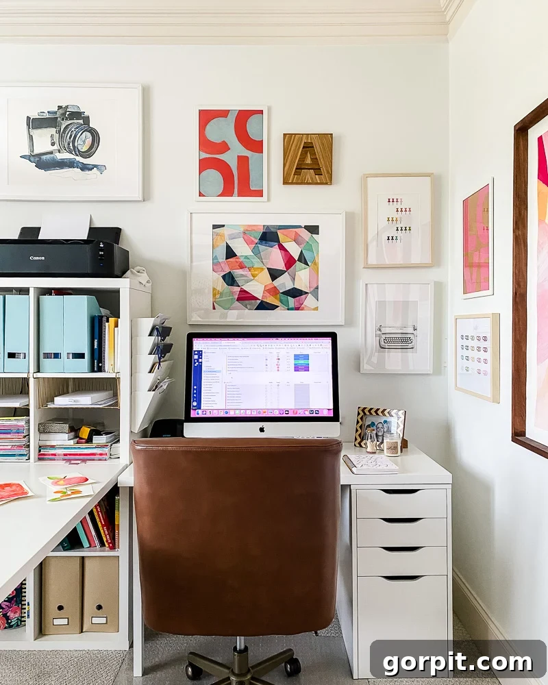
My office is a vibrant hub of creativity, and its gallery wall is a constant source of joy and inspiration. The kaleidoscope print, a piece I frequently receive questions about, is a particular favorite, embodying the dynamic energy of the space. This entire gallery makes me incredibly happy, a testament to the power of thoughtfully curated art. Complementing the kaleidoscope are the “Color,” “Like,” and “Love” prints, which conveniently came together in this inexpensive 3-pack, offering a cohesive visual statement. Further personalizing the space are the colorful prints of office supplies and the small green watercolor abstract, both of which are designs from my own shop. What’s truly remarkable here is how these diverse pieces—ranging from abstract to graphic, colorful to more subtle—all look absolutely stunning hanging together. They maintain a strong sense of cohesion in both look and feel, perfectly illustrating Tip #3 by interacting harmoniously without a hint of competition, all while adhering to our home’s consistent color story and vibrant intensity.
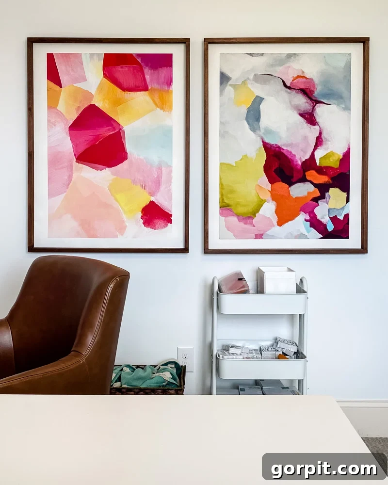
In addition to the gallery wall, my office also houses these two large abstracts and this one. Their grand scale ensures they make a significant visual impact, which is precisely what this wall needed to anchor the space. The colors chosen for these pieces are truly delightful, filling the room with a sense of energy and happiness. These large-format artworks stand out as focal points, yet they simultaneously serve as the perfect complement to the smaller, more intricate pieces found within the office gallery wall. Their bold presence and vibrant hues seamlessly integrate into the overall color story and intensity of the room, demonstrating how varied scales can coexist harmoniously to create a balanced and stimulating environment, reinforcing the principles of art that flows.
The Bonus Room: Playful Art, Thoughtful Scale
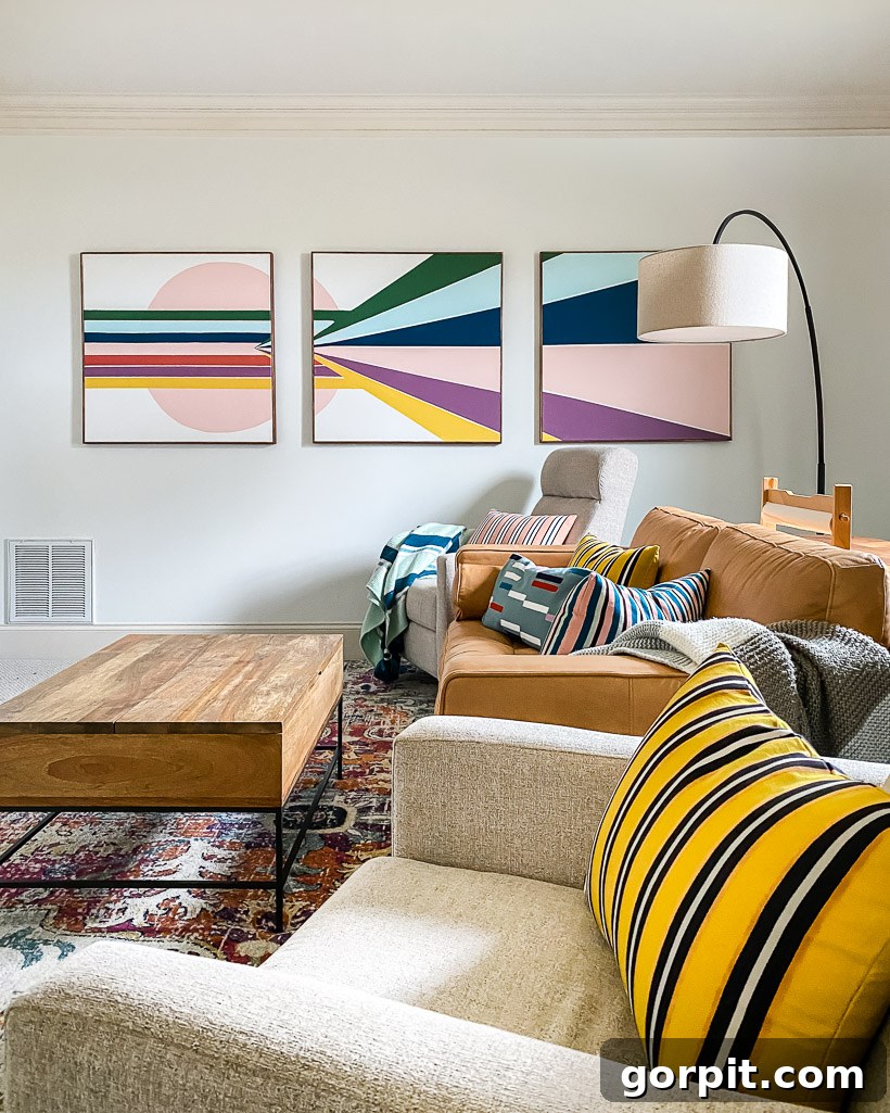
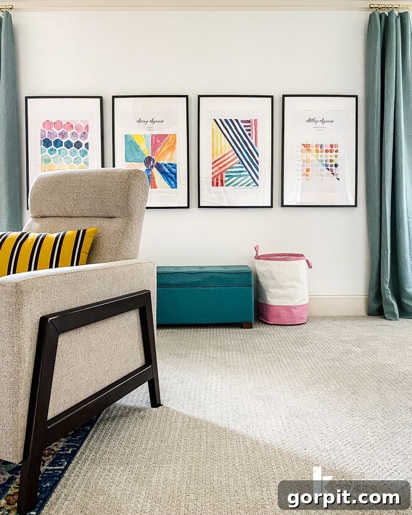
One of the most enjoyable aspects of styling our new house has been the opportunity to thoughtfully rearrange and re-envision our existing art collection. A prime example of this is the cool graphic art, inspired by the distinctive style of Banyan Bridges, which I originally painted for the foyer in our old house. It now finds a vibrant new home in the bonus room, a space designed for relaxation and play. On another wall in this same room, we feature a heartwarming collection of art—pieces painted by myself and our talented kiddos, which were then enlarged with the help of @doodlespot_theapp to create a gallery of cherished memories. (You can even find similar honeycomb and stripes designs in my shop now!).
The beauty of this room lies in its art choices that perfectly encapsulate Tip #3: choosing pieces that play nicely together. While the color palette remains consistent with the rest of our home (Tip #1), the scale and style between these two art groupings are intentionally different. The bold graphic piece offers a strong anchor, while the enlarged children’s art provides a whimsical, personal touch. This thoughtful contrast is akin to mixing a large, dominant pattern with a smaller, more intricate one in interior design—it creates visual interest and depth without overwhelming the senses. The bonus room truly showcases how a dynamic mix of art, varying in origin and scale, can still maintain a harmonious and cohesive feel, making the space both engaging and wonderfully personal.
Attley’s Room: A Rainbow of Cohesive Joy
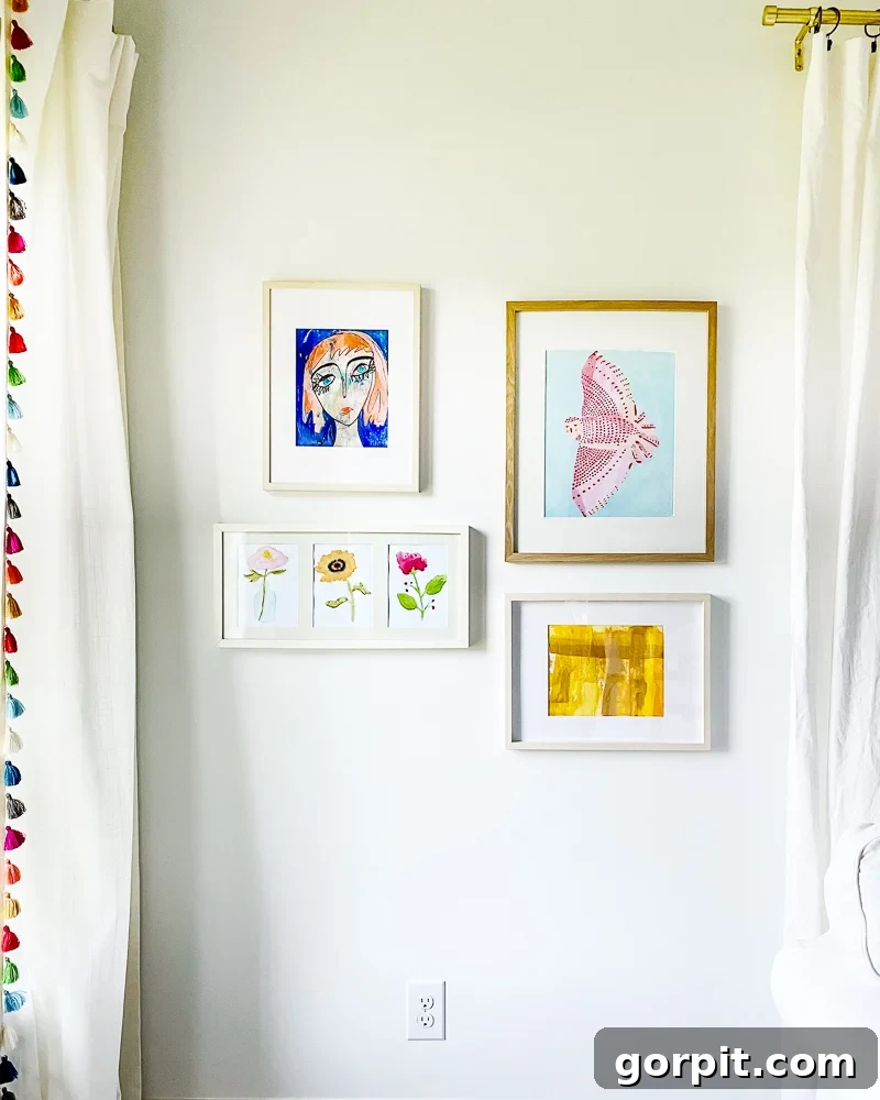
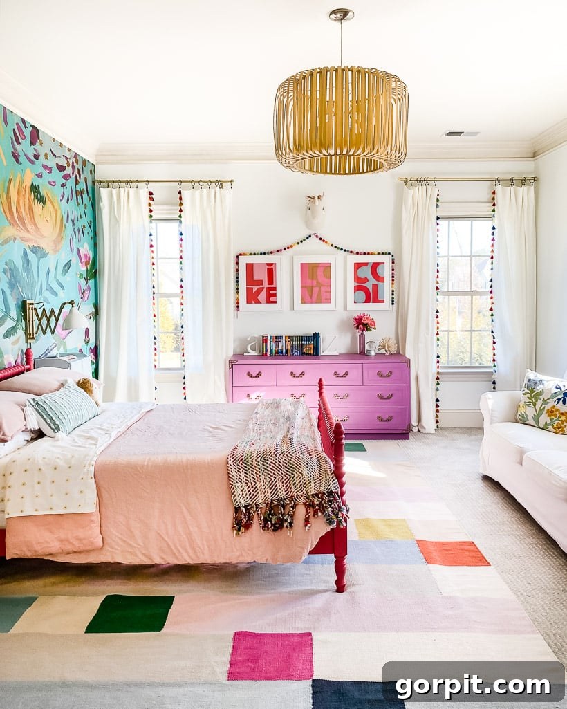
In Attley’s room, I embarked on creating a gallery wall that would undoubtedly speak to her rainbow-loving heart, all while diligently adhering to the consistent color story woven throughout the rest of our home. This thoughtful curation ensures her vibrant personality shines through, but still feels connected to the broader aesthetic. The Pink Owl and the colorful Spiral print are both fantastic finds from Artfully Walls, a new source that has quickly become a favorite of mine for its unique and vibrant selections. The playful cat print was discovered on Etsy, adding another layer of charm. An original piece by the talented Tricia Gillespie, a captivating lady portrait, introduces a unique artistic voice to the collection. The three abstract bold watercolors are my own creations, contributing a personal touch to the gallery, and, most sweetly, Attley herself painted the cheerful flowers, making this wall truly her own.
This gallery wall is a perfect demonstration of all three tips in action. The individual pieces burst with color, but their overall intensity is harmonious (Tip #2). They collectively create a rainbow effect within the boundaries of our home’s larger color palette (Tip #1), ensuring a vibrant yet cohesive look. Furthermore, the diverse styles and origins of the art—from professional prints to personal creations—interact beautifully without competing, each adding its unique energy to the joyful composition (Tip #3). It’s a space that celebrates individuality while maintaining an undeniable sense of belonging within the larger home narrative.
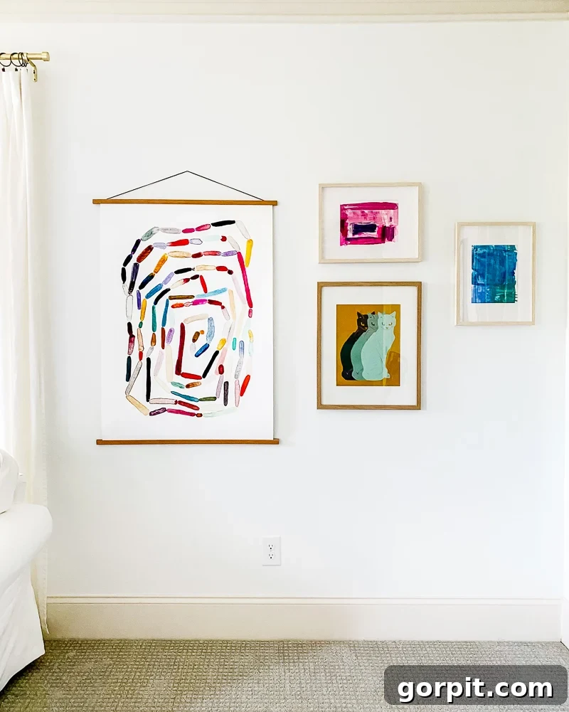
Remember those three prints from my office? Attley loved them so much that we decided to incorporate them into her room as well! This perfectly illustrates a key principle: there’s absolutely no reason you can’t use the same art piece in multiple locations if it aligns with your design vision. In fact, doing so can be an incredibly effective and effortless way to maintain consistency in your home’s color palette and vibrancy. By repeating beloved pieces, you reinforce the cohesive flow, making each space feel connected and intentionally curated. It’s a simple yet powerful trick for ensuring your home’s art collection truly sings in harmony.
Avery’s Room: Personalized Aesthetic within a Cohesive Flow
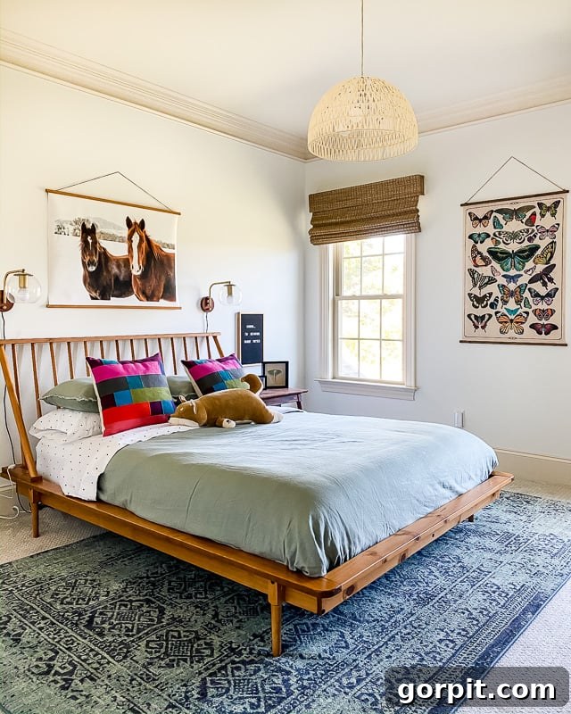
Last but certainly not least, we visit Avery’s room. While it’s still a work in progress, it already features some truly beautiful and thoughtful colorful artwork. Avery has a distinct preference for a moodier color palette, and a deep affection for animals, making her art choices uniquely hers. Together, we carefully selected the captivating horses print and the delicate butterfly wall hanging. These pieces, while reflecting her individual aesthetic, seamlessly integrate into the overall artistic flow of our home. They achieve this by maintaining a consistent level of intensity with the rest of the house’s artwork (Tip #2) and by subtly echoing elements of our core color story (Tip #1) through nuanced tones and textures. This demonstrates that personal style can absolutely thrive within a broader cohesive design, allowing each family member’s space to feel authentic and cherished, without disrupting the harmony of the whole. It’s a beautiful balance of individuality and unity.
I frequently receive questions on Instagram about the colorful wall art showcased in our home, and the volume of these inquiries has noticeably increased recently! It seems the past eighteen months, with many of us spending more time within our homes, has ignited a greater desire to make our living spaces truly beautiful and reflective of our personalities. Whatever the motivation, I wholeheartedly endorse the endeavor of filling your walls with art that speaks to you. My deepest hope is that this detailed tour, illustrating how I’ve meticulously crafted a cohesive flow of colorful artwork throughout our home, leaves you feeling deeply inspired. May it empower you to confidently curate and adorn your own home with beautiful pieces that you genuinely love, creating an environment that nurtures and delights you every single day.
Ready to shop the exact artwork you’ve seen in our home? Unfortunately, the interactive shopping widget is not available in this format, but you can find links to many of the pieces throughout this article!
Eager for even more expert tips on choosing art and mastering its placement in your home? Dive deeper into our comprehensive resources with these essential posts:
- Why You Need Big Wall Art (and where to find it!)
- Why You Also Need Small Art (and how to decorate with it)
If you’re looking to elevate your understanding of creating a home you truly adore, consider exploring the Designer in a Binder®. I developed this comprehensive system after years of refining my own interior design process, making it accessible for everyone. Within its pages, I guide you through all the critical aspects of home decor, including selecting items with the correct scale, mastering space planning, expertly mixing patterns, confidently choosing color palettes, and much more! All of this easy-to-understand, actionable guidance is encapsulated within Designer in a Binder®! With over 9,000 satisfied customers already, you can embark on your own design journey today. Click HERE to discover more and order your binder now.
You may also find these related posts incredibly helpful as you curate your home’s art collection:
- 16 Gallery Wall Ideas (and Tips) To Inspire You
- Why You Also Need Small Art (and how to decorate with it)
- Bedroom Wall Art: Top Designer Picks
- Living Room Art: Top Designer Picks
- Dining Room Wall Art: Top Designer Picks
Curious about my personal approach to transforming rooms and spaces within our home? All my methodologies and insights are comprehensively shared in Designer in a Binder®.
For exclusive content, behind-the-scenes sneak peeks, and fresh design inspiration delivered straight to your inbox, be sure to subscribe to our newsletter before you go!