
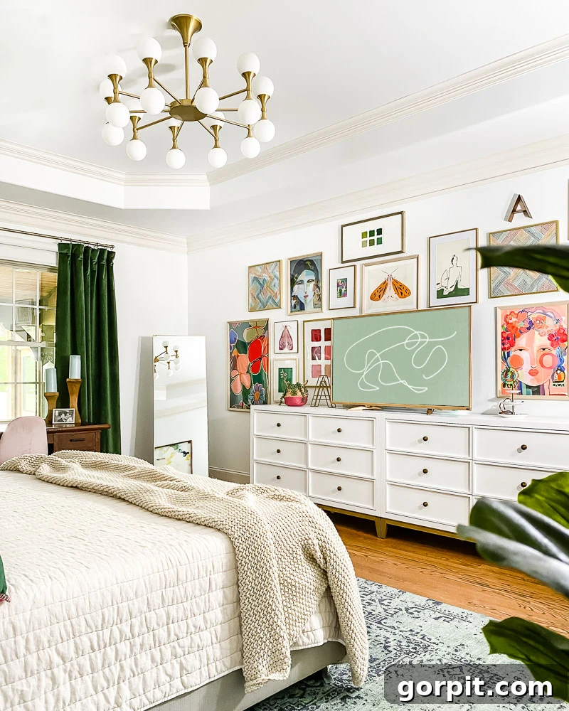
Navigating Design Challenges: Our Primary Bedroom Transformation Journey
Hello, fellow design enthusiasts! If you’ve been following my creative adventures on Instagram, you’re likely aware of the ongoing metamorphosis in our primary bedroom. I had initially envisioned sharing a grand “reveal” post with you today, celebrating a complete transformation. However, the reality of design often involves unforeseen twists and turns, and our bedroom is currently a testament to that journey. Instead of a polished reveal, I’m excited to pull back the curtain and offer you an honest look at what’s working beautifully, the design missteps I’ve encountered, and the exciting changes still on the horizon. This is a story of evolution, learning, and the pursuit of a space that truly feels like home. You’ll find a comprehensive source list for many of the items at the end of this post.
The Vision: A Lighter, Brighter Primary Bedroom Oasis
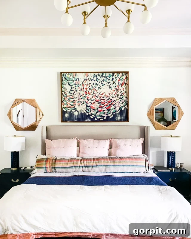
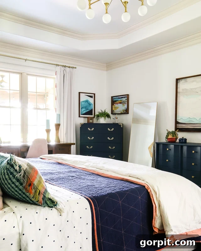
The core objective behind the changes we’ve been implementing over the past few months is refreshingly straightforward: to infuse our primary bedroom with a sense of lightness and brightness. This room, unfortunately, doesn’t receive an abundance of natural light, primarily due to the screening effect of our adjacent porch, which shades the sole window. In our previous home, a rich palette of dark navy blue furniture and decor created a cozy, inviting atmosphere in our old primary bedroom. However, when these same pieces were introduced into our current home’s bedroom, the effect was entirely different. The lack of light combined with the deep hues rendered the space feeling unexpectedly dark, heavy, and at times, even a little depressing. It became clear that a significant shift in our design approach was necessary to create the serene and uplifting sanctuary we desired.
Transformative Updates: Progress Made So Far
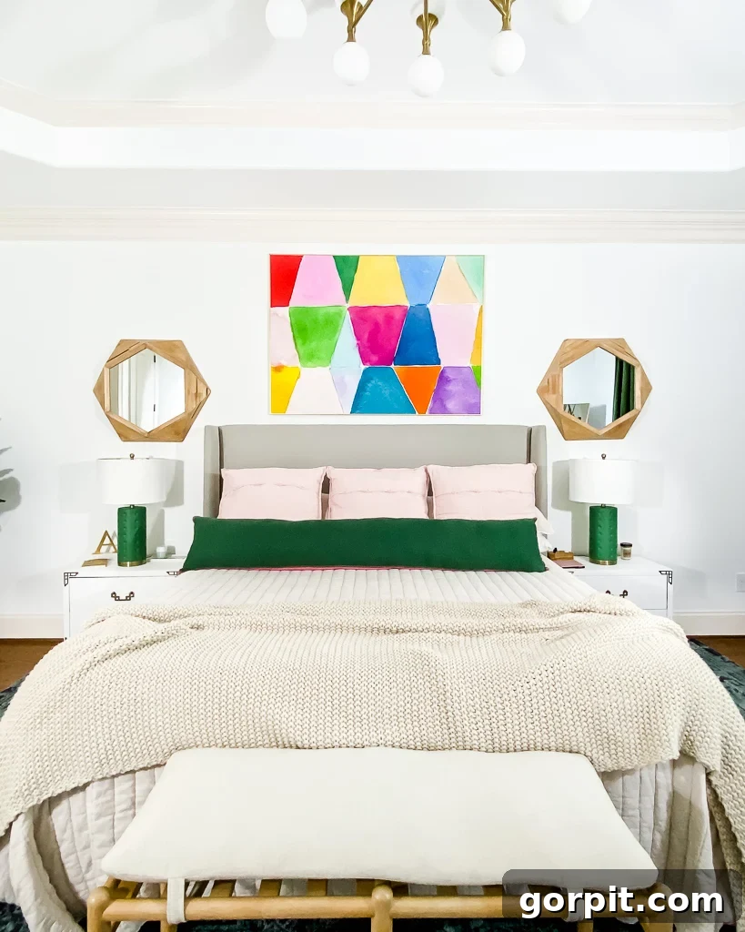
Our journey began with a series of quick, impactful changes that immediately began to shift the room’s aesthetic. Many of these initial updates were surprisingly simple yet incredibly effective in altering the overall feel of the space, proving that even small adjustments can yield significant results. First, I tackled the bedside tables and their accompanying lamps, giving them a fresh coat of paint. This seemingly minor change instantly brightened the sleeping area and created a more cohesive look. We also made a pivotal swap by replacing the art above the bed with pieces that align more closely with our evolving bright and airy vision, and introduced new bedding in a lighter, more neutral palette. These initial steps laid the groundwork for the bigger transformations to come.
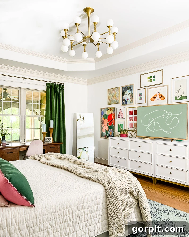
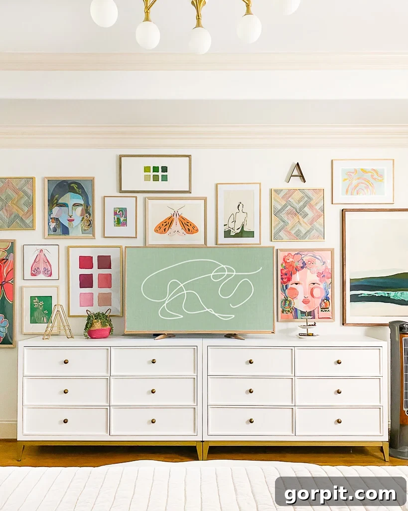
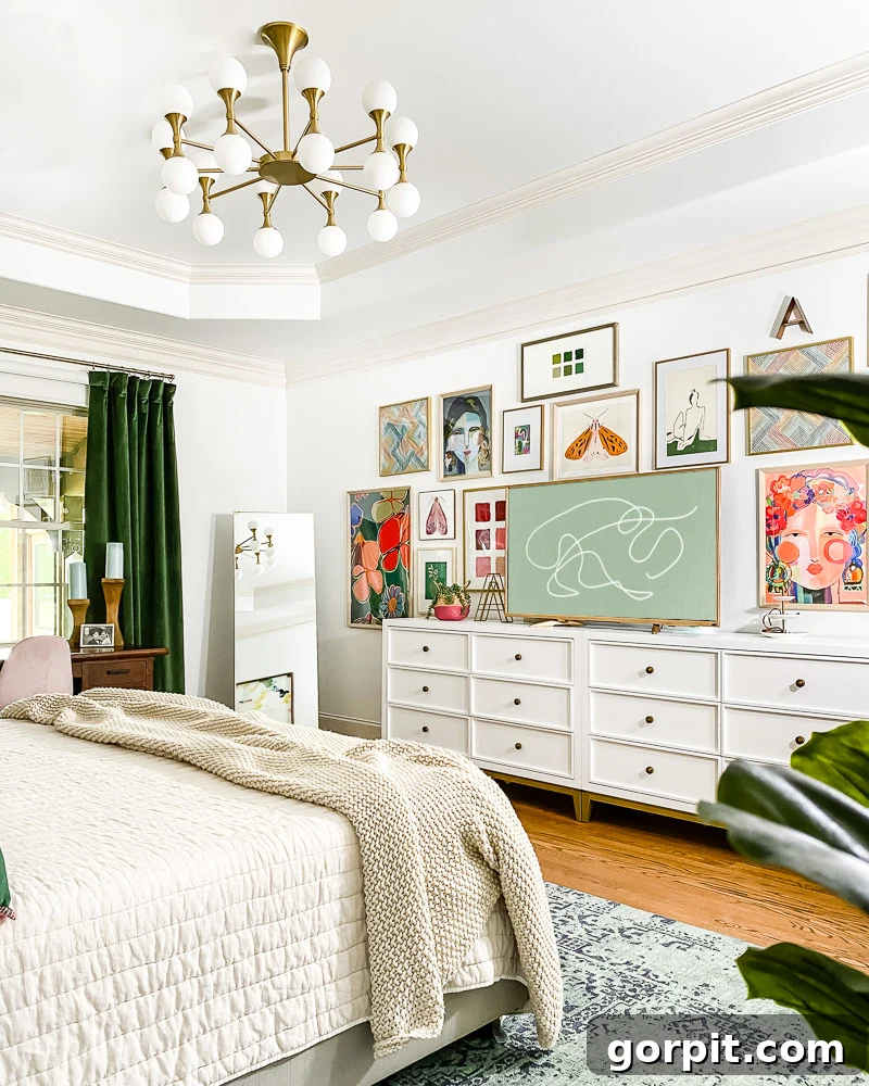
Moving to the opposite side of the room, we undertook another significant change. The heavy navy dressers, which had previously contributed to the room’s dark ambiance, were relocated to our guest room where they will undoubtedly find a new purpose. In their place, we introduced two elegant white dressers. I particularly adore how these pieces, when thoughtfully positioned side-by-side, create the illusion of a single, expansive piece of furniture, adding a sense of grandeur and streamlined sophistication to the wall. This clever arrangement maximizes both storage and visual appeal. To further enhance this area, we integrated our old family room television, transforming it into the central anchor for a vibrant and eclectic gallery wall. This approach not only provides entertainment but also serves as a dynamic artistic focal point. For those curious about achieving a similar high-end look on a budget, I’ve detailed how I cleverly disguised our very basic TV to resemble a sophisticated frame TV in this dedicated post. Finally, to complete the visual transformation of this wall, we replaced the hastily hung cream-colored curtains – which were initially chosen simply because they fit – with luxurious, bold green velvet curtains. These new drapes instantly introduced a rich texture and a much-needed pop of vibrant color, aligning perfectly with our evolving design scheme.
Assessing the Progress: What’s Flourishing and What Needs Attention
Upon reviewing the changes made thus far, I’m thrilled to report that many of our initial efforts have been remarkably successful in achieving our desired aesthetic. The vibrant splashes of green and pink, strategically introduced throughout the room, bring an undeniable freshness and joy to the space. They add a playful energy that was sorely missing before. The gallery wall, in particular, continues to be a source of immense satisfaction; its eclectic mix of art and personal touches genuinely brings life to the room and serves as a fantastic conversation starter. Furthermore, the transition to lighter, more neutral bedding has achieved precisely the serene and inviting atmosphere I envisioned, making the bed feel like a true oasis.
However, as with any authentic design process, there are still a few elements that aren’t quite harmonizing with the new direction. The most significant challenge currently is the absence of a clear “color hero” in the room. Allow me to elaborate on why this is such a critical design component and how its absence is impacting the overall cohesion.
In the room’s previous iteration, there was no doubt that navy blue proudly held the title of the dominant color, or the “color hero.” It anchored the space and provided a strong visual identity. With our recent refresh, my intention was for green to gracefully step into this leading role, becoming the defining hue that ties everything together. Yet, despite the introduction of beautiful green accents, it hasn’t quite achieved that status – at least, not yet. A significant part of this imbalance stems from the rug. I absolutely adore this rug, so much so that we’ve incorporated it into our entryway and even Avery’s room. It was a perfect fit when the room’s palette was predominantly blue, creating a harmonious and unified foundation. However, now that green and pink tones dominate the furniture and decor, the blue rug unfortunately feels out of sync, creating a visual disconnect rather than a cohesive flow. My ongoing quest for a rug that features green elements and complements the refreshed palette has proven to be a delightful challenge. I’m confident that once the ideal rug is found and perhaps paired with a few more green art pieces or accessories, green will unequivocally emerge as the room’s color hero, restoring a much-desired sense of balance and unity to the space. Selecting the right rug is often the key to truly grounding a design, and I’m patiently waiting for the perfect one to reveal itself.
Another element that is currently creating a slight visual discord is the desk. While I appreciate its practical size and thoughtful placement within the room, its dark finish simply feels too heavy and somewhat out of place amidst the new, lighter aesthetic. That being said, this is not a piece of furniture we would ever consider parting with or even painting. It holds immense sentimental value for both Joe and me, marking a significant milestone as the first “real” piece of furniture we purchased together as a couple. Its history and emotional resonance make it irreplaceable in our hearts. Therefore, the solution isn’t to alter the desk itself, but rather to thoughtfully rehome it elsewhere in the house, where its dark tones can be better appreciated and integrated into a different design scheme. Finding the perfect spot for such cherished pieces is all part of the evolving story of our home.
The Design Detective: Uncovering Where Things Went Awry
Pinpointing the exact moment where the design journey veered off course is surprisingly easy. My primary design “mistake” was a departure from my usual, highly effective process: I made a series of small, incremental changes over time without first developing a comprehensive design plan for the space. Typically, my approach involves a thorough planning phase where every element is considered and visualized before any physical changes are made. In fact, this meticulous planning methodology is precisely what I passionately advocate for and teach to others in my popular design guide, Designer in a Binder. The cornerstone of my design process, and arguably the most crucial initial step, is identifying what I refer to as a “crucial element.” This foundational choice acts as the anchor for the entire design, guiding all subsequent decisions related to color, texture, furniture, and accessories. Unfortunately, in my eagerness to brighten the room, I neglected to establish this crucial element before embarking on these piecemeal updates. And the current state of the room, with its somewhat muddled color palette and lack of a definitive “color hero,” clearly reflects this oversight. It serves as a powerful reminder that even experienced designers can fall into the trap of impulsive changes without proper foresight.
But fear not! The beauty of interior design is its inherent flexibility; virtually every design challenge can be resolved with thoughtful planning and strategic adjustments. This experience simply reinforces my longstanding belief, solidified through years of practical application, that it is always far more effective and less frustrating to fully flesh out a detailed design plan before committing to any physical changes. While life often dictates a slower, more gradual pace for design updates, that doesn’t excuse foregoing the essential step of conceptualizing the overall design goal and strategic plan from the outset. I certainly knew better, and this is a valuable lesson I hope others can learn from my personal design hiccup. Taking the time upfront saves time, money, and potential headaches down the line, ensuring a harmonious and intentional outcome.
Silver Linings: Embracing the Journey of Slow Design
Despite the current state of our primary bedroom being a work in progress, I find myself in a fortunate position: there’s absolutely no rush to finalize this space. This deliberate pace allows me the luxury of time to patiently seek out and select the perfect rug and the ideal accessories that will ultimately bring this room to a state of flawless completion. This unhurried approach also provides a practical advantage, giving me ample time to sell the old rug, which will in turn help offset the cost of a new one, among other expenses. There’s an undeniable beauty and virtue in embracing slow design; it allows for thoughtful consideration, avoids impulsive purchases, and ensures that each addition truly resonates with the overall vision. While I do wish I had dedicated more strategic thought to this space before initiating changes, I am confident that the final outcome will be all the more rewarding for the journey. It’s a powerful reminder that design isn’t always about instant gratification, but rather about a process of evolution, learning, and patient curation. We’re creating a truly personalized sanctuary, one intentional step at a time.
That concludes this honest update on our primary bedroom’s transformation. The journey is ongoing, and I’m excited about the path ahead. In the meantime, if any stunning rugs featuring the perfect shade of green or a complementary pattern catch your eye, please don’t hesitate to send your recommendations my way! Your input is always appreciated as we navigate these exciting design decisions.
Source List
Below, you’ll find a curated list of sources for many of the items featured in our primary bedroom. I’ve made every effort to link as many products as possible, recognizing that some cherished pieces are either vintage, second-hand finds, or simply too old to provide current links – apologies for any unlinked items. Simply click on any image or product name for full details and direct purchasing options.
And for those eager to delve deeper into effective design planning and avoid common pitfalls like mine, I highly recommend exploring Designer in a Binder. This comprehensive resource outlines the very process I *should* have meticulously followed to design this space from the beginning. You can discover inspiring reviews and witness incredible client before & after transformations directly on its sales page, demonstrating the power of a well-structured design approach.