The timeless appeal of white walls is undeniable, and among the myriad options, Sherwin Williams Alabaster (SW 7008) stands out as a consistently popular choice. This exquisite shade of creamy white possesses a unique depth that captivates and intrigues, making it much more than just a basic white. In this comprehensive review, we’ll delve into everything you need to know about Sherwin Williams Alabaster, supported by vivid examples and direct comparisons to other beloved white paint colors, helping you decide if it’s the perfect hue for your home.
As a passionate advocate for white interior walls, I’ve seen firsthand how a well-chosen white can transform a space. White walls act as the ultimate canvas, allowing vibrant artwork, colorful decor, and carefully curated furnishings to truly “pop” and command attention. It’s why I embraced white walls in my own home several years ago and have never looked back. The right white brings clarity, brightness, and a sophisticated foundation to any design scheme.
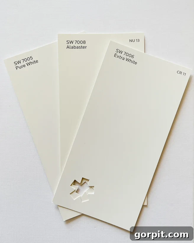
Table of Contents
Why Is Sherwin-Williams Alabaster (SW 7008) So Popular?
In my extensive quest for the perfect white paint, I’ve explored countless samples and tested more shades than I can possibly recount. Yet, one white color consistently emerged as a front-runner, garnering widespread acclaim and frequent mention: Sherwin Williams Alabaster SW 7008. Its popularity soared when it was crowned Sherwin Williams’ Color of the Year in 2016, and its appeal has only solidified in the years since.
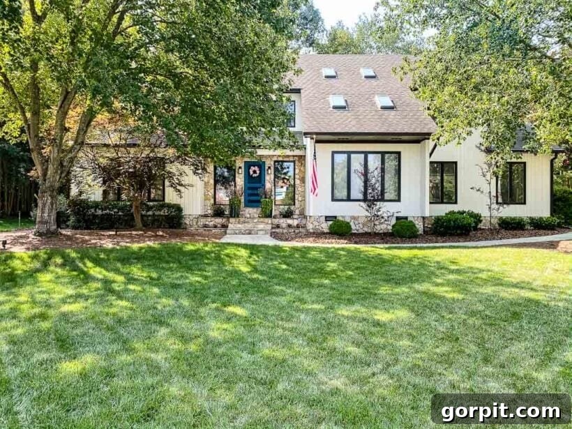
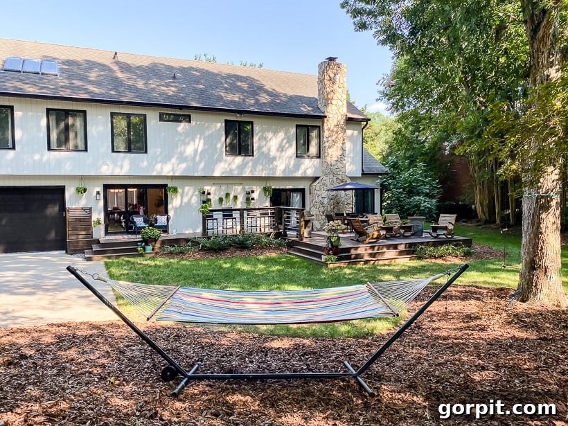
After personally experiencing Alabaster in various settings, I can unequivocally state that its enduring popularity is well-deserved. It’s a beautifully balanced white that strikes an ideal equilibrium, being neither excessively cool nor overly warm. This characteristic makes it an incredibly versatile choice, perfectly suited for both interior walls and exterior facades. In fact, when it came time to repaint the exterior of our previous home, Sherwin-Williams Alabaster was our top pick. It delivered precisely the soft, creamy white aesthetic we envisioned, enhancing the home’s curb appeal with its inviting glow.
What Undertones Does Alabaster Have?
Understanding paint undertones is crucial for selecting the perfect color for your home. Undertones are the subtle colors that lie beneath the surface of a primary hue, influencing how a paint color appears in different lighting conditions and alongside other elements in a room. While you might not consciously “see” them, they profoundly impact the overall feel and warmth of a color. For a more detailed exploration, you can refer to my guide on choosing paint colors for your home.
Many homeowners often ask, “Is Sherwin Williams Alabaster warm or cool?” This question essentially delves into its undertones. Alabaster possesses beautifully subtle undertones, rooted in a remarkably neutral base. It doesn’t strongly lean towards a single color. Instead, it features a harmonious blend of both warm yellow/beige notes and a delicate touch of cool grey. This unique combination results in what is often described as a “greige” undertone – a perfect balance that prevents it from appearing either too stark or too yellow. In my professional opinion, the most exceptional neutral paint colors master this delicate balance of warm and cool undertones, offering unparalleled versatility and sophistication.
Does Sherwin Williams Alabaster Look Yellow?
Despite its warm undertones, a common concern for many is whether Alabaster will appear overtly yellow on walls. The resounding answer is no! When applied, Sherwin Williams Alabaster does not read as yellow in typical lighting conditions. What your eye perceives is a soft, creamy white that exudes warmth without veering into a buttery or dingy yellow territory. This quality ensures it avoids the clinical, stark white appearance often associated with institutional spaces like hospitals or offices, creating an inviting and comfortable atmosphere instead.
While some might categorize Alabaster as an off-white or a cream color, I find those labels don’t fully capture its essence. When viewed in isolation, Alabaster presents itself simply as a beautiful, soft white – a true chameleon that adapts subtly to its surroundings. Its inherent warmth is just enough to make a room feel cozy and welcoming without imposing a strong color presence. Observe how beautifully it enhances the shiplap walls in a foyer, providing a clean yet amiable backdrop.
It’s important to remember that all paint colors, especially whites, are profoundly influenced by natural light. The direction of sunlight can dramatically alter a color’s perception. In north-facing rooms, where light tends to be cooler and bluer, Alabaster often appears closest to a true, crisp white, as the cool light tempers its subtle warmth. Conversely, in south-facing rooms with abundant warm light, Alabaster’s creamy qualities may be more pronounced, creating an even cozier glow. East-facing rooms, receiving morning sun, will see Alabaster appear brighter and perhaps slightly crisper, while west-facing rooms, bathed in warm afternoon light, will highlight its soft, inviting warmth. Always test Alabaster in your specific space to truly appreciate its chameleon-like versatility.
Alabaster’s Light Reflectance Value (LRV)
When selecting paint colors, one critical factor often overlooked is a color’s Light Reflectance Value (LRV). LRV is a measurement that indicates how much visible and usable light a paint color reflects versus absorbs. The scale ranges from 0 (absolute black, absorbing all light) to 100 (pure white, reflecting all light). Understanding LRV helps predict how bright or dim a room will feel after painting.
Sherwin Williams Alabaster boasts an impressive LRV of 82. This high LRV means that Alabaster is exceptionally efficient at reflecting a significant amount of light back into a room. For spaces that you want to feel bright, expansive, and airy, Alabaster is an outstanding choice. Its ability to bounce light around can visually enlarge smaller rooms and create a luminous, fresh atmosphere. This characteristic, combined with its balanced undertones, contributes immensely to its popularity as a go-to white for achieving both brightness and warmth.
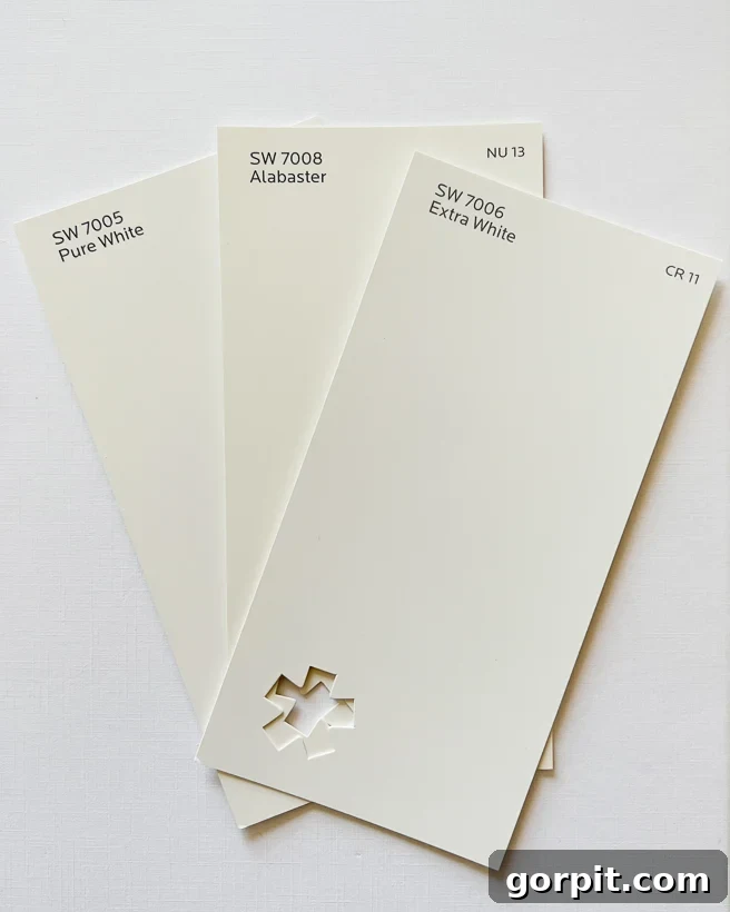
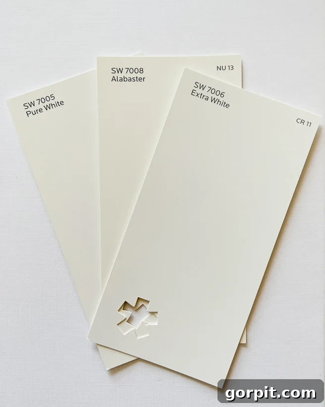
SW Alabaster vs. SW Pure White vs. SW Extra White
Note: The comparison photos below were taken on the brightest white surface available to provide the most accurate representation of color differences. However, please remember that paint colors appear differently on various screens due to display settings. This is precisely why it’s incredibly important to test paint colors in your own home before committing to one!
The inherent warmth of Alabaster becomes particularly evident when placed alongside Sherwin Williams Extra White or Pure White. Both Sherwin-Williams Pure White (SW 7005, LRV 84) and Extra White (SW 7006, LRV 86) are cooler whites, often appearing with subtle blue or grey undertones that give them a crisp, almost stark quality. In contrast, Alabaster’s creamy character is immediately noticeable. When viewed next to these “truer” or brighter whites, or even a sheet of plain white paper, Alabaster’s gentle warmth, which some might initially perceive as a hint of yellow, truly shines through. It’s this inviting warmth that distinguishes it from the cooler, more sterile whites, offering a softer, more approachable feel without sacrificing brightness.
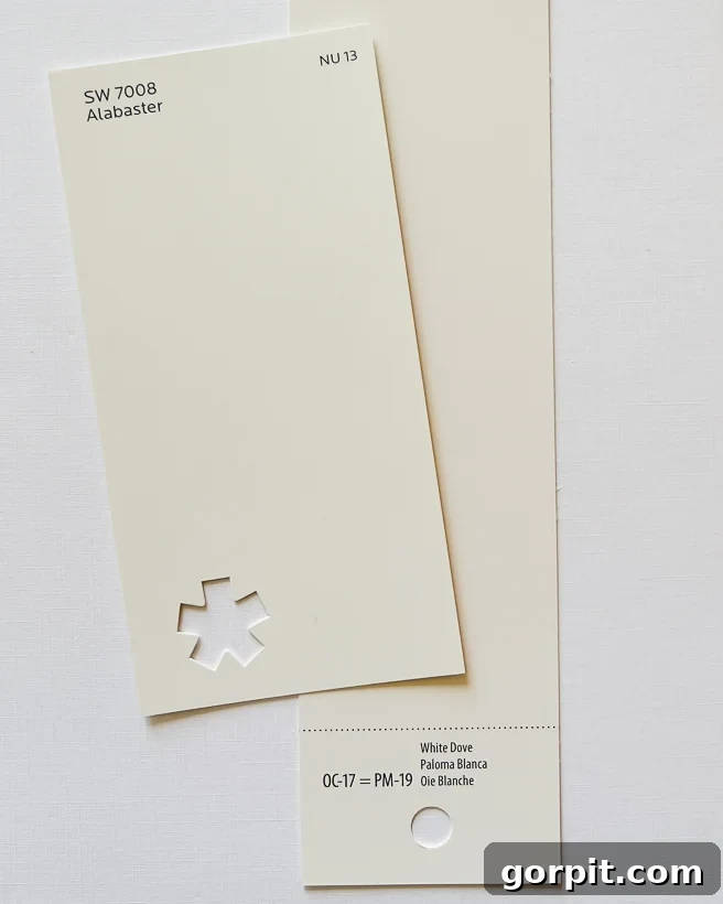
Alabaster vs. Benjamin Moore White Dove
For those considering warm white paints, Benjamin Moore White Dove (OC-17) is a frequent contender alongside Sherwin Williams Alabaster. These two colors are indeed remarkably similar, often leading to a difficult decision for homeowners. However, upon closer inspection, subtle differences emerge. To my eye, Alabaster carries a fraction more warmth than White Dove, which can sometimes reveal a very delicate hint of pinkish-grey, especially in certain lighting conditions. This barely-there nuance gives White Dove a slightly more traditional or elegant feel.
In terms of Light Reflectance Value, Benjamin Moore White Dove has an LRV of 85, marginally higher than Alabaster’s 82. This higher LRV contributes to White Dove’s slightly crisper, more “true white” appearance compared to the softer, creamier Alabaster. While both are excellent choices for a warm, inviting white, if you desire a touch more creaminess and a slightly cozier feel, Alabaster might be your preference. If you lean towards a slightly cleaner, yet still warm white with a hint of sophistication, White Dove could be the better fit. Observing them side-by-side, as in the photo below, helps highlight these subtle distinctions.
Alabaster vs. Benjamin Moore Swiss Coffee
Another popular warm white, Benjamin Moore Swiss Coffee (OC-45), often enters the discussion when searching for a creamy white. While both Alabaster and Swiss Coffee aim for a warm aesthetic, their undertones create distinct differences. The most significant distinction lies in Swiss Coffee’s more pronounced yellow undertone, which can sometimes carry a slight green cast, giving it a richer, almost beige-like appearance on walls compared to Alabaster. Its warmth is undeniable, but it leans further into the “creamy” or “off-white” category, whereas Alabaster maintains a purer white identity with subtle warmth.
Interestingly, Benjamin Moore Swiss Coffee has an LRV of 81.91, which is almost identical to Alabaster’s 82. Despite similar light reflectance, the difference in undertones is where they diverge. If your goal is a creamy, inviting warm white that remains firmly within the white spectrum and avoids any noticeable green or strong yellow undertones, Alabaster is generally the superior recommendation. Swiss Coffee, with its deeper warmth and potential for green notes, caters to those seeking a slightly more saturated, antique white feel. When seen side-by-side, the nuanced differences in their underlying colors become clearer, helping you pinpoint the exact warm white that resonates with your vision.
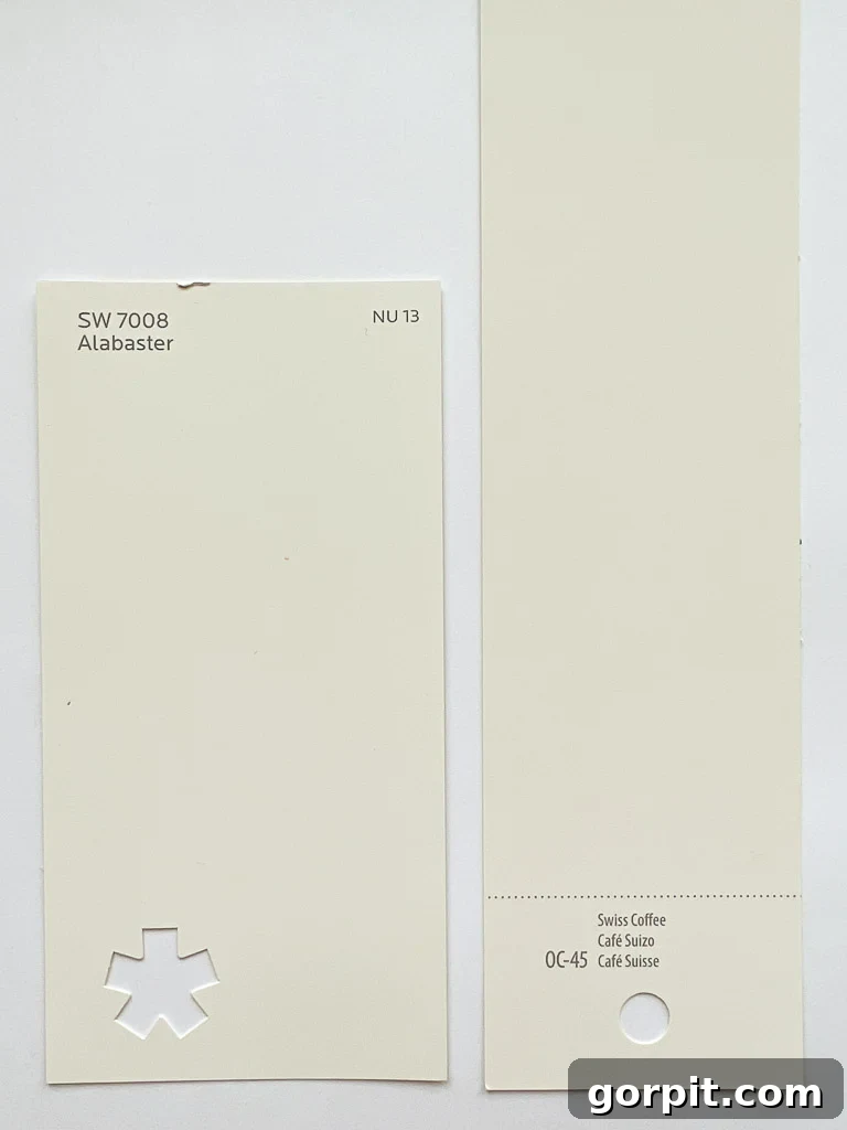
To reiterate, while Alabaster has warm undertones, in practical application, it absolutely does not appear yellow. When viewed as a standalone color on your walls, it consistently reads as a sophisticated, beautiful white, perfectly balancing warmth and brightness.
More Examples of Alabaster In Real Homes
It’s one thing to discuss paint colors in theory, and quite another to see them in tangible, real-world applications. If you’re anything like me, you crave visual evidence of Sherwin Williams Alabaster gracing actual homes. To that end, I’ve curated a collection of inspiring examples to help you visualize this versatile white in various settings. Please bear in mind that Alabaster’s appearance can vary significantly from one home to another due to differences in natural light, artificial lighting, and surrounding decor. Before making your final decision, I strongly encourage you to consult my tips for how to choose paint colors to ensure it perfectly complements your unique space and lighting conditions. Testing paint colors is simpler than ever with modern tools like Samplize peel-and-stick paint samples, which offer a mess-free way to preview colors in your home.
Examples of Alabaster on Walls
The beauty of Alabaster on walls lies in its ability to provide a clean, fresh backdrop that feels both inviting and expansive. As you can glean from various examples, Alabaster is a remarkably pretty shade of white that adapts effortlessly across diverse interior design styles. Whether gracing the walls of a charming farmhouse-style home, where it perfectly complements rustic textures and warm wood tones, or providing a sophisticated canvas in a sleek, modern contemporary space, its versatility is unmatched. It allows other design elements, from bold furniture to intricate textiles, to take center stage without competing for attention, all while contributing to an overall sense of brightness and serenity.
Examples of Alabaster on Trim & Cabinets
Beyond walls, Sherwin Williams Alabaster proves to be an exceptional choice for trim work, offering a softer alternative to stark, true white trims. For those who prefer a less contrasting, more harmonious look between their walls and architectural details, Alabaster trim can seamlessly blend with a variety of wall colors, including popular greys, creating an elegant and understated transition. Imagine Alabaster trim paired with light grey walls, as seen in many contemporary designs, where it adds a touch of warmth without losing its pristine quality.
Furthermore, Alabaster is a highly favored option for painting kitchen cabinets and other built-in features such as bookcases, shelving, and mudroom lockers. Its creamy white hue brings an inviting brightness to kitchens, offering a fresh, clean aesthetic that feels cozy rather than cold. In a kitchen setting, Alabaster cabinets can perfectly complement various countertop materials and backsplash tiles, creating a timeless foundation. The image below, taken at night with interior lights on, beautifully illustrates how Alabaster cabinets can cast a warm, welcoming glow, showcasing its adaptability under different artificial lighting conditions.
Its versatility also extends to practical, high-traffic areas. For instance, Alabaster looks absolutely beautiful on built-in lockers in an entryway or mudroom, providing a durable and aesthetically pleasing finish that brightens the space and highlights the architectural details.
Alabaster on Ceilings
While tradition often dictates pure white ceilings, breaking from this norm can yield stunning results. If you’ve explored my post on interior trim ideas that aren’t white, you’ll know that a little deviation can create a more cohesive and intentional design. Indeed, we’ve even opted for a creamy beige on our own ceilings and trim, proving that alternative choices can be incredibly effective.
Using a warmer white like Sherwin Williams Alabaster on ceilings is an excellent option, particularly for those who gravitate towards warmer color palettes and decor styles. The inherent creaminess of Alabaster allows it to harmonize beautifully with other warm tones in a room, softening the overhead plane and making the space feel more enveloped and cozy. Instead of a stark contrast, Alabaster on the ceiling can create a gentle transition from the walls, making the room feel taller and more cohesive. It avoids the sometimes jarring effect of a bright white ceiling against warm-toned walls, fostering a sense of continuous flow and elegant sophistication throughout the space.
Should You Use Alabaster White In Your Home?
If your quest is for a versatile, neutral white paint color that brings both brightness and warmth, Sherwin Williams Alabaster should undoubtedly be at the top of your consideration list. Its impressively high LRV of 82 ensures that any room painted with Alabaster will feel bright and airy, a quality highly sought after by many homeowners, including myself. This makes it an adaptable choice suitable for a wide array of spaces, from a bustling living room to a tranquil bedroom or a serene bathroom.
What sets Alabaster apart from more clinical whites like Sherwin Williams Extra White is its subtly warm undertones. This delicate warmth prevents it from appearing stark or cold, instead infusing spaces with a cozy, inviting, and soft ambiance that is gentle on the eyes. It creates a beautiful, adaptable backdrop that beautifully complements almost any decor style, from minimalist modern to rustic farmhouse, traditional, or eclectic.
My strongest advice when considering a white wall color is to obtain samples of several whites, making sure Alabaster is among them. It is absolutely crucial to follow my recommendations in this post about how to choose paint colors: paint samples on at least two different walls within the same room. This allows you to observe how the color reacts to varying light conditions throughout the day. You can either purchase small cans of paint to brush directly onto your walls or, my personal preference, try the incredibly convenient peel & stick paint samples. Simply cut them in half to test on multiple surfaces. Remember, choosing a paint color based solely on a small swatch or online photos is a common pitfall and almost always leads to disappointment. Always test in your actual space!
I genuinely believed Alabaster would be the perfect choice for the walls in my current home, given how much I adore it. However, after extensive sampling, I discovered it didn’t quite harmonize with my existing trim color as I had hoped. Ultimately, I opted for Sherwin-Williams Pure White – you can read my full review of Sherwin-Williams Pure White here to see why it was the ideal fit for my space. This personal experience underscores the absolute necessity of testing colors in your unique environment.
More Paint Posts
SEE ALL PAINT POSTS
-
The Best Neutral Paint Colors for Kitchen Cabinets
-
Benjamin Moore Swiss Coffee- Is it Right For You?
-
Samplize Peel & Stick Paint Samples: An Unbiased Review
-
Sherwin Williams Pure White SW7005 Paint Review With Pictures
-
Navy Blue Paint Colors Designers Love
-
Beautiful Blue Paint Colors Designers Love & Use
Other posts you may enjoy:
- How to Choose Paint Colors for Your Home: 6 Simple Tips to Follow
- DIY Paint Projects
- The Best Paint for Kitchen Cabinets: 10 Successful Cabinet Transformations
- A Paint Sheen Guide & Reference Chart
- How to Decorate With Color Even When It Scares You
Curious about my approach to transforming rooms and spaces in our home? Explore Designer in a Binder® for a simple and affordable decorating solution.
And for exclusive content and behind-the-scenes glimpses, make sure to subscribe before you leave!