As homeowners, the quest for the quintessential white paint can often feel like navigating a labyrinth of endless shades and elusive undertones. The last thing anyone wants is to invest time and effort only to find their living space transformed into a cold, uninviting expanse due to an ill-chosen hue. This is precisely where Sherwin-Williams Pure White SW7005 emerges as a beacon of clarity and warmth. Renowned for its beautifully balanced, neutral character, Pure White stands as an exceptional choice for those seeking a crisp yet soft foundation for their walls, trim, and ceilings. It delivers brightness without veering into starkness, offering a welcoming embrace that many other whites struggle to achieve. Join us as we delve deep into the attributes of Sherwin-Williams Pure White SW7005, exploring its unique qualities to help you determine if this beloved shade is the perfect white paint for your home.
In this comprehensive guide, we will unpack every essential detail about Sherwin-Williams Pure White. From its crucial Light Reflectance Value (LRV) and subtle undertones to detailed comparisons with other popular white paint colors, our aim is to equip you with all the insights needed to confidently select the ideal shade for your unique living environment. Understanding how this particular white interacts with various lighting conditions and complementary colors is key to making an informed decision that will bring lasting beauty to your space.
Table of Contents
Why Sherwin-Williams Pure White Became My Go-To
For those who have followed my decorating journey, my preference for white interior walls is no secret. This appreciation began in our previous home, where I discovered how white walls served as an unparalleled canvas, allowing our vibrant artwork and decorative accents to truly pop. The clean, uncluttered backdrop provided by white paint made every carefully chosen piece stand out with greater impact and intention.
Therefore, when we embarked on the exciting adventure of moving into our new house, the decision to paint all interior walls white before moving in was an easy one. The process of choosing paint colors can be overwhelming, especially when faced with an empty canvas. Opting for a consistent white throughout allowed us a fresh start, providing a versatile foundation that could accommodate any future design changes, even if we eventually decided to introduce accent colors in certain rooms. It offered a sense of calm and continuity, a perfect blank slate.
However, the crucial question remained: “Which white is the right white?” Our specific challenge was to find a wall color that harmonized with our existing trim, which was painted in Divine White by Sherwin-Williams. Divine White is, surprisingly, not a true white at all; it carries distinct beige undertones. Our goal was to select a white for the walls that would create a subtle, elegant contrast with this warmer trim, allowing the trim itself to be a design feature.
Using interior trim colors that aren’t white is a rising trend in home decor, and it was a look I was eager to embrace. Not only did I find the aesthetic appealing, but it also promised significant savings by eliminating the monumental task of repainting all the existing trim and doors throughout the house. This practical consideration made our white wall selection even more important.
We diligently sampled several different white paints against our Divine White trim, carefully observing how each shade behaved in various lights. This extensive testing process ultimately narrowed our choices to Sherwin-Williams Alabaster and Sherwin-Williams Pure White. After much deliberation and observation, Pure White emerged as the clear winner. Its ability to create a crisp yet gentle contrast with our beige trim was exactly what we envisioned, and we have been absolutely delighted with the results. Keep reading to discover more about this remarkably versatile and nearly perfect white paint color!
Is Pure White the Perfect White Paint Color?
Sherwin-Williams Pure White holds its title as one of the brand’s most popular white paint colors for compelling reasons. Its universal appeal lies in its remarkable balance. If you’ve read my review of Sherwin-Williams Alabaster, you might be surprised that I didn’t ultimately choose it for our current home. Frankly, I was surprised myself! I initially believed Alabaster would be the superior choice, confidently telling my husband it was “the one.” However, the sampling process was a powerful lesson. When we painted swatches of Alabaster and Pure White directly against our existing trim color, Alabaster, much to my surprise, appeared too yellow in contrast.
It was at that moment I truly grasped the understated brilliance of Pure White. While Alabaster leans distinctly warm with visible yellow undertones, Pure White presents a subtly cooler profile. This nuanced difference allows it to remain a crisp, bright white that still manages to feel incredibly inviting and soft, devoid of any stark or sterile qualities. It truly strikes a harmonious balance.
Pure White by Sherwin-Williams distinguishes itself by having remarkably few obvious undertones. Despite its neutral appearance, it possesses just enough creaminess and softness to create a warm and welcoming atmosphere, steering far clear of any cold or clinical vibes. While generally classified as a warm white, it notably lacks the pronounced yellow undertones that can sometimes become apparent in Alabaster, particularly in certain lighting conditions. Its balanced nature is what makes it so adaptable and widely cherished.
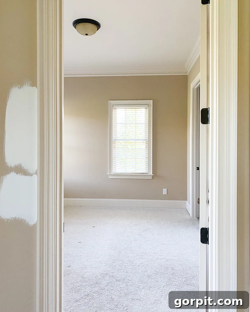
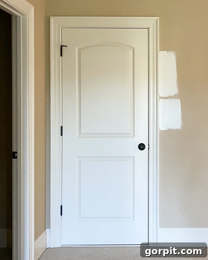
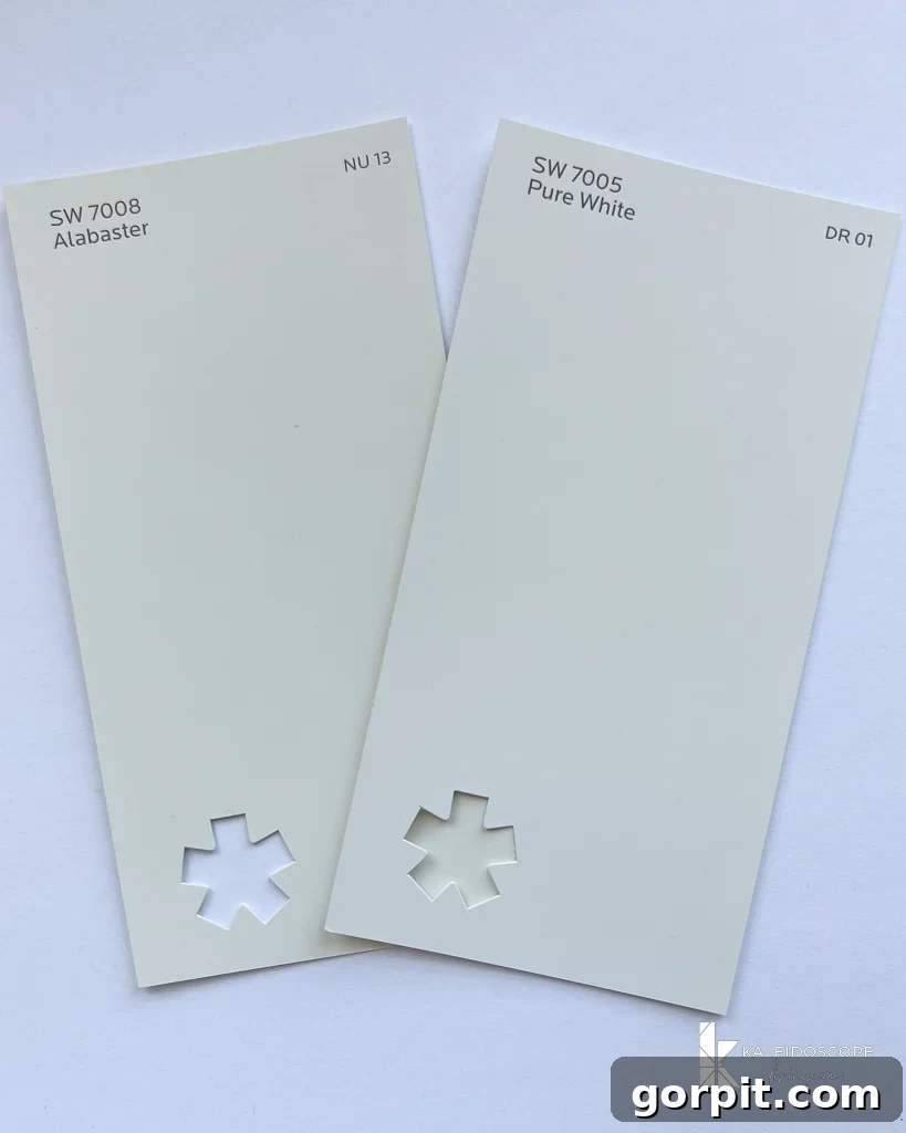
The visual evidence from our own home testing clearly illustrates these differences. In the photos below, you can see samples of Alabaster (top) and Pure White (below) from two different areas. Although the differences are subtle rather than drastic, you can observe how Alabaster appears slightly warmer and more yellow compared to SW Pure White, which consistently reads as a clean, unwavering neutral. These images also serve as a vital reminder of how dramatically paint colors can shift based on the direction and intensity of natural light, underscoring the indispensable need for in-home sampling.
Unveiling SW Pure White’s Subtle Undertones
The term “undertones” in paint colors refers to the underlying hues that are not immediately obvious but become visible under certain lighting conditions or when contrasted with other colors. These subtle background colors can significantly influence how a paint shade appears in your home. If you’ve ever pondered, “Is Sherwin Williams Pure White warm or cool?”, you’re essentially inquiring about its foundational undertones.
What sets Pure White apart is its remarkable neutrality, meaning its undertones are almost imperceptible. However, like most whites, it’s not simply white pigment. The magic in Pure White’s formula lies in a carefully balanced blend: it includes a very slight hint of yellow, perfectly counteracted by a delicate touch of black or gray. The yellow component provides that crucial, gentle warmth, ensuring the paint never feels stark, sterile, or clinical. This is a vital distinction, as truly stark white walls can often feel unwelcoming and austere.
Crucially, the subtle gray undertones are what truly stabilize Pure White. They prevent the yellow from becoming too dominant, ensuring the color doesn’t lean overtly creamy or yellow, a characteristic often observed in warmer whites like Sherwin Williams Alabaster. This touch of black or gray provides a sophisticated balance, preventing it from appearing washed out or overly bright. This intentional formulation makes Pure White a nuanced, rich white that is far more captivating and versatile than a basic builder’s white or even Sherwin Williams Extra White. It’s this meticulous blend that creates a timeless, adaptable backdrop for any interior design scheme.
The Significance of Pure White’s Light Reflectance Value (LRV)
When selecting paint colors, one critical factor often overlooked is a color’s Light Reflectance Value, or LRV. This numerical scale, ranging from 0 (absolute black, absorbing all light) to 100 (pure white, reflecting all light), quantifies how much light a paint color reflects rather than absorbs. Understanding LRV is essential because it directly impacts how bright, airy, and spacious a room feels.
Sherwin-Williams Pure White boasts an impressive LRV of 84. To put this into perspective, a truly pure, theoretical white would have an LRV of 100. This high LRV value of 84 signifies that Pure White reflects a substantial amount of light back into the room. This makes it an exceptional choice for any space where you desire to maximize brightness and create an open, expansive atmosphere. Rooms painted with Pure White will naturally feel larger, more illuminated, and generally more inviting, making it a powerful tool for enhancing the perceived size and mood of your home.
Experiencing Pure White in Real Room Settings
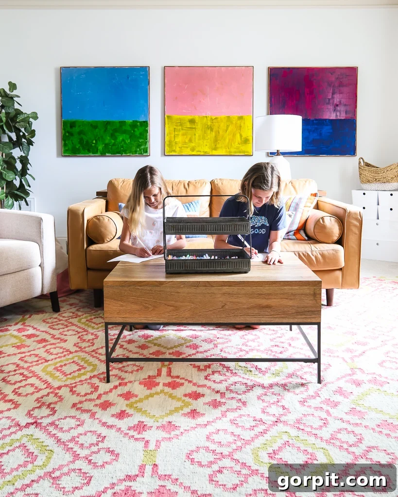
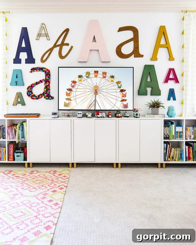
The true beauty and versatility of Sherwin-Williams Pure White truly come alive when observed in various room settings and lighting conditions. Its subtle nuances can shift, creating different moods and perceptions, yet its inherent neutrality always shines through.
For instance, consider our bonus room, which is a north-facing space. North-facing rooms typically receive indirect, cooler light throughout the day. In such environments, Pure White appears closest to a pristine, true white. The cooler light enhances its crispness, allowing its subtle warmth to recede, resulting in a very clean and bright look that still feels soft and approachable. The absence of strong yellow undertones ensures it doesn’t appear dingy or shadowed.
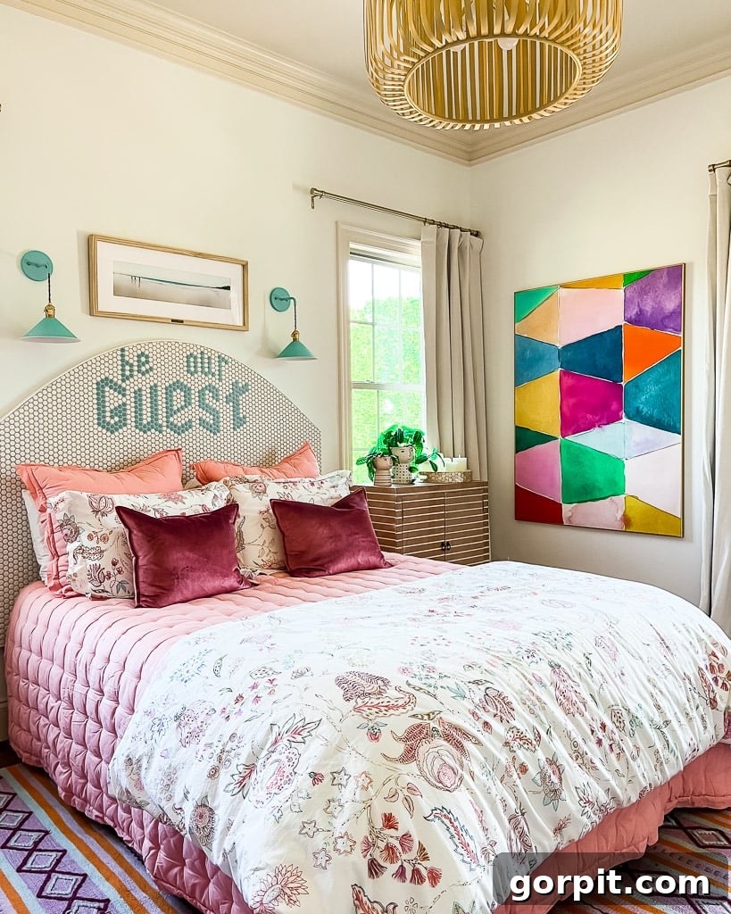
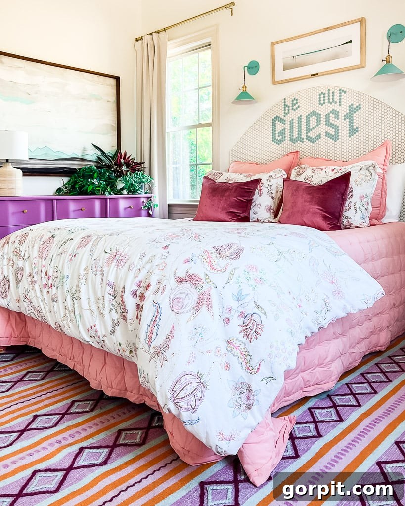
Our guest room also shares a north-facing orientation. However, a crucial observation here is how the appearance of Pure White subtly changes depending on the time of day the photos are captured and the specific angle from which they are taken. This phenomenon, while seemingly minor, profoundly illustrates why it is absolutely paramount to meticulously follow my tips for choosing paint colors for your home before making any final decisions. What looks one way in a morning photo might appear slightly different in the afternoon, emphasizing the need for real-world testing.
In south-facing rooms, which typically benefit from consistently bright and warm light throughout the day, Pure White is most likely to reveal its inherent, subtle warmth. This holds true for my home office, which receives abundant southern exposure. Yet, even under these conditions, I find that Pure White maintains its balanced character and never reads as excessively warm or yellow. Instead, the southern light enhances its creamy quality, making the room feel exceptionally cozy and inviting without losing its clean appeal.
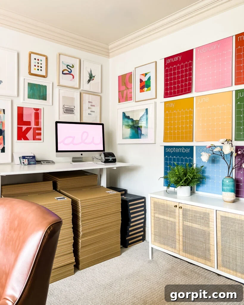
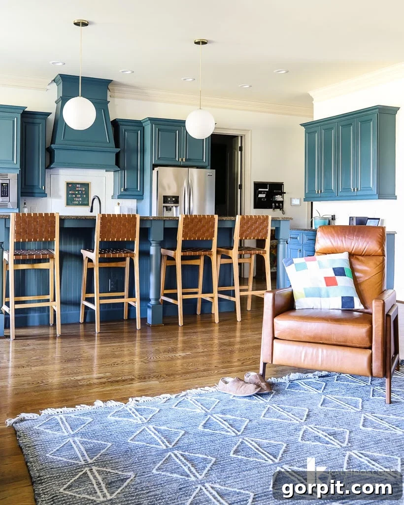
Our kitchen, being an interior room, primarily relies on indirect light, predominantly from southern sources. In such a space, the high Light Reflectance Value of Pure White becomes particularly significant. This high LRV is crucial for keeping the room bright and open, especially when juxtaposed against elements like dark cabinetry, which I personally transformed using this super easy DIY cabinet painting method. Pure White successfully prevents the kitchen from feeling dim or confined, proving its effectiveness even where natural light is limited.
How SW Pure White Compares to Other Popular White Paints
Choosing the perfect white paint often involves comparing various shades to understand their unique undertones and characteristics. If you’re wondering how Sherwin-Williams Pure White stacks up against some of the other highly favored white wall and trim colors on the market, you’re in the right place. Let’s break down the key differences to help clarify your decision.
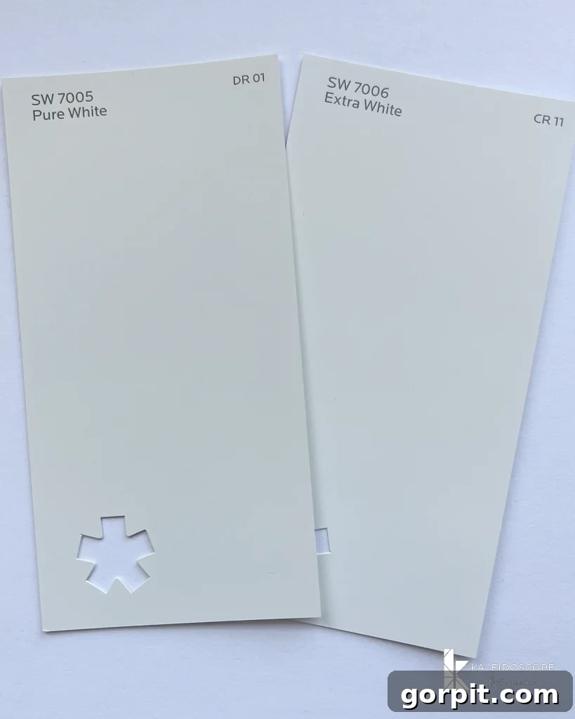
Pure White vs. Sherwin-Williams Alabaster vs. Extra White
Note: The comparison photos below were taken on the brightest white surface I could find to ensure the most accurate color representation. However, please remember that the exact colors you perceive can vary significantly based on your device’s screen settings. This variability is precisely why it is absolutely essential to test paint colors directly in your own home before committing to a final choice!
This comparison vividly illustrates why Pure White is often lauded for its neutral qualities. You’ll clearly see that Pure White is far more neutral than SW Alabaster, which carries noticeable creamy, yellow undertones, giving it a warmer feel. Conversely, Pure White is distinctly less stark and cold than SW Extra White, which is a very clean, almost stark white with cool, sometimes bluish undertones. When placed next to printer paper – which represents a “true white” – Pure White reveals itself to be a softer, more nuanced shade, making it far more inviting for interior spaces than an unyielding pure white.
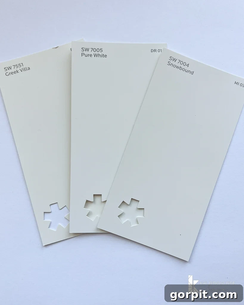
Pure White vs. Snowbound vs. Greek Villa
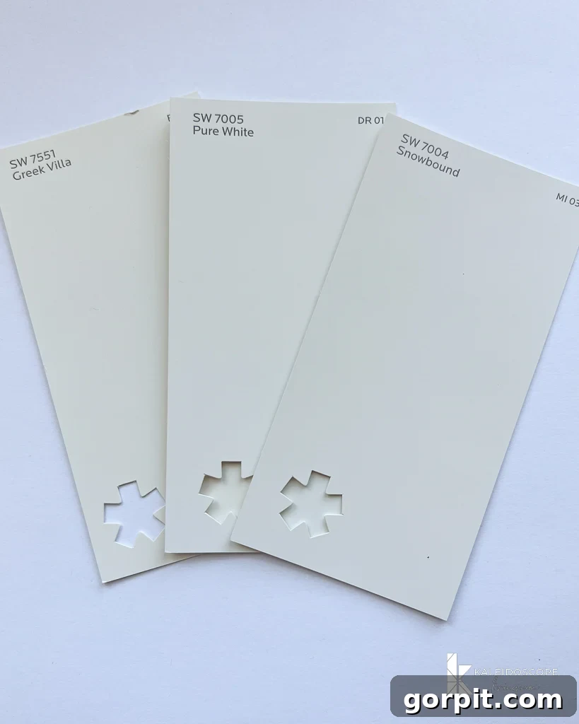
In this trio, Greek Villa stands out as noticeably warmer and creamier than Pure White, making it a good choice if you desire a truly cozy, Mediterranean-inspired warmth. Snowbound, on the other hand, possesses a more discernible gray undertone and is slightly less bright than Pure White, giving it a muted, sometimes slightly cooler, sophisticated edge. Pure White remains the most balanced and true neutral among these three, offering a clean canvas without strong leanings towards yellow or gray.
Pure White vs. High Reflective White
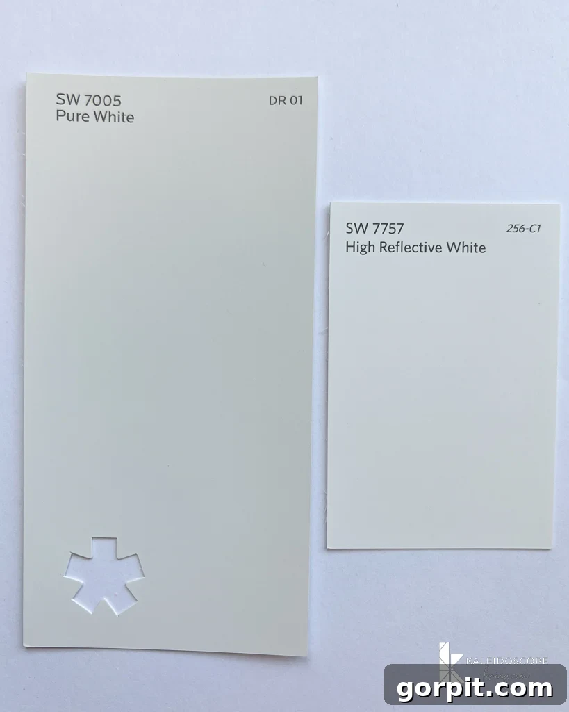
This comparison truly highlights the “softness” of Pure White, distinguishing it from what I refer to as a “true” or unyielding white. When you place Pure White next to High Reflective White, the difference is striking. High Reflective White, as its name suggests, is extremely bright and has a pronounced blue undertone. This blue tint makes it a significantly cooler hue, which, in many residential settings, can translate into a stark, almost clinical feel. For most homes, Pure White’s balanced warmth and neutrality make it a far more pleasant and livable option, avoiding the overly sharp appearance of High Reflective White.
Pure White vs. Benjamin Moore White Dove
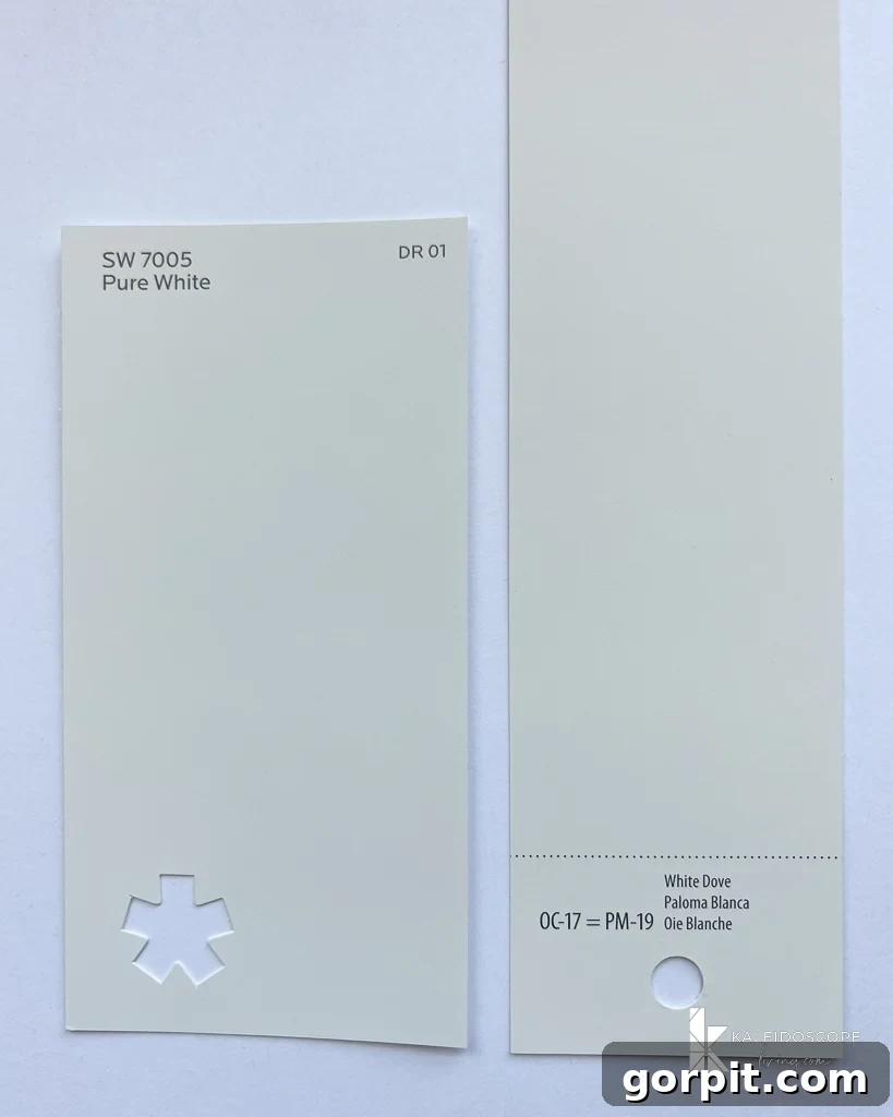
Benjamin Moore White Dove is remarkably similar to Sherwin-Williams Pure White in its general appeal as a soft, versatile white. However, upon closer inspection, White Dove carries an ever-so-slight creamy warmth, distinguishing it from Pure White’s more neutral stance. I would place Benjamin Moore White Dove somewhere between Alabaster and Pure White in terms of its perceived warmth. Where Pure White maintains its crispness with just a hint of warmth, White Dove embraces a touch more creaminess, often with a whisper of greige or muted yellow undertones that can become more pronounced in certain lighting, whereas Pure White’s subtle gray counteracts its warmth more effectively. This makes Pure White a slightly cleaner, more consistently neutral option.
Pure White vs. Benjamin Moore Swiss Coffee
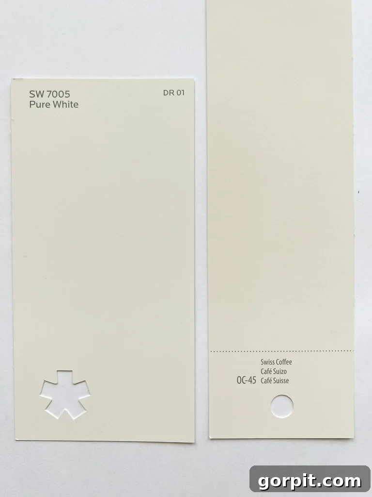
When comparing these two popular whites, Benjamin Moore Swiss Coffee presents a noticeably stronger yellow undertone than Sherwin-Williams Pure White. In fact, Swiss Coffee can even appear warmer and creamier than SW Alabaster, which is already considered a warm white. This makes Swiss Coffee a distinctly softer, more muted white that can lean towards beige or off-white depending on the light. In terms of light reflection, Pure White also has a slightly higher LRV of 84 compared to Swiss Coffee’s 81.90, indicating it will reflect marginally more light, contributing to a brighter feel. While popular, I’ve found that Swiss Coffee’s prominent yellow-green undertones can sometimes make it challenging to work with, causing it to appear somewhat muddy or outdated in certain contexts. You can read my full review of Benjamin Moore Swiss Coffee for more details, but spoiler alert: it tends to be my least favorite among the most popular white wall paint colors for its often less-than-pure appearance.
Should You Choose Sherwin-Williams Pure White for Your Home?
If your design vision leans towards a truly neutral white paint color that offers immense versatility and timeless appeal, then Sherwin-Williams Pure White SW7005 should undoubtedly be at the top of your consideration list. Its high Light Reflectance Value (LRV) of 84 is a significant asset, ensuring that any room it graces will feel exceptionally bright, open, and airy – a quality highly sought after by homeowners and designers alike. From bustling living rooms and serene family spaces to cozy bedrooms and functional bathrooms, Pure White is an outstanding choice that adapts beautifully to diverse environments and functions.
What truly distinguishes Pure White is its remarkable neutrality. It’s a white with virtually no obvious undertones, meaning it doesn’t lean heavily towards yellow, blue, or gray. The subtle infusion of black in its formula is a masterstroke, preventing it from appearing cold, stark, or clinical, instead lending it an inviting softness that makes a space feel welcoming and comfortable. My personal experience with Pure White on our walls has been nothing short of delightful; I have absolutely zero regrets about choosing it.
This paint color is not only perfect for walls but also excels when applied to trim, ceilings, and even cabinetry. Its consistent performance across varying light conditions further solidifies its position as one of the most versatile white paint colors available. Whether your home receives ample natural light or relies more on artificial illumination, SW Pure White will consistently deliver its balanced beauty. It has become my personal go-to white wall color and the shade I most frequently recommend to friends, family, and clients seeking expert advice.
My sincerest advice, if you are contemplating a white wall color, is to obtain samples of several white paints, and make sure that list includes Sherwin-Williams Pure White! The appearance of Pure White, or any paint color, will vary dramatically from one home to another, influenced by unique lighting, existing finishes, and surrounding decor. Therefore, it is absolutely crucial to follow my recommendations in this post about how to choose paint colors. Specifically, test your samples on at least TWO different walls within the same room. You’ll be surprised at how different a color can look simply based on the direction the light hits it.
For optimal testing, it’s always a brilliant idea to use large, repositionable swatches such as Samplize Peel & Stick Paint Samples directly where you intend to apply the color. I’ve even written a full review of Samplize Peel & Stick Paint Samples that provides an unbiased perspective on their benefits. These convenient samples can even be cut in half, allowing you to try them on multiple walls simultaneously. The cardinal rule of paint selection remains: never, ever, ever choose a paint color based solely on a tiny paint swatch or digital photos found online. That approach is a surefire recipe for disappointment.
Finally, remember that Pure White will also exhibit slight variations depending on the paint sheen you select. For a detailed breakdown, consult my tips for choosing the perfect paint sheen. For example, Pure White in a semi-gloss finish, often used on trim, will appear somewhat brighter and crisper than the same color in an eggshell finish, which is commonly applied to walls. As a reference point, all the Pure White walls in my home are finished with an eggshell sheen, striking a perfect balance between durability and a soft, inviting aesthetic.
Discover More Paint Color Insights
SEE ALL paint color posts
-
The Best Neutral Paint Colors for Kitchen Cabinets
-
Benjamin Moore Swiss Coffee: Is It Right For You?
-
Samplize Peel & Stick Paint Samples: An Unbiased Review
-
Sherwin Williams Pure White SW7005 Paint Review With Pictures
-
Navy Blue Paint Colors Designers Love
-
Beautiful Blue Paint Colors Designers Love & Use
Curious about how I approach transforming rooms and spaces in our home, achieving cohesive and beautiful results? Explore Designer in a Binder® – my unique system designed to simplify and streamline your decorating process.
For exclusive content, behind-the-scenes glimpses, and the latest design tips delivered straight to your inbox, be sure to subscribe before you go!