Blue, a timeless and universally adored color, consistently ranks among the most popular choices for interior paint. When blended with the sophisticated subtlety of gray, the result is a beautifully balanced and incredibly versatile hue: blue-gray. This captivating combination offers the perfect neutral backdrop for virtually any space in your home, providing a refined alternative to conventional whites or beiges. Much like a trusty pair of blue jeans effortlessly complements any outfit, a well-chosen blue-gray paint color harmonizes with diverse design styles and existing decor. For those who appreciate color but seek an elegant neutrality, blue-gray delivers an intriguing depth and character that pure neutrals often lack.
However, navigating the vast spectrum of blue-gray paint colors can be a delightful challenge. The interplay of blue and gray, along with subtle undertones, means each shade offers a unique personality. To simplify your search for the ideal tint for your living spaces, we’ve curated a selection of popular, designer-favorite blue-gray hues. This guide will help you understand their nuances and visualize how they can transform your home.
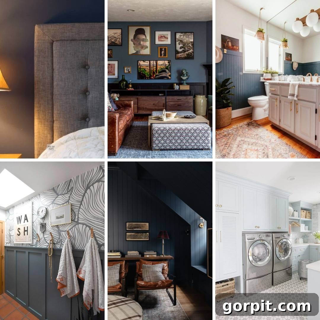
Table of Contents
What is a Blue-Gray Paint Color?
At its core, a blue-gray paint color is precisely what its name implies: a harmonious blend of blue and gray pigments. It’s a color family where the calming, serene qualities of blue meet the steady, sophisticated attributes of gray. The beauty of blue-gray lies in its incredible range; some shades lean more heavily towards blue, offering a vibrant yet muted tone, while others skew grayer, providing a subtle coolness that hints at blue without being overtly colorful. This spectrum allows for an endless array of moods and atmospheres, making it a favorite among interior designers and homeowners alike. The precise ratio of blue to gray, alongside often hidden undertones, dictates how the color will appear in various lighting conditions and alongside different decor elements. Blue, in general, is one of the most beloved and frequently used colors in home decor, celebrated for its ability to create tranquil and inviting spaces. If you’re exploring beyond the specific nuances of blue-gray, you might also enjoy discovering a broader spectrum of beautiful blue paint colors that can bring peace and style to your home.
Why Choose Blue-Gray Paint Colors?
Beyond their aesthetic appeal, blue-gray paint colors offer a host of benefits that make them ideal for modern homes. They serve as a sophisticated neutral, capable of creating a serene and calming environment without feeling stark or uninviting. The gray component grounds the blue, preventing it from appearing too juvenile or overwhelming, while the blue infusion adds a refreshing depth and coolness that plain gray often lacks. This unique balance makes blue-gray incredibly adaptable. It can evoke a sense of coastal tranquility, modern minimalism, or even classic elegance depending on the specific shade and accompanying decor. Furthermore, blue-gray hues are known for their ability to promote relaxation and focus, making them excellent choices for bedrooms, home offices, and living areas where comfort is paramount. They provide a versatile foundation that allows other colors and textures in your space to truly shine, effortlessly tying together various design elements.
Understanding LRV (Light Reflectance Value)
When selecting paint, particularly for shades like blue-gray, understanding LRV (Light Reflectance Value) is crucial. LRV is a number that indicates how much light a paint color reflects or absorbs. It’s measured on a scale from 0 (absolute black, absorbing all light) to 100 (pure white, reflecting all light). A higher LRV means the color will appear lighter and more airy, while a lower LRV indicates a darker, moodier hue. For blue-gray paints, LRV helps you predict how a color will behave in your room’s natural and artificial lighting, influencing its perceived depth and intensity. Paying attention to LRV can guide you in choosing a shade that creates the desired ambiance, whether you aim for a bright and open feel or a cozy and intimate retreat.
Where Can Blue-Gray Paint Colors be Used?
The versatility of blue-gray paint colors truly knows no bounds; they can enhance virtually any room in your home. While pure white walls, like the ever-popular Pure White by Sherwin-Williams, offer a clean canvas, blue-gray provides a more dynamic neutral alternative to traditional greige or sterile whites. Imagine the tranquil beauty of a stormy sky or the soothing expanse of the ocean – these colors bring a similar sense of calm and sophistication indoors. In a bedroom, a soft blue-gray can foster a peaceful sanctuary conducive to rest. For a family room or living area, deeper blue-grays create an inviting and elegant space perfect for gathering. A kitchen can feel fresh and modern with blue-gray cabinets or walls, while a bathroom transformed with these shades can become a spa-like retreat. Entryways, dining rooms, and even home offices also benefit from the balanced appeal of blue-gray, effortlessly complementing a wide array of furniture styles, from rustic farmhouse to sleek contemporary.
How to Choose the Best Blue-Gray Paint Color
Determining the “best” blue-gray paint color is inherently subjective, as it largely depends on your personal taste, existing decor, and the unique lighting conditions of your home. What looks stunning in a designer’s portfolio might not translate perfectly to your specific space. That said, I’m excited to share some of my absolute favorites below, complete with their LRV (Light Reflectance Value) to give you a better sense of their depth.
Before you fall in love with any of these beautiful blue hues, please consult my essential guide: How to Choose Paint Colors for Your Home: 6 Simple Tips to Follow. The single most critical piece of advice I can offer is to **always test every paint color** you are considering directly in your own home. Observe the samples on every wall and at different times of day to see how natural and artificial light affects them. For an incredibly easy and mess-free way to test, I highly recommend peel-and-stick paint samples. You can also purchase small sample pots, but the peel-and-stick option offers unmatched convenience. Trust me, learning from my past mistakes will save you immense heartache, stress, and money. I once rushed a decision and ended up repainting my kitchen three times! A designer image, no matter how perfect, cannot replicate the specific interaction of light with your furniture and architectural features. Always try before you buy!
Water’s Edge by Benjamin Moore (1635) LRV 31.48
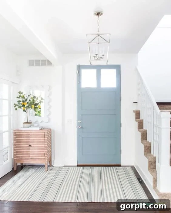
This exquisite blue-gray shade from Benjamin Moore introduces a breath of fresh air wherever it’s used. In a foyer, painting the front door with Water’s Edge offers a delightful pop of color that remains beautifully neutral, setting an inviting tone from the moment you step inside. The inherent gray tones in this hue expertly temper the blue, preventing it from feeling overly saturated or intense. Its balanced nature makes it a superb choice not just for doors, but also for creating serene bedroom walls or adding sophisticated character to cabinetry. Water’s Edge is a versatile contender that infuses spaces with a sense of calm elegance.
Adirondack Blue by Behr (N480-5) LRV 23
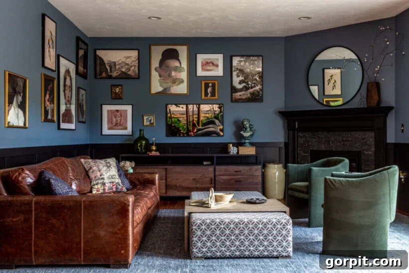
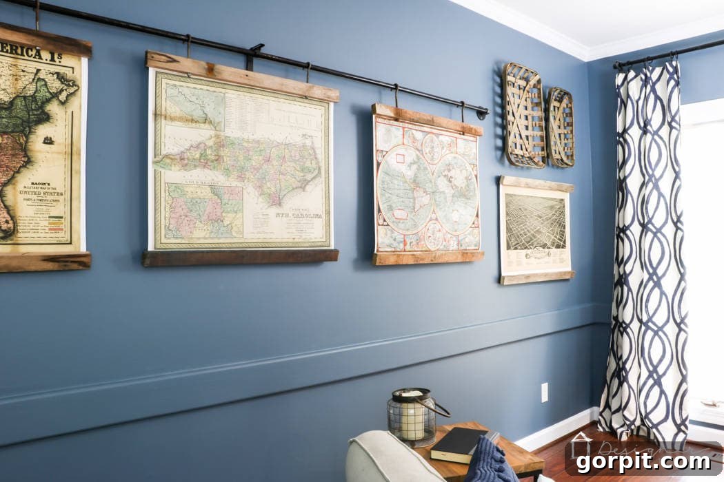
Adirondack Blue by Behr strikes a remarkable balance, offering a grayish-blue that can lean into a charming farmhouse aesthetic, yet when paired thoughtfully, achieves an elevated and sophisticated feel. In a family room, as demonstrated with striking black wainscoting, this hue transcends typical expectations. Its depth provides a rich backdrop for an amazing gallery wall and modern decor elements, culminating in a perfect modern traditional design. Adirondack Blue is a fantastic choice for those looking to infuse their living spaces with a profound sense of style and comfort without compromising on versatility, creating an atmosphere that is both inviting and chic.
Waterloo by Sherwin-Williams (SW 9141) LRV 13
Sherwin-Williams’ Waterloo is a compelling blue-gray that possesses crisp gray undertones, giving it a clean and refreshing feel. This deep yet vibrant shade looks particularly stunning when juxtaposed with natural wood tones and crisp whites, creating a balanced and visually appealing environment. Waterloo offers the perfect amount of depth and rich color without becoming overly heavy or overwhelming. It’s an excellent choice for adding a significant splash of color and personality to a room while maintaining a sophisticated and grounded aesthetic. Ideal for spaces where you want to make a statement yet ensure lasting appeal, Waterloo delivers elegance with a serene presence.
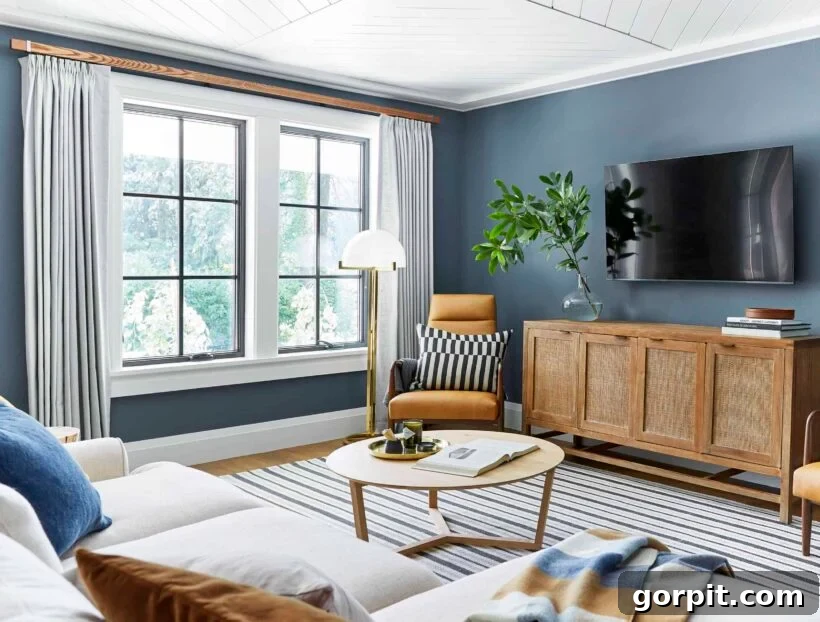
Philipsburg Blue by Benjamin Moore (HC-159) LRV 19
I hold a special fondness for Benjamin Moore’s Philipsburg Blue, a blue-gray paint color so captivating that I’ve incorporated it into two of my own homes. This particular shade, in my opinion, is profoundly underrated and underutilized. In our previous home, it graced the walls of our family room, transforming the space into an inviting and soothing haven. Philipsburg Blue masterfully blends moodiness with tranquility, creating an atmosphere that is both dramatic and comforting. Its ability to create such a profound and elegant statement, while remaining incredibly livable, makes it a top recommendation for anyone seeking a blue-gray with genuine character and depth.
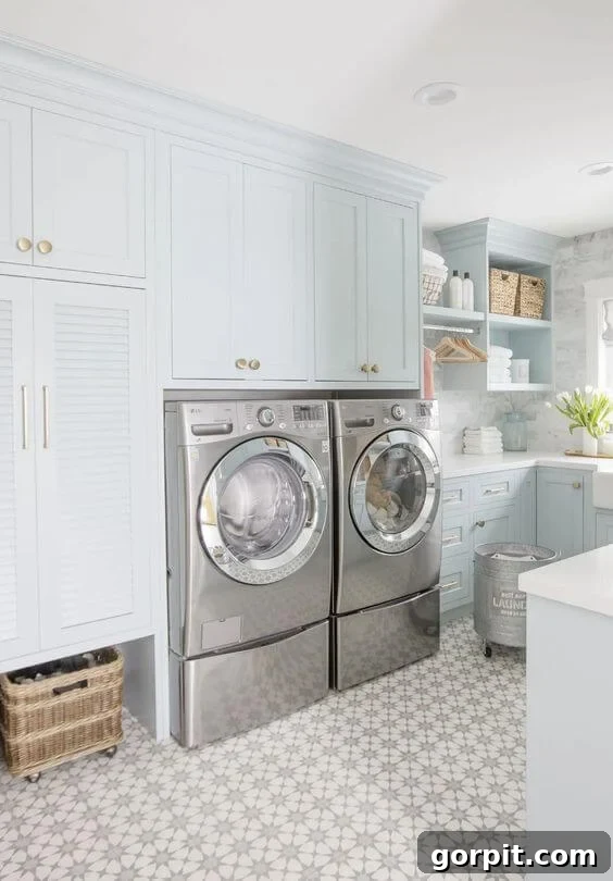
Smoke by Benjamin Moore (2122-40) LRV 56
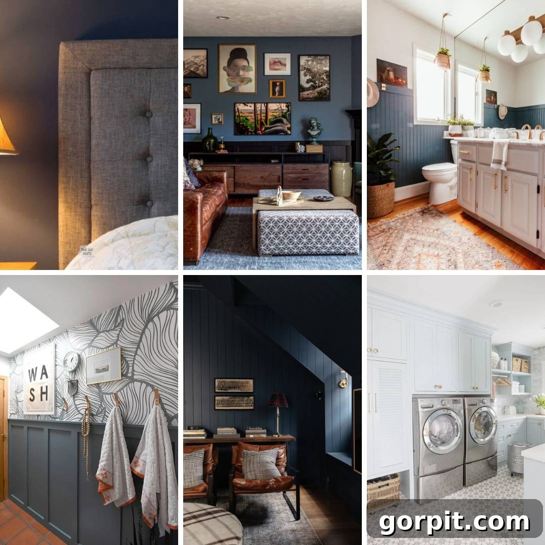
Benjamin Moore’s Smoke is a stunningly pale blue-gray that brings a delicate coolness and airiness to any room. It’s a testament to bold design choices, as seen in a laundry room where cabinetry painted with Smoke transforms the space. This shade feels wonderfully neutral without resorting to traditional white, offering a refreshing and sophisticated alternative. Its subtle character allows it to pair flawlessly with brass hardware and elegant tiles, creating a polished and cohesive look. Smoke is an excellent choice for those desiring a light, ethereal blue-gray that brightens and expands a space while maintaining a distinct and refined personality.
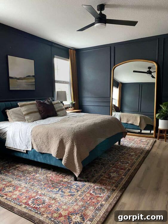
Ink Black by Behr (N490-7) LRV 7
Despite its name, Behr’s Ink Black is a magnificently moody dark blue, softened just enough by a whisper of gray to create a truly captivating hue. With an LRV of 7, it’s profoundly dark, establishing a deep, dramatic backdrop that feels incredibly calming. This color is perfect for cultivating a serene and luxurious atmosphere, especially in a bedroom where relaxation is key. It allows lighter elements, like a giant gold mirror or crisp white bedding, to pop with exquisite contrast. Ink Black offers the boldness of a deep, inky shade while retaining the soothing qualities of blue, making it an ideal choice for creating a sophisticated and tranquil retreat.
Indigo Batik by Sherwin-Williams (SW 7602) LRV 8
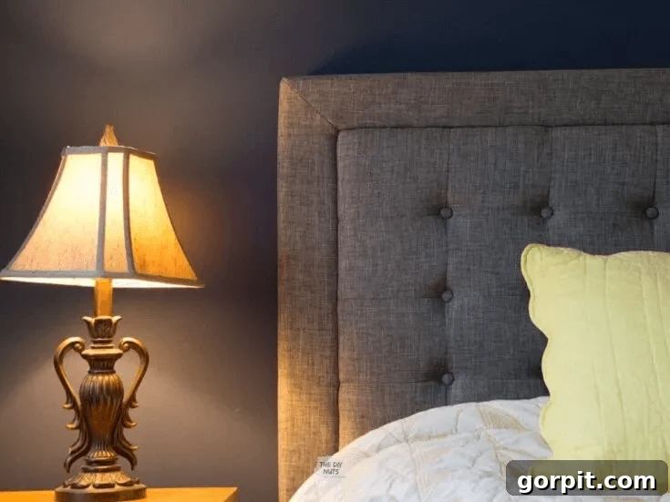
Sherwin-Williams’ Indigo Batik offers the richness of navy but with a slightly lighter touch, making it an excellent choice for those who desire a dark blue room without committing to the most dramatic end of the spectrum. With an LRV of 8, it still provides substantial depth and contrast, creating an impactful yet wonderfully livable environment. This hue pairs beautifully with softer elements, such as a gray upholstered headboard and bright accent pillows, which stand out elegantly against its deep tone. Indigo Batik is a go-to for designers seeking a sophisticated blue that exudes classic charm and offers plenty of visual interest without feeling overwhelming.
Stiffkey Blue by Farrow and Ball (281) LRV 10
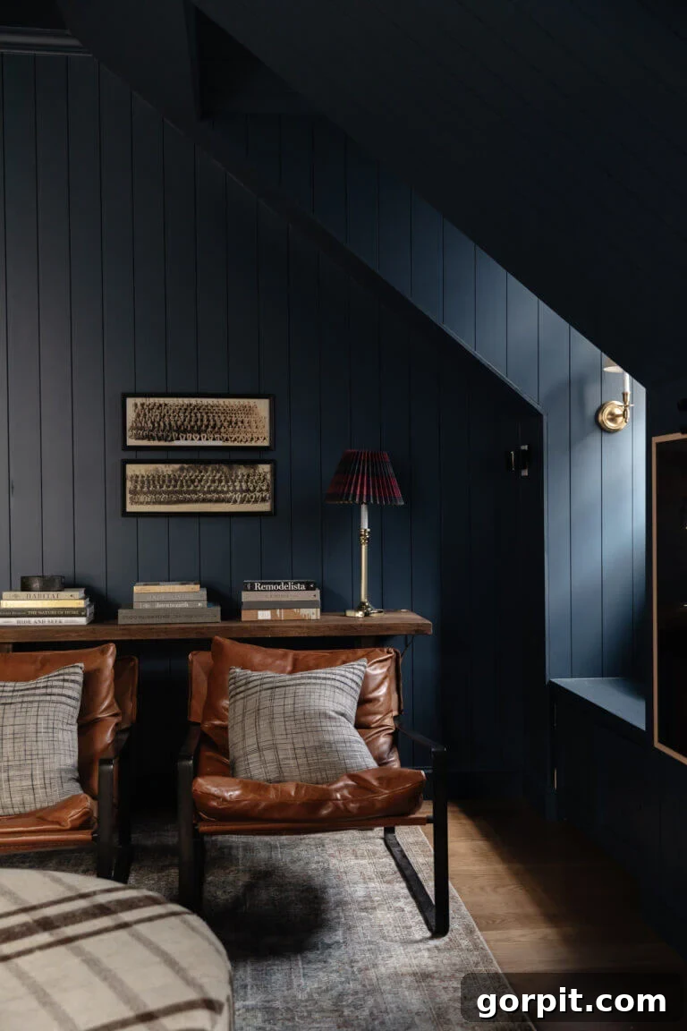
Stiffkey Blue by Farrow and Ball embodies moodiness and sophistication in every brushstroke. With a low LRV of 10, this rich navy embraces darkness beautifully, creating an enveloping atmosphere that feels both luxurious and intimate. Its dramatic impact is showcased wonderfully in a bonus room where every surface—walls, trim, and even the ceiling—is drenched in this deep hue. This bold design choice magnifies architectural details like paneling, dormers, and window nooks, transforming them into striking features. Stiffkey Blue’s intense presence, balanced with neutral furnishings, proves that daring with dark blues can result in an extraordinarily elegant and memorable space.
Smoky Blue by Sherwin-Williams (SW 7604) LRV 15
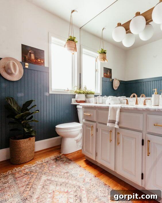
Sherwin-Williams’ Smoky Blue is a captivating and dramatic color that borders on a deep teal, distinguished by its subtle smoky green undertones. With an LRV of 15, this hue offers significant depth and a unique character that makes it a fantastic choice for creating a striking visual impact. It performs beautifully in a bathroom setting, where it forms an exquisite backdrop for crisp whites and natural neutrals, enhancing their brightness and freshness. Smoky Blue is perfect for those seeking a rich, atmospheric blue that leans slightly into the green spectrum, providing a sophisticated and somewhat unexpected twist on the classic blue-gray.
Dragonfly by Behr (PPU12-03) LRV 26
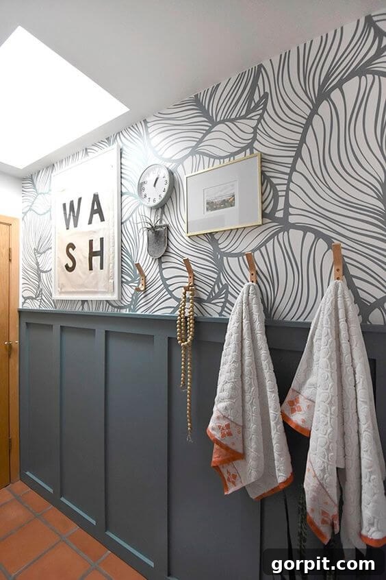
Behr’s Dragonfly is a truly gorgeous teal-blue, boasting an LRV of 26, that became a trending color for good reason. Its bohemian and earthy vibe makes it an exceptional choice for spaces that embrace natural textures and a relaxed aesthetic. This particular shade was perfectly matched with existing wallpaper and complemented the warm terracotta tones of bathroom tiles that needed to remain. Dragonfly demonstrates how a vibrant blue-gray can integrate seamlessly into a room, providing both depth and a lively character. It’s ideal for bringing a touch of nature-inspired color and a contemporary feel to your home, proving that blue-gray can be both bold and harmonious.
Decorating Tips for Blue-Gray Paint Colors
Once you’ve chosen your perfect blue-gray shade, consider these decorating tips to maximize its impact. Blue-gray pairs beautifully with a variety of accent colors. For a serene look, combine it with crisp whites, creamy off-whites, or other muted grays. To add warmth, introduce natural wood tones, leather, or accents in soft blush, muted gold, or even subtle coral. Metallic finishes like brushed brass or warm bronze can elevate the sophistication, while cool silvers or chromes complement its inherent coolness. Texture is also key: think cozy knit throws, linen curtains, or jute rugs to add depth and tactile appeal. Incorporate greenery through plants to bring life and vibrancy, enhancing the natural feel of the blue-gray. The beauty of blue-gray lies in its ability to serve as a versatile foundation, allowing you to layer different styles and elements to create a truly personalized space.
Common Mistakes to Avoid When Choosing Blue-Gray Paint
While blue-gray is incredibly forgiving, certain pitfalls can derail your design. The most common mistake is failing to test samples in your actual home and lighting conditions. A color swatch in a store looks vastly different under your unique lighting, which can vary from room to room, and even between walls within the same room. Another error is neglecting your existing furnishings and fixed elements. Your flooring, upholstery, and trim colors all have undertones that will interact with your chosen paint. Be mindful of the specific undertones in the blue-gray itself – some lean greener, others purpler. Ignoring these subtle shifts can lead to a color clash rather than a harmonious blend. Lastly, don’t be afraid to go bold or stay subtle; a blue-gray can be anything from a barely-there whisper to a deep, dramatic statement, so choose a depth that genuinely suits the mood and function of the room.
I sincerely hope this comprehensive guide to beautiful blue-gray paint colors helps you discover the ideal shade for your home. These hues offer a unique blend of calm, sophistication, and versatility, making them a fantastic choice for almost any interior space. If blue-gray isn’t quite the right fit, but you still crave the depth and elegance of blue, consider exploring these stunning navy blue paint colors, which can also act as a surprisingly chic neutral in your home!
More Paint Color Inspiration
SEE ALL PAINT POSTS
-
The Best Neutral Paint Colors for Kitchen Cabinets
-
Benjamin Moore Swiss Coffee- Is it Right For You?
-
Samplize Peel & Stick Paint Samples: An Unbiased Review
-
Sherwin Williams Pure White SW7005 Paint Review With Pictures
-
Navy Blue Paint Colors Designers Love
-
Beautiful Blue Paint Colors Designers Love & Use
Other Posts You May Enjoy
- How to Choose Paint Colors for Your Home: 6 Simple Tips to Follow
- How to Match a Paint Color That’s Already On a Wall
- A Paint Sheen Guide & Reference Chart
Curious about my personal approach to transforming rooms and spaces within our home? Explore Designer in a Binder® for an organized and efficient way to tackle your interior design projects.
For exclusive content, behind-the-scenes glimpses, and the latest design inspiration delivered straight to your inbox, be sure to subscribe to our newsletter before you go!