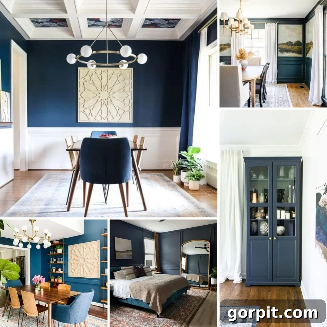
Ever wondered about the enduring appeal of navy blue in interior design? It’s a color that consistently captures the imagination of designers and homeowners alike, offering a unique blend of style, sophistication, and dramatic flair without the starkness often associated with black. Like a dependable pair of dark wash jeans, navy blue effortlessly complements a vast array of colors and textures, making it an incredibly versatile choice for any space.
However, the quest for the “perfect” navy paint color is an exploration, not a single destination. Every shade of navy possesses its own distinct personality, capable of transforming a room in myriad ways. From the deep intensity of classic navy to the subtle elegance of muted dark blue or the almost-black allure of inky blue, discerning the nuances is key. This comprehensive guide will navigate the best navy blue paint colors from leading paint companies, helping you discover the ideal hue to elevate your home.
Table of Contents
Benjamin Moore Navy Blue Paint Colors
Benjamin Moore is renowned for its rich and sophisticated color palette, and their navy blue offerings are no exception. These shades are celebrated for their depth and ability to create a truly luxurious ambiance in any setting.
Polo Blue by Benjamin Moore
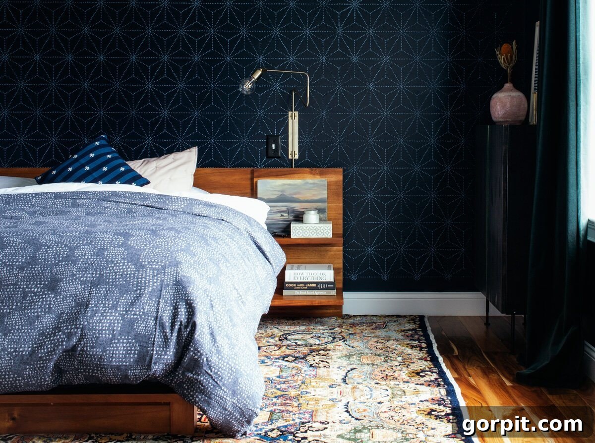
Imagine a bedroom transformed into a serene sanctuary, where dark, moody blue walls meet an unexpected touch of lightness. That’s precisely the magic of Benjamin Moore’s Polo Blue. This deep, rich navy instills an immediate sense of calm, making it an ideal choice for a bedroom where relaxation is paramount. Designer Brianna elevated this classic shade by incorporating a subtle light blue stencil, preventing the dark walls from feeling too enclosed or “cave-like.” The stencil introduces a delicate contrast, allowing the room to breathe while maintaining its tranquil depth. Polo Blue offers a timeless elegance, working beautifully with crisp whites, warm woods, and even metallic accents to create a truly sophisticated space. It’s particularly stunning in rooms with ample natural light, which allows its complex undertones to truly shine throughout the day.
Hale Navy by Benjamin Moore
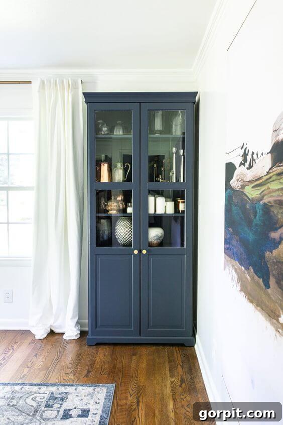
Navy blue isn’t confined to just walls; its versatility extends to furniture, cabinetry, and even exterior elements. Benjamin Moore Hale Navy stands as a testament to this adaptability, often hailed as one of the most beloved navy shades. With its distinctly softer character and subtle gray undertones, Hale Navy offers a sophisticated alternative to bolder blues. Lauren, for instance, masterfully used Hale Navy on an IKEA cabinet in her dining room, breathing new life into a standard piece of furniture. For those contemplating painting laminate furniture, there are effective tricks that make the process surprisingly easy. In Lauren’s dining room, this particular navy shade beautifully accentuates the various blues present in her artwork and area rug, tying the entire space together with a cohesive and elegant touch. Its muted quality makes it incredibly forgiving, appearing vibrant in bright light and deeply rich in dimmer settings, making it perfect for both accent pieces and entire room transformations.
Sherwin-Williams Navy Paint Colors
Sherwin-Williams offers a compelling range of navy blues, each designed to evoke a distinct mood and style. These colors are favored by designers for their consistent quality and ability to deliver impactful results, from dramatic statements to subtle sophistication.
Moscow Midnight by Sherwin-Williams
For those seeking a truly luxurious and enveloping atmosphere, Sherwin-Williams’ Moscow Midnight offers an unparalleled depth. Zoe at Pine and Poplar skillfully employed this shade as a striking backdrop, allowing the natural wood tones of her decor and bed to dramatically pop. This dark navy blue possesses a velvety quality, reminiscent of rich fabric, creating an instant sense of opulence. It’s an exceptional choice for a bedroom, transforming the space into a cozy, womb-like haven perfect for deep relaxation and restorative sleep. The intense saturation of Moscow Midnight ensures that any lighter elements or textures within the room will stand out with stunning clarity, making it a powerful tool for contrast in interior design. Consider pairing it with brushed brass or gold accents to enhance its inherent luxury, or with crisp white linens for a classic, sophisticated look.

Gale Force by Sherwin-Williams
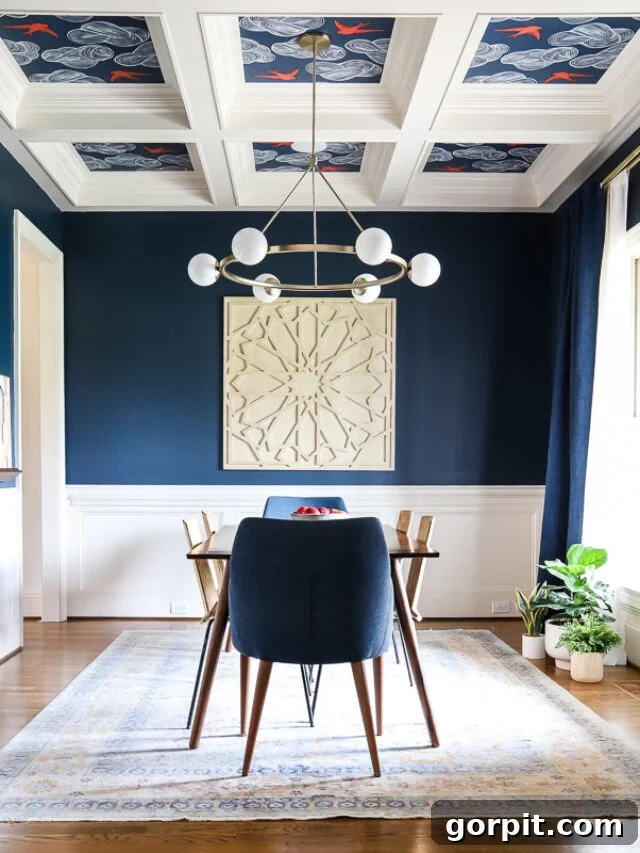
When searching for a truly rich, deep, and authentic navy, Sherwin-Williams’ Gale Force emerges as a top contender. For my own navy blue dining room, after sampling numerous hues, Gale Force was the clear victor. Its undeniable depth and bold character create a stunning focal point, ideal for spaces where you want to make a strong visual statement. This gorgeous dark blue doesn’t shy away from being a true navy, offering a classic nautical feel without being overly thematic. It has just the right amount of intensity to feel substantial and inviting, making it excellent for dining rooms, studies, or accent walls. The color holds up beautifully in various lighting conditions, often revealing subtle nuances as the day progresses. Paired with crisp white trim, it creates a striking contrast that is both elegant and timeless, providing a perfect backdrop for artwork or sophisticated furnishings.
Indigo Batik by Sherwin-Williams
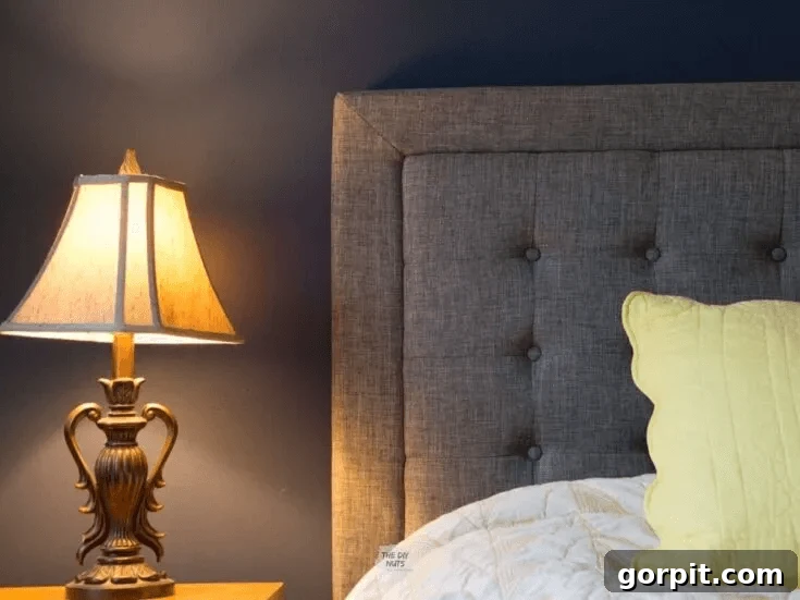
If the idea of a dark blue room is appealing but the thought of going “too dark” feels daunting, Sherwin-Williams’ Indigo Batik offers a perfect middle ground. This lighter navy provides ample contrast and depth without the dramatic intensity of its darker counterparts. It’s an excellent choice for those who desire a distinct blue statement but prefer a slightly softer aesthetic. Indigo Batik maintains a sophisticated presence, making it suitable for entire rooms, from bedrooms to living areas. I particularly appreciate how beautifully it harmonizes with the soft gray of a headboard, as seen in the example, creating a cohesive and calming visual. Its balanced hue makes it adaptable to various decor styles, from modern minimalist to classic coastal. This shade can also be an ideal choice for smaller rooms where a darker navy might feel overwhelming, providing a sense of expansiveness while still delivering rich color.
Behr Navy Blue Paint Colors
Behr offers budget-friendly yet impactful navy blue paint options that deliver stunning results. Their range includes nuanced shades that can transform spaces with sophistication and charm.
Ink Black by Behr
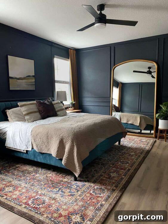
Don’t let the name mislead you – Behr’s Ink Black is a truly captivating dark blue, not black, featuring just the right whisper of gray to soften its intensity. For those who adore blue-gray paint colors, this shade is an absolute dream. It strikes a perfect balance, offering the drama of a deep hue with the subtle tranquility of gray. Amanda beautifully leveraged Ink Black in her bedroom to cultivate a calming, moody vibe, setting an ideal atmosphere for sleep and total relaxation. This color is exceptional for creating a cocoon-like feel, providing a rich backdrop that allows brighter elements, like golden mirrors or light bedding, to pop with elegance. Its deep, almost inky quality makes it a fantastic choice for accent walls, studies, or any space where you want to evoke a sense of quiet sophistication and introspection. It pairs wonderfully with natural textures and warm lighting.
Midnight in the Tropics by Behr
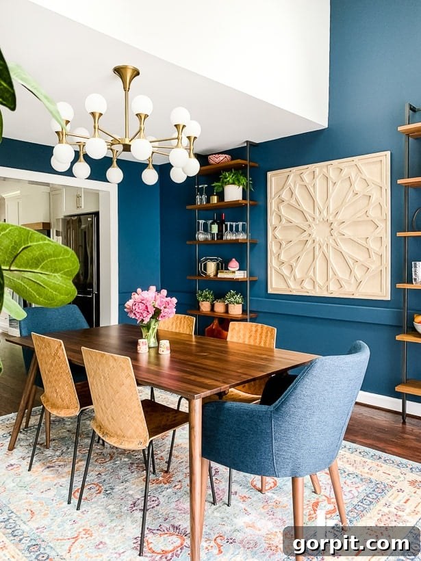
During a complete kitchen renovation in my old house, the newly opened dining room presented a wonderful opportunity to create the eclectic navy dining room of my dreams. The star of this transformation was Behr’s Midnight in the Tropics, a dark blue with remarkable depth and a subtle hint of green that truly makes it special. This particular shade was ideal for us, especially with the abundant natural light streaming through our windows, which allowed its complex undertones to shift beautifully throughout the day. The hint of green prevents it from feeling stark, adding a unique richness and a touch of the unexpected. It looked absolutely stunning against all the crisp white trim, creating a vibrant yet sophisticated contrast. Midnight in the Tropics is perfect for spaces that benefit from a deep, inviting color, whether it’s a dining room designed for lively gatherings or a cozy living area where comfort is key.
Other Remarkable Dark Blue Paint Colors
Beyond the major brands, independent paint companies and specialty lines offer unique dark blue shades that can bring distinctive character and artisanal quality to your interiors. These hidden gems are often worth exploring for their nuanced formulations and rich finishes.
Stiffkey Blue by Farrow and Ball
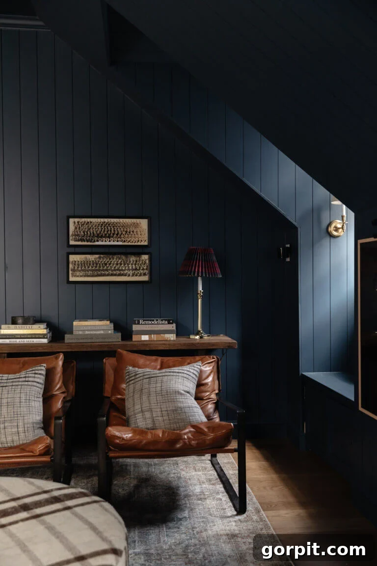
Farrow and Ball’s Stiffkey Blue embodies dark and moody elegance in all the right ways. Known for its intense, inky depth, this shade creates an atmosphere of unparalleled sophistication. The team at Chris Loves Julia bravely embraced this rich navy, painting every inch of their bonus room—including the trim and ceiling. This bold design choice was a resounding success, highlighting the architectural details of the paneling, dormers, and window nooks with striking clarity. The uniform application of Stiffkey Blue across various surfaces emphasizes the room’s unique structure, turning architectural elements into features rather than fading them into the background. This daring use of a singular, rich blue, complemented by carefully chosen neutrals elsewhere, paid off handsomely, resulting in a cohesive, enveloping, and profoundly stylish space. Stiffkey Blue is particularly captivating in natural light, where its deep tones can appear almost charcoal, while under artificial light, it exudes a more intense blue, offering dynamic visual interest throughout the day.
Blue Ridge Parkway by RomaBio Mineral Paints
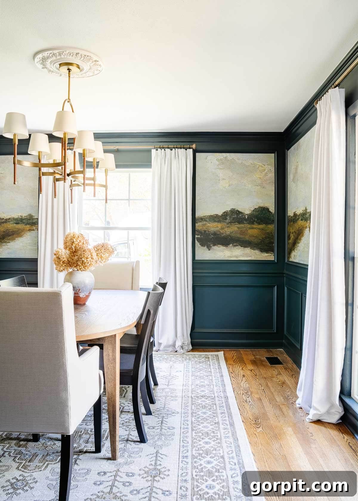
For a dining room makeover that truly elevates the space, consider the transformative power of RomaBio’s Blue Ridge Parkway. Lauren achieved a high-end designer look by combining this beautiful dark blue paint with peel-and-stick landscape murals and elegant molding. The result is a stunning blend of classic and contemporary, showcasing how different elements can work in harmony to create a cohesive and dramatic aesthetic. Blue Ridge Parkway offers a robust and earthy dark blue, making it an excellent choice for creating depth and character. When paired with a large-scale mural, as seen in this example, the paint serves as a grounding force, allowing the more intricate details of the wallpaper to shine without overwhelming the space. This combination is particularly effective for those looking to create a feature wall or a room with distinct visual interest, providing a sophisticated backdrop that complements artistic expressions while maintaining an elegant foundation. The choice of a mineral paint also contributes to a unique, soft matte finish that adds to the overall luxurious feel.
These navy blue shades are undeniably gorgeous, each possessing its own unique charm and ability to transform a space. But the world of blue paint extends far beyond just navy! If you’re captivated by the broader spectrum of blue, I encourage you to delve into my article, Beautiful Blue Paint Colors Designers Love & Use. This guide explores everything from barely-there whispers of blue and sophisticated blue-gray shades to bold royal blue options and refreshing blue-greens, ensuring you find the perfect blue for any design vision.
When selecting your ideal navy blue, careful consideration is crucial. Always remember to sample your chosen hues on different walls and observe them at various times of day. Natural and artificial light dramatically impact how a color appears, especially during the hours you spend most in the room. I personally found Samplize peel-and-stick samples to be an absolute game-changer a few years ago – they simplify the sampling process immensely! Additionally, for comprehensive guidance, be sure to read How to Choose Paint Colors for Your Home: 6 Simple Tips to Follow! This article is packed with practical ideas and expert advice that will demystify the process of selecting the perfect blue hues for your home.
Furthermore, don’t limit your imagination to just walls when envisioning how to incorporate your favorite dark blue paint colors! Think creatively and explore unconventional applications. A deep navy can make a dramatic statement on your front door, offering a welcoming yet sophisticated entrance. It can transform ordinary kitchen cabinets into stylish focal points, or even be used as an unexpected and elegant trim color, providing a fresh alternative to traditional white. In our old house, all of my interior doors were painted navy, a choice that remains one of my favorite upgrades, significantly enhancing the look and feel of our home. Blue is incredibly versatile; the key is to choose the shade that resonates most with your personal style and design aspirations.
More Inspiring Paint Posts
SEE ALL PAINT POSTS
-
The Best Neutral Paint Colors for Kitchen Cabinets
-
Benjamin Moore Swiss Coffee: Is it Right For You?
-
Samplize Peel & Stick Paint Samples: An Unbiased Review
-
Sherwin Williams Pure White SW7005 Paint Review With Pictures
-
Navy Blue Paint Colors Designers Love: Revisited
-
Beautiful Blue Paint Colors Designers Love & Use
Additional Home Decor Insights:
- A Paint Sheen Guide & Reference Chart
- 5 Tips to Decorate With Color (Even When It Scares You)
- Sherwin-Williams Pure White Color Review with Pictures
- Best Furniture Painting Secrets
- Benjamin Moore Swiss Coffee: Is it Right For You?
- How to Match A Paint Color That’s Already On A Wall
Curious about my personal approach to transforming rooms and spaces within our home? Discover the strategies and insights in Designer in a Binder®, your affordable and simple guide to decorating with confidence.
For exclusive content, behind-the-scenes glimpses, and the latest design inspiration, be sure to subscribe to our newsletter before you leave!