As a self-proclaimed lover of vibrant colors, I often hear surprise and even a touch of disappointment from many of you when you learn about our decision to install neutral kitchen cabinets. However, let me assure you: our kitchen will be anything but bland! I am incredibly excited to share all the intricate design details and the thoughtful rationale behind our choices in this post. My aim is to give you a clear understanding of our creative process, whether you’re simply curious about our kitchen design plans or actively seeking inspiration for adding captivating color to your own neutral kitchen. You’ve definitely landed in the right place.
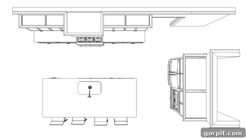
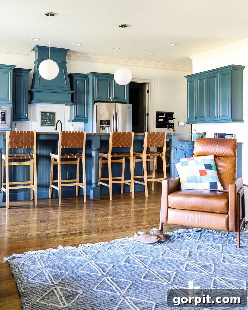
For those who might have missed it, I previously delved into all the compelling reasons that led us to undertake a complete kitchen renovation. In that comprehensive post, I also outlined the significant functional transformations we’re implementing, alongside the initial renderings for our revamped kitchen. So many of you expressed eager anticipation, saying things like, “I can’t wait to see the changes! I hope it’s as colorful as your current kitchen.” Indeed, many of you adored the striking blue hue I selected for the cabinets during our budget-friendly kitchen makeover, a project I tackled almost four years ago. That particular shade remains one of my all-time favorite blue paint colors, and I absolutely cherished it, as you can witness in the photograph below.
The Unexpected Twist: Embracing a Neutral Palette for Kitchen Cabinets
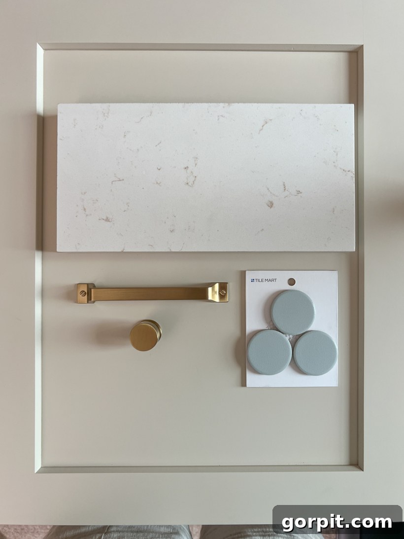
Given my reputation for embracing bold colors, it’s no wonder that when I unveiled the chosen color for our new kitchen cabinets on Instagram, a collective gasp of shock rippled through my followers. We opted for Accessible Beige by Sherwin Williams, a truly versatile and sophisticated neutral that happens to be one of my top picks for kitchen cabinetry. Complementing this, we selected this exquisite light-blue oversized penny tile for the backsplash, a choice that, while charming, is far from a bold, in-your-face color statement. Consequently, the overwhelming question from many of you has been: “Is your new kitchen going to be entirely neutral?”
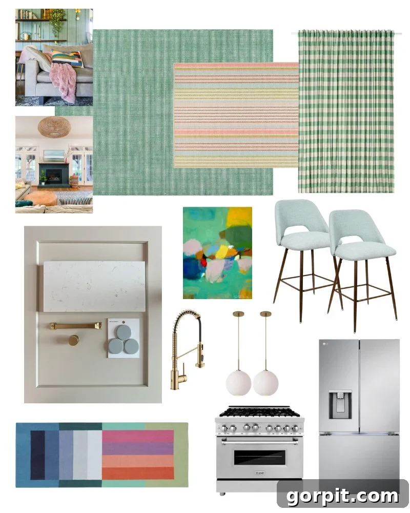
The emphatic, resounding answer is an absolute NO! While the foundational elements of our new kitchen design embrace a neutral backdrop, the overall plan is undeniably vibrant and full of personality. The magic, you see, lies in how we will introduce the majority of the color: through strategically layered elements such as exquisite rugs, stylish curtains, and captivating artwork. If you’ve been following my design journey for any length of time, you likely already know that almost all of our home’s walls are painted Pure White by Sherwin Williams. This isn’t an accident; it’s a deliberate choice because I adore how our dynamic, colorful decor and curated art pieces truly POP against such a clean, neutral canvas. This very same design philosophy is precisely what we are aiming for in our new kitchen. By keeping the fixed elements neutral, we create a timeless, adaptable foundation that allows us to effortlessly inject character, warmth, and an ever-evolving spectrum of colors through easily changeable decor items. This approach ensures our kitchen remains fresh, personalized, and reflective of our evolving tastes without committing to permanent, bold fixtures.
The Power of a Neutral Base: Longevity and Versatility in Kitchen Design
Choosing neutral cabinets for our kitchen design, despite my love for color, was a strategic decision rooted in the principles of timelessness and versatility. Unlike the bold blue cabinets of our previous kitchen, which, while beautiful, undeniably commanded attention, a neutral shade like Accessible Beige provides a serene and sophisticated foundation. This allows us the ultimate freedom to experiment with trends and seasonal palettes through less permanent elements. Neutral cabinets are not only incredibly adaptable, complementing virtually any style from modern farmhouse to transitional, but they also contribute significantly to the long-term value and appeal of our home. Should our tastes evolve, or if we decide to sell in the future, a neutral kitchen offers broad appeal, making it a wise investment. This philosophy echoes our preference for Pure White walls throughout the rest of our home; it creates a consistent, cohesive flow and a perfect stage for our carefully chosen colorful accents to truly shine.
How to Infuse Vibrant Color into Your Neutral Kitchen
The beauty of a neutral kitchen lies in its boundless potential for personalization and dynamic shifts through thoughtful decor. Here’s how we plan to layer color into our space, and how you can too:
1. Dynamic Area Rugs
Rugs are often overlooked in kitchen design, but they are incredibly powerful tools for adding color, pattern, and texture. In a kitchen, a durable, washable rug can define zones, add warmth to hard flooring, and instantly elevate the aesthetic. We’ll be incorporating colorful area rugs to introduce vibrant hues and intricate patterns, transforming the feel of the space. Consider a runner in front of the sink or a larger rug under a kitchen island to anchor the area and inject personality.
2. Elegant Curtains and Window Treatments
Curtains bring softness and a vertical splash of color to any room, and the kitchen is no exception. They can frame a window beautifully, add privacy, and tie into your overall color scheme. We’ve chosen green check curtains to introduce a refreshing natural tone and a subtle pattern that complements our chosen palette. These can be easily swapped out to refresh the look of your kitchen with minimal effort.
3. Captivating Artwork
Art is a personal expression and a fantastic way to introduce color and character. Whether it’s a large statement piece or a curated gallery wall, artwork can instantly draw the eye and infuse the space with your unique style. We’re excited to feature an abstract art print by Eleanor Scott Davis, which will serve as a focal point and a vibrant source of inspiration in our kitchen. Art is also one of the easiest elements to change, allowing for endless possibilities in evolving your kitchen’s colorful narrative.
4. Thoughtful Accessories and Styling
The smaller details often make the biggest impact. Think about colorful serving bowls, decorative trays, artisan pottery, or even a collection of brightly hued cookbooks on open shelves. Fresh flowers or potted herbs in vibrant planters can add life and natural color. Even functional items like dish towels and small appliances can be chosen in colors that enhance your desired scheme. These are low-commitment ways to play with color and add layers of interest to your neutral kitchen. Our counter stools, for example, will not only offer comfortable seating but also contribute to the overall aesthetic with their design and texture.
5. Illuminating Pendant Lights
While often chosen for their material and shape, pendant lights can also contribute to the color story, even if subtly. Our pendant lights will provide essential task lighting while adding a stylish element that complements the overall design. Consider fixtures with colored glass or metal finishes that resonate with your chosen palette.
A Detailed Explanation of Our Kitchen Design and Mood Board
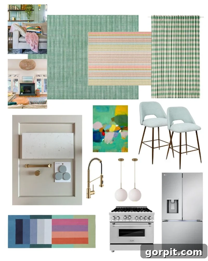
I encourage you to understand the meticulous thought process behind our kitchen design, particularly how the plans and accompanying mood board truly came to life. Creating a mood board is an essential step in any successful design project, acting as a visual roadmap that ensures every element works in harmony. I have an entire post dedicated to teaching you how to make a mood board effectively if you’re interested in mastering this invaluable tool. As I do with every space I design in our home, I leveraged my proprietary Designer in a Binder® system. This comprehensive method streamlines the entire design process, making the journey of developing a truly cohesive design plan not only easy but also incredibly enjoyable and rewarding. It’s how we ensure that every choice, from the largest appliance to the smallest accessory, aligns with our overarching vision for a neutral yet vibrant kitchen.
This post contains affiliate links for your convenience. Click here for my full disclosure policy.
Our New Kitchen Sources: Curated Elements for a Colorful Foundation
As I often mention, some cherished items, like our unique colorblock runner, have been with us for many years and are unfortunately no longer available for purchase. However, I’ve made every effort to link to as many of the key sources as possible below, so you can easily replicate or draw inspiration from our selections for your own colorful kitchen transformation!
- Green check curtains (also available here on Amazon) – Adding a refreshing natural accent to the windows.
- Green area rug – Introducing warmth and defining the kitchen’s functional zones.
- Ticking stripe area rug – A subtle pattern that adds texture and depth without overwhelming.
- Colorblock runner (no longer available – we purchased it years ago from West Elm) – A vibrant piece that inspired much of our layered color approach.
- Pendant lights – Stylish fixtures that provide essential lighting and aesthetic appeal.
- Counter stools – Combining comfort with design to complement the kitchen island.
- Faucet, hardware and more – The essential functional and decorative details that tie the design together.
- Abstract art print by Eleanor Scott Davis – A key artistic statement bringing vibrant color and personality.
- Light blue oversized penny tile – A soft, sophisticated backsplash choice that adds subtle color and texture.
- Countertop: Quartz Aspen Gold – A durable and elegant surface choice, providing a luxurious yet practical workspace.
- Cabinet color: Accessible Beige by Sherwin Williams – Our chosen neutral foundation for timeless style.
- Counter-depth refrigerator – A sleek, space-saving appliance that integrates seamlessly into the kitchen’s flow.
- 36-inch Dual Fuel Range – A high-performance cooking appliance, combining gas cooktop and electric oven for versatile culinary experiences.
Bringing the Vision to Life: A Truly Colorful Neutral Kitchen
So there you have it! I truly hope this detailed explanation allows you to fully grasp the vibrant and colorful vision I hold for our kitchen, even with its fundamentally neutral “bones.” This approach proves that a neutral foundation doesn’t equate to a lack of character or color; rather, it provides the perfect canvas for artistic expression and allows the more playful elements to truly shine. We believe this strategy creates a kitchen that is both timeless and deeply personal, offering endless possibilities for refreshing its look with ease. Be sure to follow along in my Instagram stories for daily updates and behind-the-scenes peeks at our renovation progress. You can also catch up on all the journey so far in my dedicated kitchen plan and kitchen reno highlight bubbles. Stay tuned for the final reveal – we are excitedly anticipating the completion of the renovation by the end of September!
MORE INTERIOR DESIGN TIPS
SEE ALL design & decorating posts
-
6 Tips for Decorating With Color When You Are Used to Neutrals
-
Space Planning Basics: How to Create a Space Plan
-
The Dos and Don’ts of Using Area Rugs on Carpet
-
How To Make a Mood Board: A Step-By-Step Guide
-
How to Choose Paint Colors for Your Home: 5 Simple Tips to Follow
-
Interior Trim Color Ideas (That Aren’t White)
Are you curious about my systematic approach to transforming rooms and spaces throughout our home? Discover the power of Designer in a Binder® – your guide to creating beautiful, cohesive spaces with ease.
For exclusive content, behind-the-scenes sneak peeks, and fresh design inspiration delivered straight to your inbox, be sure to subscribe before you go!