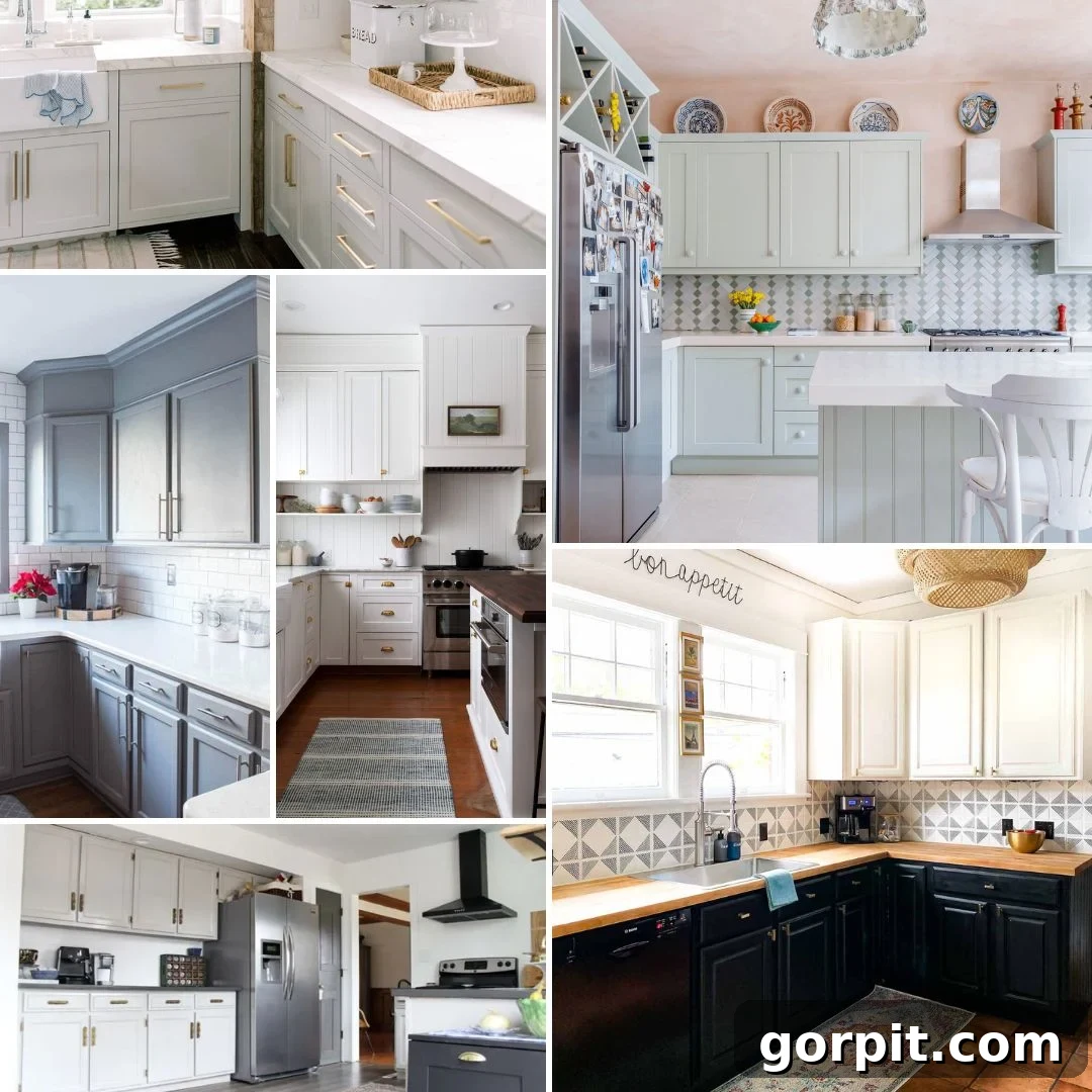
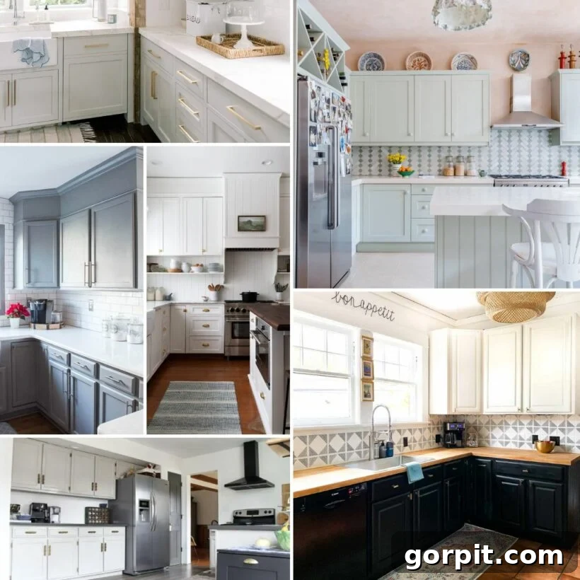
The kitchen, often hailed as the true heart of any home, deserves a cabinet color that not only reflects your personal style but also stands the test of time. While bold and vibrant hues have their moment, neutral paint colors remain an enduring choice for kitchen cabinets, and for very good reason. Their unparalleled versatility and timeless elegance make them a favorite among both designers and homeowners alike. Whether your goal is to infuse your culinary space with comforting warmth, sophisticated charm, or a fresh, airy ambiance, the spectrum of neutral shades offers a perfect solution. From crisp whites and soft beiges to versatile greiges and classic grays, these popular choices provide a foundational palette that can seamlessly adapt to evolving decor trends and personal tastes.
This post contains affiliate links for your convenience. Click here for my full disclosure policy.
Popular White Paint Colors for Kitchen Cabinets
White cabinets are a perennial favorite in kitchen design, offering a bright, clean, and expansive feel. They are incredibly versatile, serving as a blank canvas for various design styles, from modern minimalist to rustic farmhouse. White can make a smaller kitchen feel larger and more inviting, reflecting light and creating an airy atmosphere. However, “white” is far from a single shade; it encompasses a vast range of undertones that can lean warm or cool, creamy or stark. Choosing the right white involves considering the natural light in your kitchen and the existing elements like countertops and flooring.
Simply White by Benjamin Moore
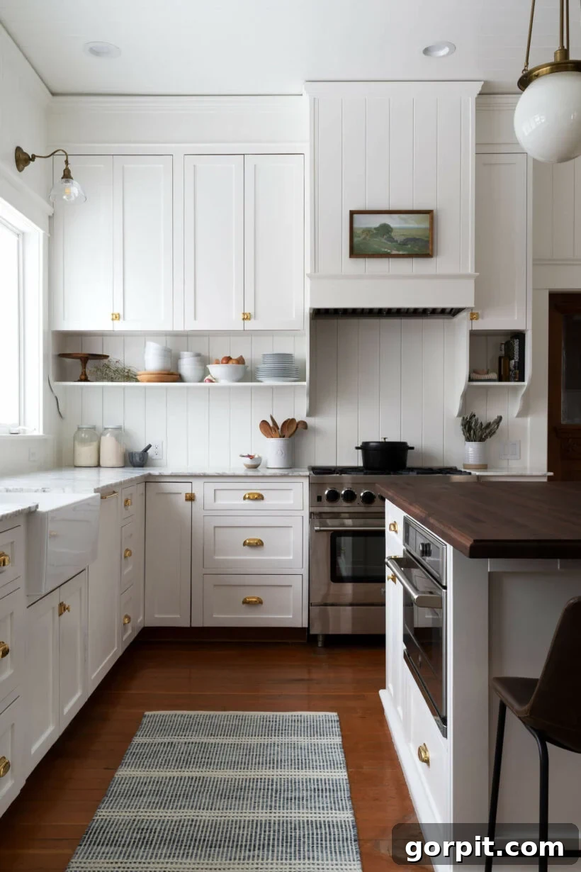
As its name elegantly suggests, Simply White by Benjamin Moore is celebrated for its clean, bright, and universally appealing quality. It’s a designer-favorite for a reason, often chosen for spaces aiming for a fresh yet classic look. This shade is a mild warm white, possessing just a hint of yellow undertone that prevents it from appearing cold or sterile. Instead, it offers a welcoming glow, perfect for creating that quintessential farmhouse feel, as beautifully demonstrated in a remodeled kitchen designed to look original. Its adaptability extends beyond cabinetry; Simply White is an excellent choice for an entire kitchen space, including walls and trim, ensuring a cohesive and harmonious design.
Pure White by Sherwin-Williams
For those envisioning crisp white kitchen cabinets, Sherwin Williams Pure White consistently ranks as a top choice. This highly sought-after white strikes an impeccable balance, presenting as soft and clean without veering into overly stark or cold territory. Its inherent versatility makes it an ideal selection for general interiors as well as a popular cabinet color. Indeed, it was the chosen hue for the cabinets during a total kitchen renovation in our old home, where we cherished its bright and clean aesthetic. Pure White serves as an exceptional backdrop, equally complementing both neutral and vibrant decor schemes, allowing for endless styling possibilities.
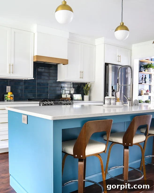
Creamy White by Benjamin Moore
Creamy White by Benjamin Moore introduces a luxurious warmth with its off-white bisque character. This shade beautifully illustrates how contrasting whites can elevate a kitchen’s design. Observing the subtle yet stunning difference between a stark white hood, luminous marble countertops, and the inviting cream-colored cabinets reveals a masterful play on neutral tones. The choice of brass hardware against this warm scheme acts as a perfect accent, adding a touch of elegance and completing a sophisticated neutral palette. It’s a fantastic option for those seeking softness without losing the brightness of white.
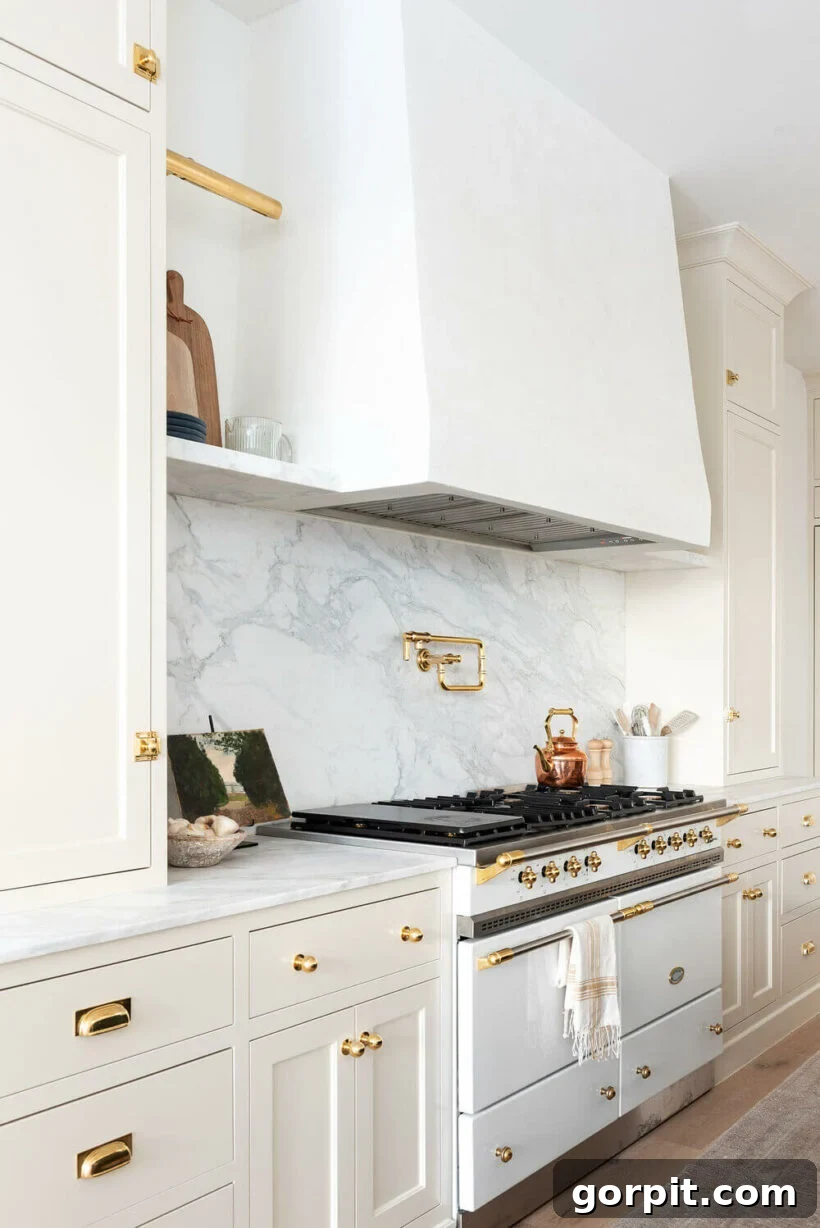
Alabaster by Sherwin Williams
Sherwin Williams Alabaster consistently tops lists of popular white paint colors, and it’s easy to see why. This exquisite, barely-off-white shade offers a softer, warmer alternative to a stark white, thanks to its subtle beige undertones. Its inviting warmth makes it a favored choice for creating cozy and sophisticated spaces. A notable example features this color gracefully applied to both walls and cabinets, yielding a beautifully harmonious effect. Alabaster pairs wonderfully with stainless-steel appliances, contributing to a kitchen that feels both fresh, clean, and endlessly inviting.
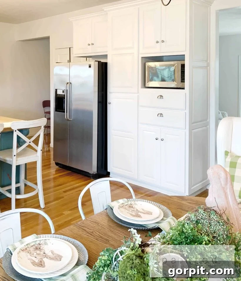
Ivory White by Benjamin Moore
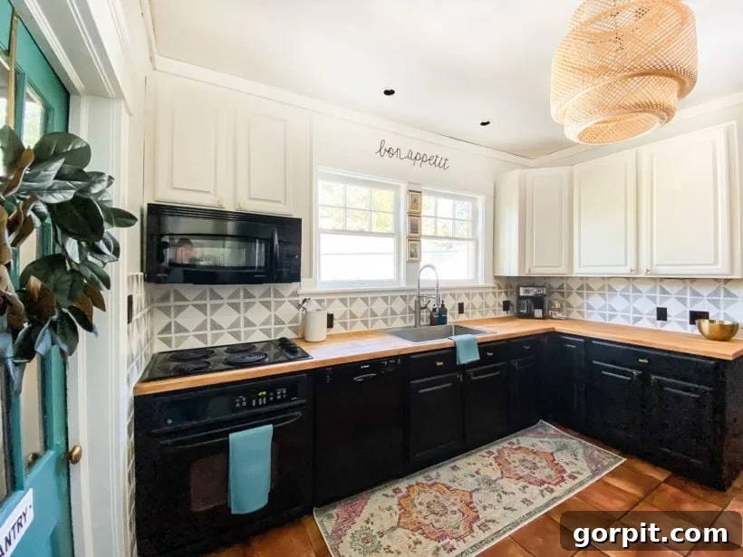
In a charming DIY remodel, Ivory White by Benjamin Moore was selected for kitchen cabinetry, bringing a soft, off-white hue with distinctly warm undertones to the space. This particular shade possesses a faint yellow tint, which gives it a more inviting and less stark character compared to cooler whites. It beautifully complements organic textures such as black iron, rich wood, and natural stone, fostering a charming rustic ambiance. Ivory White is an excellent choice for kitchens seeking warmth and a connection to natural elements, without sacrificing the brightness associated with white cabinetry.
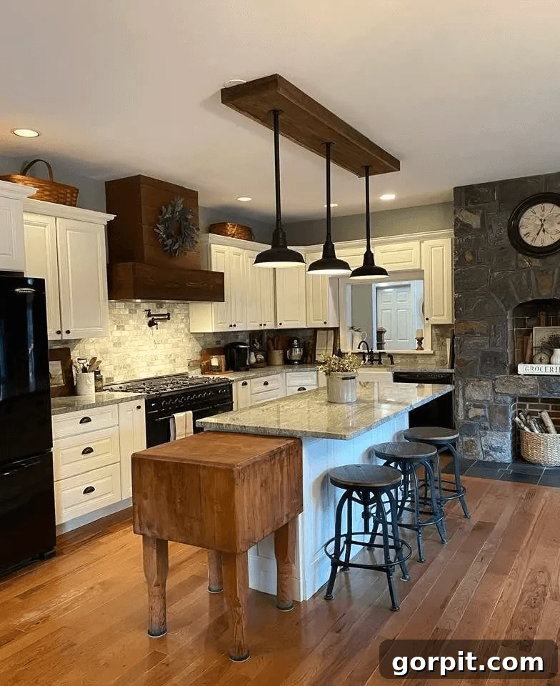
Raw Silk by Fusion Mineral Paint
When undertaking a kitchen makeover for a close friend a few years back, Raw Silk by Fusion Mineral Paint was my confident choice for the upper cabinets. This shade is a remarkably light and creamy off-white that I hold in high regard. It offers a subtle depth that a pure white might lack, providing a soft, almost ethereal quality to the cabinetry. Raw Silk is ideal for creating a gentle contrast with darker lower cabinets or an island, contributing to an inviting and elegant kitchen atmosphere that feels both fresh and sophisticated. Its creamy undertones ensure a welcoming warmth, making it a fantastic option for those who desire a white that feels truly lived-in and comfortable.
Popular Greige and Beige Paint Colors for Kitchen Cabinets
Greige and beige tones have steadily risen in popularity for kitchen cabinets, offering a sophisticated alternative to traditional white. These versatile and timeless neutrals provide more depth and character than pure white, yet remain incredibly adaptable to various design aesthetics. They skillfully bridge the gap between warm and cool, making them a safe and stylish choice that isn’t overly trend-driven. This ensures your kitchen will maintain its appeal for years to come, without the concern of quickly going out of style. Like white cabinets, greige and beige cabinetry are neutral enough to beautifully complement a wide array of color palettes, countertop materials, and hardware finishes, allowing for significant flexibility in your overall kitchen design.
Accessible Beige by Sherwin Williams
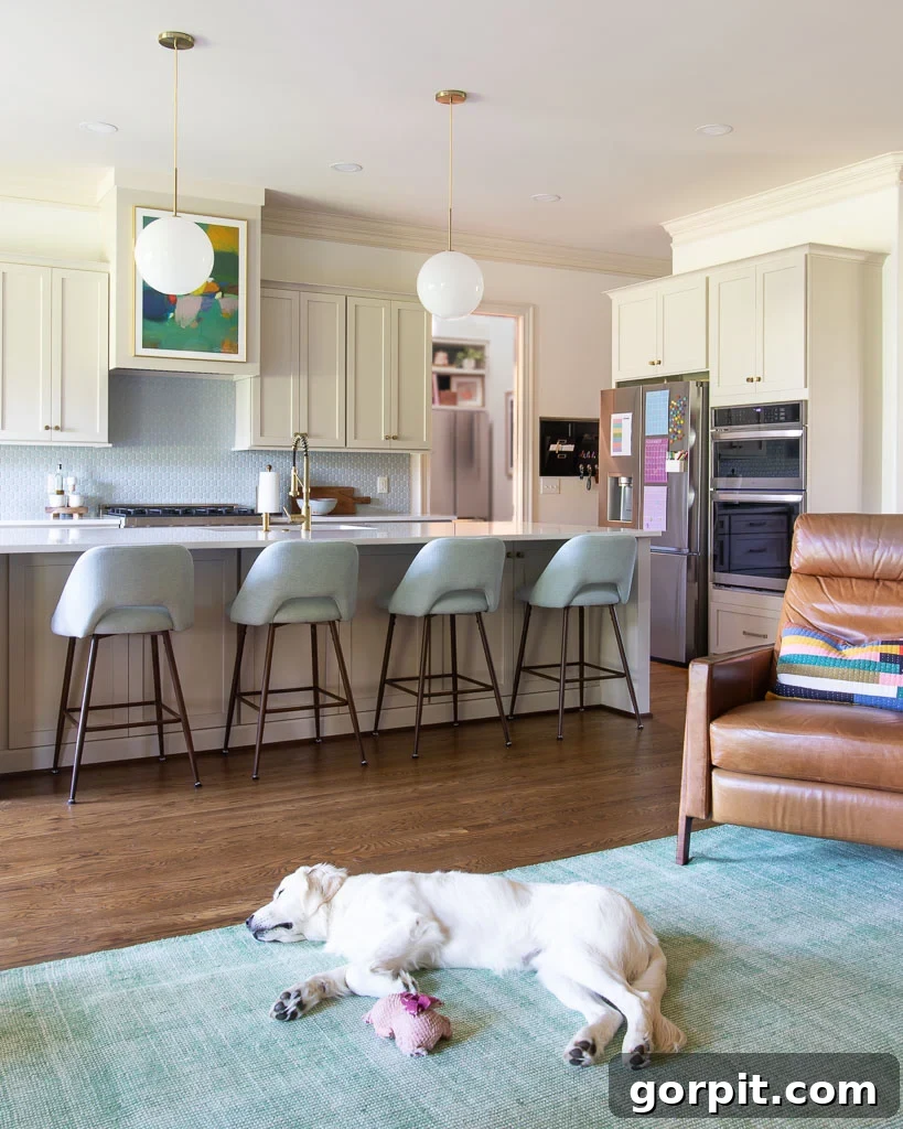
Accessible Beige by Sherwin Williams is a masterclass in balanced neutrality. It offers the ideal amount of warmth and depth, meticulously formulated to be free from unwelcome yellow or orange undertones that can sometimes plague beige hues. Despite its richness, it remains wonderfully light and airy, making it an excellent choice for homeowners who appreciate the brightness of white kitchen cabinets but desire a subtle shift towards something distinctively different. This precise blend of qualities is precisely why we ultimately selected it for the cabinetry in our recent kitchen renovation, a decision that followed months of diligent research and rigorous paint color testing. The image below was instrumental in guiding our choice, showcasing the color’s undeniable charm and turning us on to Accessible Beige – a decision we are incredibly grateful for!
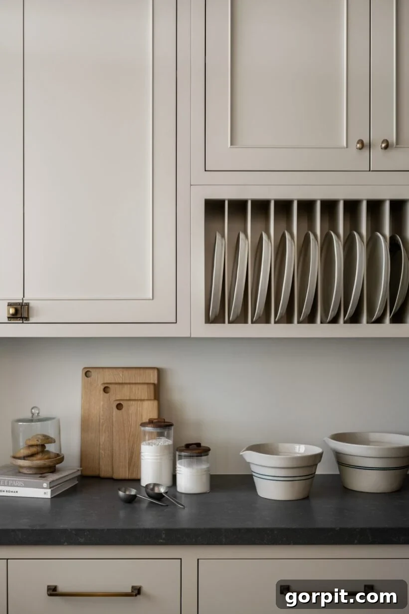
You can observe how Accessible Beige transforms in different settings by comparing the previous image with its appearance on our own kitchen cabinets below. It’s evident that the color takes on a lighter quality in our space. This highlights a crucial point: any paint color’s perceived shade is heavily influenced by lighting conditions, surrounding elements, and even the orientation of your room. This phenomenon underscores the immense importance of testing paint samples directly in your own kitchen across various times of day before finalizing your choice.
Natural Cream by Benjamin Moore
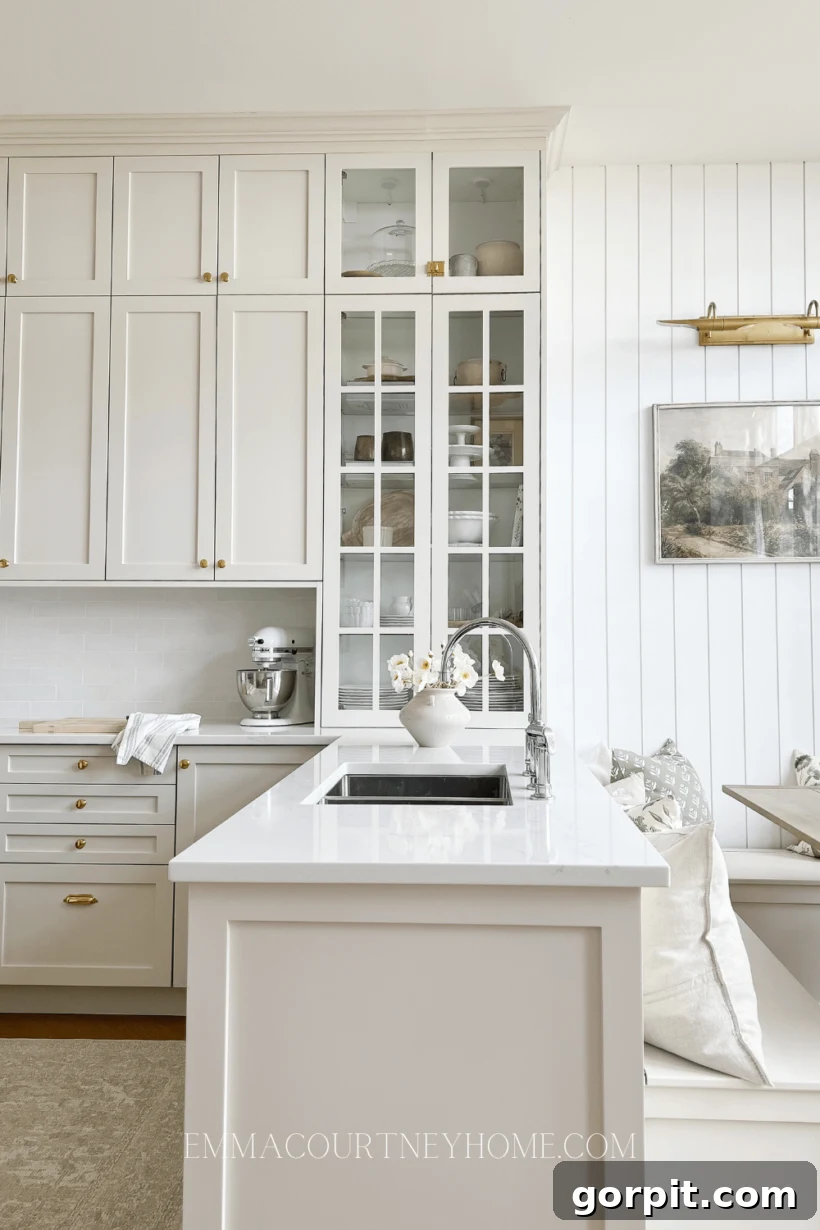
Natural Cream by Benjamin Moore stands out as a soft, sophisticated neutral, frequently lauded by interior designers for kitchen applications. This color is best described as a light greige or beige, delivering a truly beautiful creamy neutral effect. It offers a warmth that is noticeably different from stark whites, creating a more inviting atmosphere for kitchen cabinets. This hue excels when paired with mixed metals, such as brass or bronze hardware, which enhance its inherent warmth. Alongside bright white walls, Natural Cream provides a gentle contrast, offering a harmonious and balanced look that feels both classic and contemporary. It’s a superb choice for homeowners seeking a refined, understated elegance that easily integrates with diverse design elements.
Repose Gray by Sherwin Williams
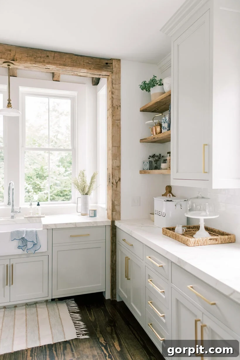
Repose Gray holds its status as one of Sherwin Williams’ most consistently popular colors, and for compelling reasons. Classified as a versatile greige, it presents as a very pale gray with the merest suggestion of a violet undertone. This subtle complexity prevents it from feeling flat or sterile, instead giving it a sophisticated edge. If you’re drawn to the elegance of light gray but find stark white too intense, Repose Gray is an exquisite choice for cabinet color. Its ability to complement a variety of materials is evident in its pairing with luxurious marble counters and rustic wood accents, creating a perfectly balanced and visually appealing kitchen aesthetic.
Popular Gray Paint Colors for Kitchen Cabinets
Gray has emerged as a cornerstone in contemporary kitchen design, celebrated for its ability to create a clean, sophisticated, and distinctly modern feel. The appeal of gray cabinets lies in their vast spectrum of shades, ranging from the whisper-soft, barely-there grays that almost read as off-white, to the dramatic depths of dark charcoal. Each shade possesses the power to evoke vastly different moods within a space. Whether you’re aiming for a light, airy ambiance or a bold, statement-making kitchen, there’s a gray tone to suit. Crucially, gray encompasses both warm and cool undertones, allowing for seamless integration with virtually any existing decor or desired color scheme. This adaptability ensures that gray cabinets can be tailored to complement a wide range of aesthetic preferences, from minimalist industrial to refined traditional.
Dove Tale by Farrow and Ball
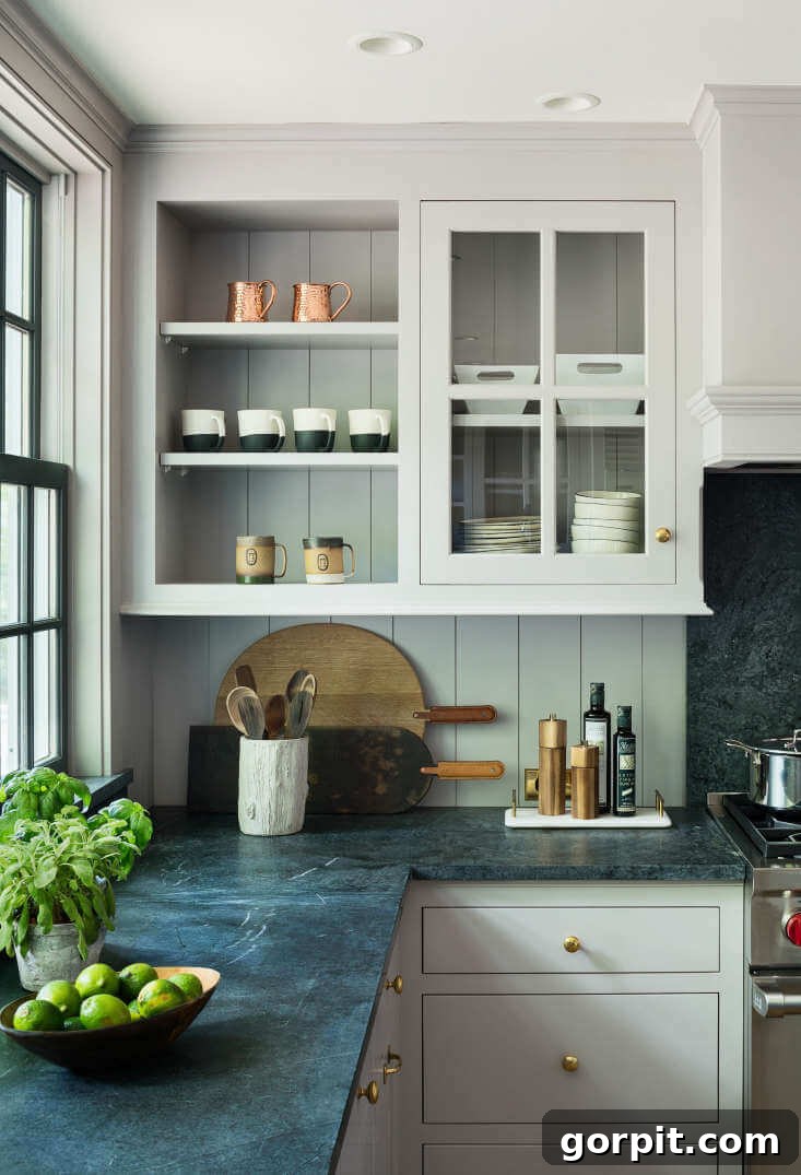
For those seeking a warm yet refined gray, Dove Tale by Farrow and Ball presents an exquisite option. This light gray possesses subtle lilac-purple undertones, which imbue it with a unique warmth and character, distinguishing it from cooler grays. It acts as a superb neutral choice for kitchen cabinets, providing a sophisticated backdrop that feels both inviting and elegant. The beauty of Dove Tale is particularly highlighted when paired with dark countertops, where the contrast creates a striking visual interest, adding depth and a touch of understated luxury to the kitchen design.
Cracked Pepper by Behr
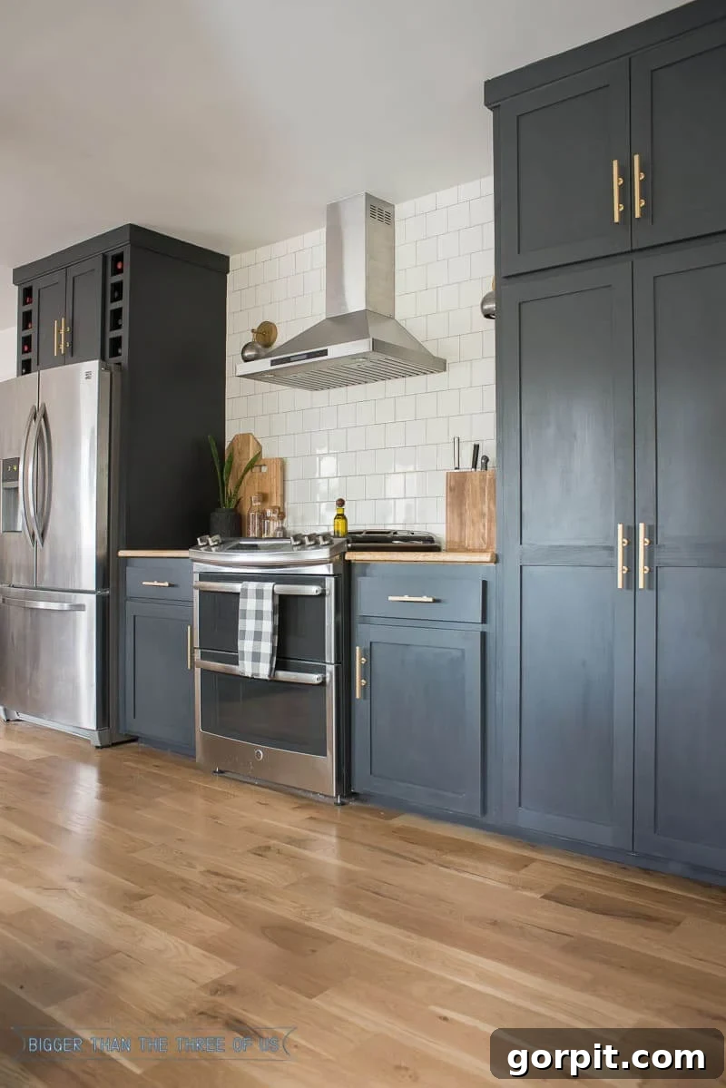
For those daring to embrace drama and depth in their kitchen, Cracked Pepper by Behr offers the perfect impactful touch. This striking deep charcoal gray is so profound it almost reads as black, yet it distinguishes itself with subtle blue undertones that add complexity and sophistication. It stands as an exceptional choice for anyone desiring dark kitchen cabinet paint colors without fully committing to a true black. Cracked Pepper pairs beautifully with modern elements like stainless steel appliances, gleaming gold pulls, and a pristine white, floor-to-ceiling tile backsplash, creating a visually dynamic and utterly chic culinary space. Its bold presence establishes a strong foundation, allowing other design elements to truly pop.
Neutral Painted Cabinets with a Hint of Color
For those who love the foundational stability of neutrals but crave a touch more personality than traditional white, beige, or gray, there’s a captivating world of “colored neutrals” to explore for your kitchen cabinets. These shades subtly integrate color while retaining the versatility and timelessness that define neutral palettes. Some offer just a whisper of color, creating a light and airy feel that feels fresh and unique, while others delve into darker, richer tones, delivering a dramatic flair with impressive depth and weight. These nuanced shades provide an opportunity to make a statement without overwhelming the space. If you’re looking to venture beyond the conventional, these designer-approved picks offer beautiful, sophisticated alternatives that bring character and charm to any kitchen.
Vert de Terre by Farrow and Ball
Vert de Terre by Farrow and Ball is a beautifully muted sage green that effortlessly bridges the gap between a pure neutral and a color. Its subdued nature, without an overwhelming saturation of color, allows it to easily fall into the neutral category while bringing a distinctively fresh and interesting element compared to plain white. This sophisticated shade boasts subtle blue undertones, enhancing its versatility and allowing it to pair harmoniously with both warm and cool color schemes. Vert de Terre is an excellent choice for creating a serene and natural aesthetic in the kitchen, offering a touch of organic charm without sacrificing elegance or adaptability.
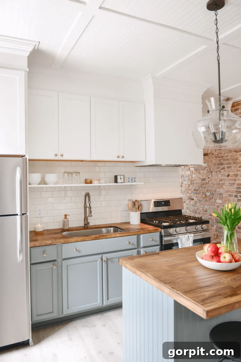
Beguile by Valspar
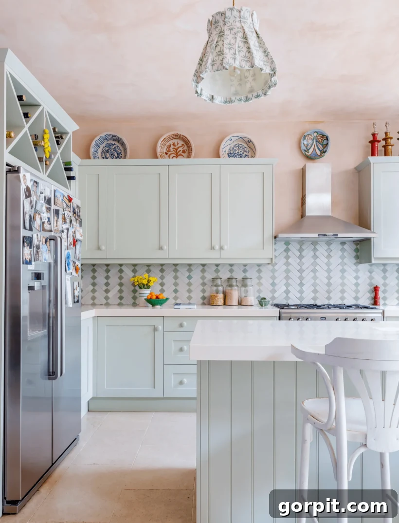
For those desiring a neutral with a captivating chameleon-like quality, look no further than Beguile by Valspar. This intriguing shade is officially described as a blue-green-gray, yet its appearance can shift dramatically depending on the specific lighting conditions within your home. In some settings, particularly when applied to lower cabinets as shown, it can lean more towards a distinct blue. However, under different light or as depicted on Valspar’s official swatches, it might exhibit a more pronounced green-gray character. This dynamic behavior perfectly illustrates the absolute necessity of always testing a paint sample in multiple areas of your kitchen and observing it throughout the day. Beguile is a truly beautiful and versatile neutral, potentially offering that perfect nuanced combination of blue and green you’ve been searching for to create a unique and sophisticated kitchen ambiance.
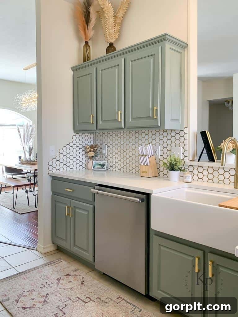
Evergreen Fog by Sherwin Williams
Evergreen Fog by Sherwin-Williams, the distinguished Sherwin Williams Color of the Year for 2022, is a stunning soft sage green that effortlessly combines serenity with sophistication. This cool green hue is characterized by subtle blue and gray undertones, giving it a muted, misty quality that makes it feel incredibly versatile. It pairs beautifully with off-white walls, creating a gentle and harmonious scheme, but also demonstrates its adaptability by looking equally striking against the bright white of a sink and countertops. This inherent flexibility confirms Evergreen Fog as a truly versatile grey-green neutral, capable of bringing a calming, organic touch to any kitchen design while remaining chic and contemporary.
Choosing the Perfect Neutral for Your Kitchen
There’s no doubt that selecting the perfect neutral paint color for your kitchen cabinets can profoundly influence the overall aesthetic and functional vibe of your space. This guide aims to illustrate the rich diversity within the neutral palette, proving that “neutral” is far from boring. The countless tones available offer endless possibilities, whether your personal style leans towards modern minimalist, cozy traditional, or anything in between. These versatile hues are not just about creating a timeless and elegant look; they also establish a flexible foundation that seamlessly integrates with a myriad of countertops, backsplash designs, and hardware finishes.
Before you commit to painting, remember that proper prep work, especially in color selection, is paramount. I strongly advocate for trying out samples of your chosen colors directly in your kitchen. Samplize Peel and Stick paint samples are an invaluable tool for this, allowing you to easily test multiple options without the mess of traditional paint pots. For a comprehensive approach to narrowing down your choices, be sure to consult my detailed guide, How to Choose A Paint Color, which offers all my best tips and insights.
More Paint color Posts
SEE ALL paint color posts
-
The Best Neutral Paint Colors for Kitchen Cabinets
-
Benjamin Moore Swiss Coffee- Is it Right For You?
-
Samplize Peel & Stick Paint Samples: An Unbiased Review
-
Sherwin Williams Pure White SW7005 Paint Review With Pictures
-
Navy Blue Paint Colors Designers Love
-
Beautiful Blue Paint Colors Designers Love & Use
Other Kitchen Posts You May Enjoy:
- How To Paint Kitchen Cabinets Without Sanding or Priming
- How to Paint Your Tile Backsplash in 5 Simple Steps
- How to Paint Countertops to Look Like Marble
- 15 Affordable DIY Countertops That Will Blow Your Mind
Wondering how I approach transforming rooms and spaces in our home? Check out Designer in a Binder®.
And if you want exclusive content and behind-the-scenes sneak peeks, be sure to subscribe before you head out!