
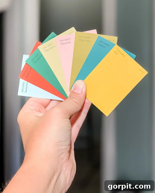
Without a doubt, one of the most common questions I receive from readers is, “How do I confidently select paint colors for my home without feeling overwhelmed? I simply don’t know where to begin!” If this resonates with you, please know that you are absolutely not alone. I vividly recall being in that exact position myself, facing a dizzying array of paint chips and feeling utterly lost.
I genuinely wish I could claim to have always possessed an innate talent for choosing paint colors. However, the truth is, I could share countless stories of significant mistakes I’ve made over the years! For instance, a rather embarrassing but enlightening fact: I painted the kitchen of our very first home (way back in 2003) no less than THREE different times because I repeatedly chose the wrong shade. Each attempt resulted in a color that just didn’t feel right, teaching me valuable lessons through trial and error.
Since those early blunders, I’ve dedicated myself to understanding the intricate art and science of paint color selection. I’ve learned an incredible amount, and now I feel confident in my ability to get it right every single time. This expertise isn’t magic; it’s the culmination of two decades of learning from every mistake and valuable experience. Now, I’m thrilled to share my best designer tips and proven strategies to help you navigate the world of paint colors with confidence and create spaces you truly adore.
Table of Contents
Toggle
How to Choose Paint Colors for Your Home: 5 Easy Designer Tips
Tip #1: NEVER choose your interior paint colors first–let your “crucial element” guide you.
The single biggest and most common mistake I observe people making when decorating their homes is attempting to choose a paint color BEFORE they’ve made any other significant design decisions for a space. Painting your walls is indeed one of the most impactful and cost-effective ways to completely transform a room, giving it a fresh new look and feel. Because of this powerful effect, it can be incredibly tempting to rush to the nearest paint store, grab a handful of swatches, and pick a new paint color quickly. However, this approach often leads to frustration and costly repaints.
Instead, your paint color selections should be one of the final steps in developing a truly cohesive and harmonious design plan for your room. It is far easier to find a paint color that perfectly complements your chosen furnishings, textiles, and art than it is to try and build an entire room’s design around a specific paint color you’ve already applied to the walls. Think of paint as the backdrop, not the star – it should enhance, not dictate.
I delve into this fundamental principle in much greater depth within my comprehensive interior design system, Designer in a Binder®. But for now, here’s the essential version. I strongly recommend that everyone initiate any room design project by selecting something I refer to as a “crucial element.”
A crucial element acts as the primary source of inspiration and the guiding force for your entire design scheme. Ideally, this element will feature a variety of colors, textures, or patterns that you absolutely adore. It could be anything from a captivating area rug, a vibrant piece of artwork, a unique throw pillow, a luxurious pair of curtains, or even a statement piece of furniture with interesting upholstery. Your crucial element should be that ONE THING you absolutely have to have in the room—the item you love so much that you want its existing color palette to naturally set the tone and direction for the rest of your space. To visualize how all your chosen elements will interact, I also highly recommend putting together a digital mood board that prominently showcases your crucial element.
Why is this approach so effective? Because once you’ve thoughtfully chosen a crucial element, its inherent color palette will effortlessly guide your paint color choice(s) for whatever space you are transforming! The demanding work of curating a harmonious color scheme has already been expertly done for you by the artist or designer who created your crucial element. They’ve already selected colors that work beautifully together, providing you with a pre-approved, cohesive foundation.
If your preference leans towards neutral shades for your wall color, simply look to the whites, creams, grays, or beiges present within your crucial element’s pattern or design. If you’re eager to introduce a more saturated color onto your walls, then select one of the more prominent accent colors directly from your crucial element. This method ensures that your wall color will always feel integrated and intentional.
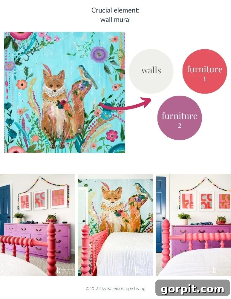
Let me provide a concrete example to illustrate this principle. Below, you can observe how the crucial element (in this case, the vibrant and colorful wall mural) in Attley’s old bedroom served as my primary inspiration. By drawing colors directly from the mural—specifically, looking to the various neutral tones within it—I was able to effortlessly choose a coordinating paint color for her walls and even select complementary furniture pieces for her room. The power of a crucial element extends far beyond just choosing paint colors; it truly helps establish a comprehensive and harmonious design for an entire room, a concept I teach in much greater detail in Designer in a Binder®.
Tip #2: Understand how to read and interpret paint swatches.
Paint color chips, those tiny squares of color you bring home from the store, can be incredibly deceptive and confusing, can’t they? They often look very different on the small card than they do once painted on an entire wall. Here’s what you absolutely need to know to decipher them effectively.
The most crucial colors on any given paint swatch card are actually the darkest hues, typically found at the bottom of the strip. Why is this so important? Because the darkest hue on the strip will give you the clearest indication of the true color undertones that will be present in all the lighter shades above it. While these undertones might be barely discernible on a tiny, lighter paint swatch, they become much more apparent and impactful when the lighter shade is painted across a large surface like your wall.
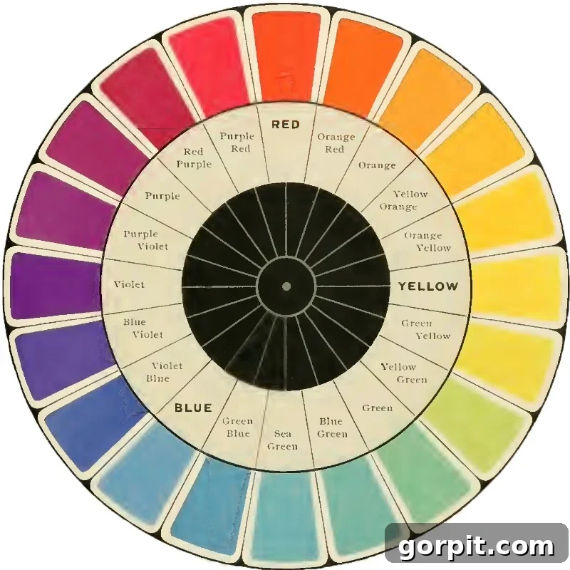
So, what exactly is a paint undertone? I’m delighted you asked! Undertones are subtle colors that emerge when more than one primary color is combined to create a specific paint shade. The dominant color, often referred to as the overtone, is the obvious color you immediately perceive – for example, a beautiful blue. The undertone, however, is the underlying color influence that you don’t overtly see but that subtly impacts how the dominant color presents itself. Undertones are generally categorized as either warm (think subtle hints of reds, oranges, or yellows) or cool (think blues, greens, or purples). You can visualize this distinction by looking at a color wheel, where warm colors typically occupy one half and cool colors the other.
The undertone of a paint color can truly make or break a room’s design. Imagine choosing a seemingly “neutral” paint color that, unbeknownst to you, possesses a strong warm undertone (like a hidden yellow tint). If all the other elements in your space—your furniture, fabrics, and decor—have cool undertones, the walls will inevitably clash, making the entire room feel unbalanced and, frankly, bad. The seemingly neutral wall color will suddenly appear sickly or out of place against your cool-toned furnishings.
The core problem is that most people don’t know how to accurately identify the undertone of a paint color. However, it’s actually incredibly simple to discern and should be a critical consideration every single time you choose a paint color. This simple trick will save you countless headaches and costly repaints.
Take a moment to observe the photo below. Notice how the lightest hues on all three paint swatch cards appear relatively similar. They are close enough in shade that you can easily imagine how challenging it would be to confidently choose between those three light pink colors if you were only looking at their lightest representations.
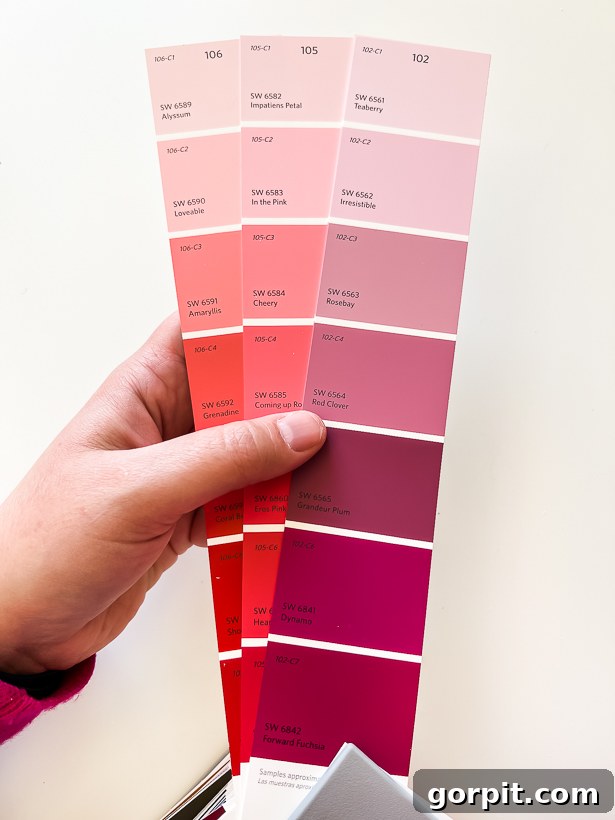
Now, shift your focus and look closely at the darkest hues located at the bottom of those same swatches… The difference is striking, isn’t it?
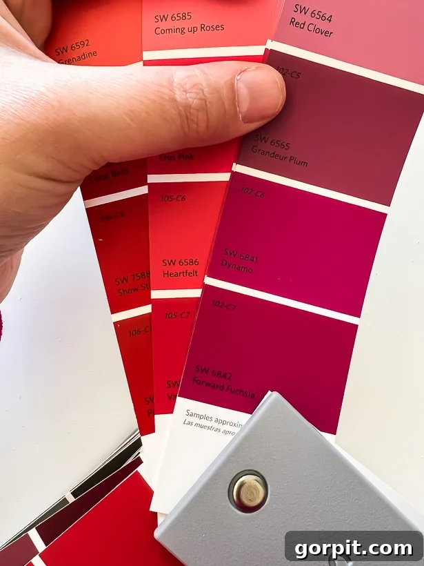
When you examine the darker color hues on these cards, it’s highly probable that you’ll instinctively think, “There’s absolutely NO WAY I would ever paint that particular shade on my walls!” about some of them. Well, if you have that strong a negative reaction to the darkest hue on a paint card, then I urge you, do not use any of the hues on that specific card, no matter how appealing the lighter shades seem. Trust me on this. Once the lighter hues from that same strip are painted across a large wall surface, the true undertones—which are most visibly expressed in those darker hues—will inevitably emerge and become much more pronounced. You’ll likely find yourself disliking the overall effect.
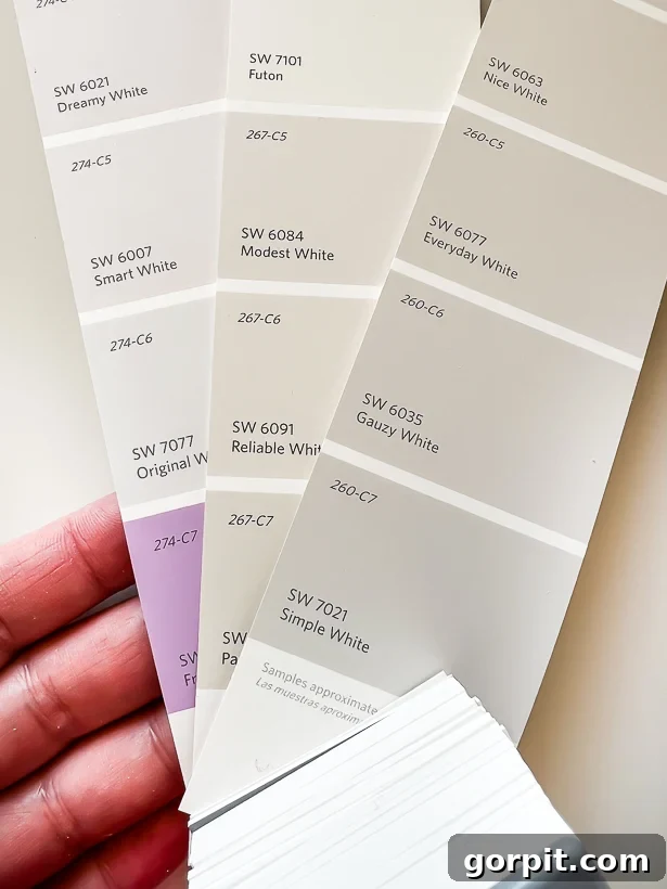
You must also exercise extreme caution when dealing with undertones in neutral colors, particularly if you are trying to select a white wall color. Many people assume white is just white, but this couldn’t be further from the truth. Just glance at the darkest hues on these paint chips of white colors! Do you notice how distinctively purple the undertone of the darkest hue on the paint swatch on the left appears? Since you would probably never intentionally choose to paint your walls that prominent purple color, it’s a clear signal to avoid all colors on that same paint swatch, even the seemingly pure white at the top. This trick applies to all neutrals, whether white, gray, or beige—always look at the darkest shade to reveal the underlying truth.
And there’s another crucial piece of information you need to understand when reading paint chips: Each color swatch provides you with the Light Reflectance Value (LRV) of that specific color. The LRV is almost always printed on the back of the paint chip (you can see an example depicted below).
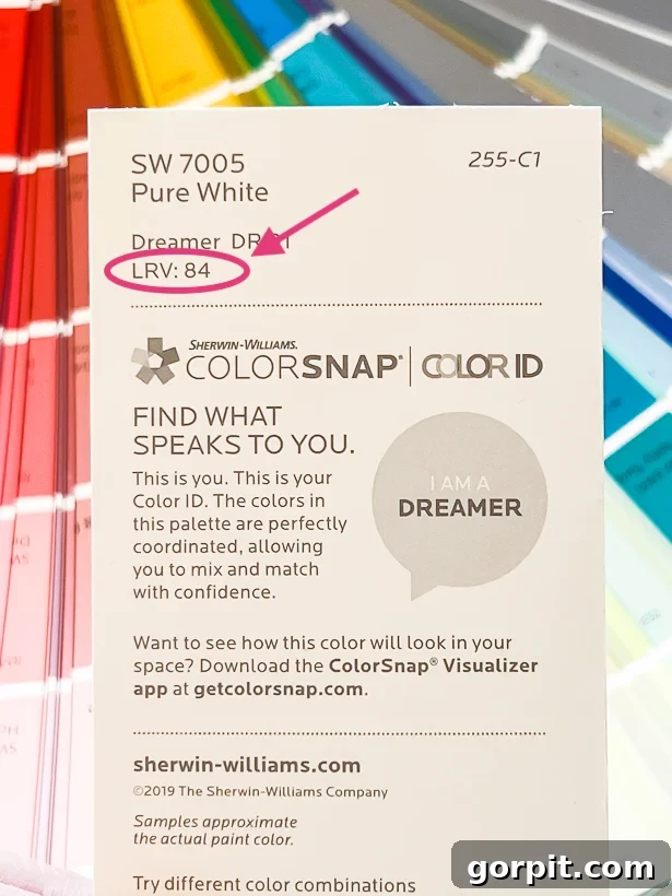
Here’s what you should always keep in mind about LRV and how it impacts your paint color choice:
- The LRV scale ranges from 0 (absolute black, absorbing all light) to 100 (pure white, reflecting all light). Therefore, the higher the LRV number, the lighter and more reflective the color will be. Conversely, the lower the LRV number, the darker and more absorbent the color will be.
- Colors with an LRV above 50 are generally considered lighter shades. These colors will effectively bounce back more ambient light than they absorb, making them excellent choices for creating a bright, open, and airy feel in a room. They can make smaller spaces feel larger and more expansive.
- Colors with an LRV lower than 50 are darker shades. These colors will predominantly soak up more light than they reflect, which contributes to a darker, cozier, and more intimate or moody atmosphere in a room. They can add depth and drama.
- If your goal is to make a space feel more expansive and filled with light, opt for a color with a high LRV. This is particularly useful in rooms with limited natural light.
- If you aim to create a moody, sophisticated, or remarkably cozy ambiance, select a color with a low LRV. These darker hues can transform a room into a comforting retreat.
Tip #3: Test paint color samples in your home!
This tip is non-negotiable and cannot be stressed enough. I promise you, even if you absolutely fall in love with a paint color you saw in a magazine, on a blog, or even in a friend’s home, there’s a very high probability that you may not like it as much once it’s on your own walls! This is due to a multitude of factors, primarily the unique lighting conditions of your specific home and even the existing colors of your furnishings. Paint colors are chameleons, constantly changing based on their environment.
Even if you are considering several colors that appear to be very similar on a small swatch, I wholeheartedly recommend obtaining samples of each. Then, paint decent-sized sample squares of EACH color on at least two different walls within the same room. Why multiple walls? Because paint colors can look dramatically different depending on how natural and artificial light hits them throughout the day. You need to be thorough with this crucial step. Be sure to observe how the samples appear at various times of the day—morning, midday, and evening—and under different kinds of artificial light. Turn your overhead lights on and off, and your lamps on and off, to see the full spectrum of how the color behaves. After living with these samples on your wall for a minimum of a couple of days and scrutinizing them under all possible lighting scenarios, you’ll be well-equipped to make your final, confident selection and proceed with painting your room.
Furthermore, if you are contemplating using the same paint color for adjacent rooms—perhaps because both rooms feature a crucial element that shares a common color you wish to pull out for your walls—it is still imperative to test paint samples in all connecting rooms. This is vital because the paint colors will be significantly affected by the specific type and direction of natural light each room receives! For instance, south-facing rooms tend to be flooded with warmer, often yellower, light, which can make colors appear a bit more golden or yellow than they actually are. Conversely, north-facing rooms generally receive cooler, bluer light, which can cause colors to seem more blue, gray, or muted than their true hue. East-facing rooms get bright morning light, while west-facing rooms get warm afternoon light. These nuances are incredibly important for accurate color perception.
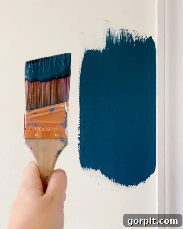
For ease and accuracy, I highly recommend ordering peel-and-stick paint samples from Samplize! This method is often more economical and significantly less messy than buying multiple small cans of paint and painting a bunch of sample squares directly on your wall (or on paper to then tape on your wall). A major advantage is that you can easily reposition them – this makes it incredibly simple to try a specific color on different walls, in various lighting conditions, or even in different rooms without any fuss. You can even cut them in half to try on multiple small sections if you prefer. Samplize offers an extensive range of paint samples for popular brands such as Sherwin-Williams, Farrow & Ball, Benjamin Moore, and PPG (which you can find at Home Depot). Most importantly, these samples are created with actual paint, unlike traditional paper paint chips which are merely printed representations of color. This ensures a far greater level of accuracy in your color testing.

Tip #4: Match the color to the feeling you want to have in the room.
Colors possess an undeniable and profound impact on our psychological state, our mood, and the overall type of energy we experience when we occupy a particular space. This influence is so significant that it forms the basis of an entire field of study known as the psychology of color. Understanding this can be a powerful tool in your paint selection process. For example, cooler tones like blues and greens are widely recognized for their calming, serene, and peaceful effects, making them ideal for bedrooms or bathrooms where relaxation is key. In contrast, warmer hues such as reds, yellows, and oranges tend to have a more energizing, stimulating, and vibrant effect, often favored for social spaces like living rooms or dining areas.
As a general guideline, warm colors—those typically found on the RIGHT side of the color wheel (like reds, oranges, and yellows)—will inherently create a more inviting, comforting, and cozy atmosphere. They tend to make a space feel more intimate and can even physically feel warmer. On the other hand, cool colors—situated on the LEFT side of the color wheel (such as blues, greens, and purples)—generally evoke a sense of calm, tranquility, and relaxation. They can make a room feel more open, spacious, and airy.
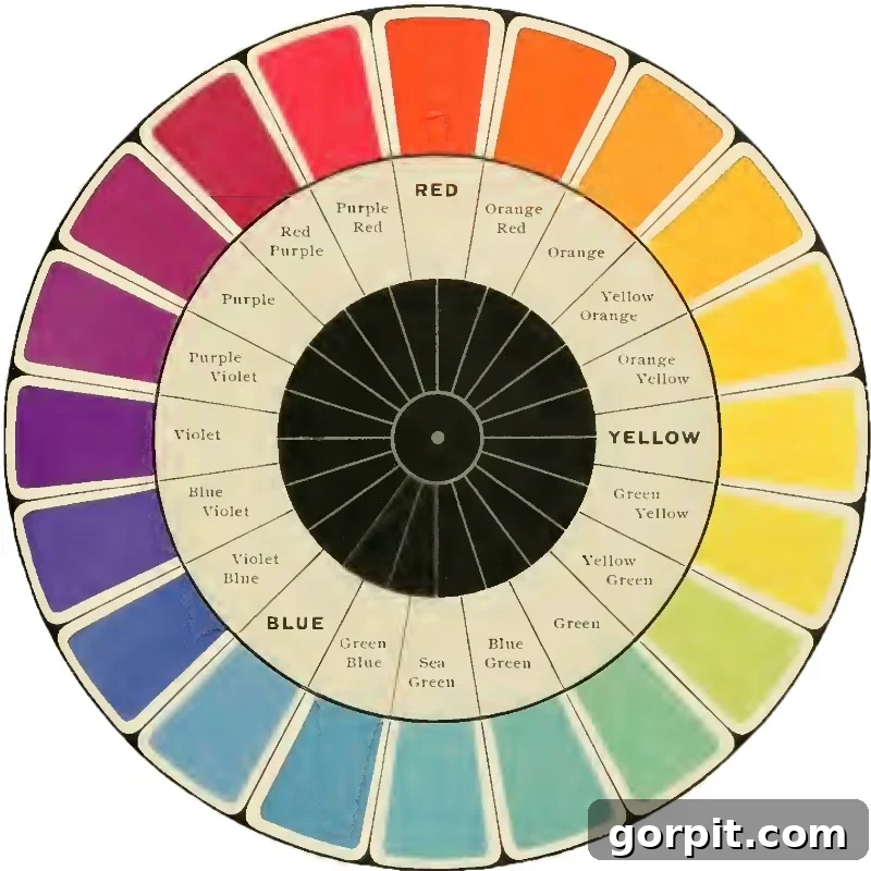
Here’s a more detailed breakdown of how individual colors commonly affect moods and emotions, guiding your decisions for specific rooms:
- Red – This bold color energizes, excites, and stimulates. It can heighten appetite and conversation, making it a powerful choice for dining rooms or areas where you want to spark enthusiasm, but use sparingly in bedrooms unless you aim for high energy.
- Orange – Warm and inviting, orange stimulates activity and encourages socializing. It’s often associated with enthusiasm and creativity, perfect for playrooms or creative studios.
- Yellow – The color of sunshine, yellow instantly boosts enthusiasm, happiness, and optimism. Lighter yellows can be uplifting for kitchens or breakfast nooks, while too much bright yellow can sometimes feel overwhelming.
- Green – A harmonious color that balances and evokes feelings of safety, stability, and connection to nature. Greens are incredibly versatile, ideal for offices (promoting concentration), bedrooms (calming), or living areas (serene).
- Blue – Known for its soothing properties, blue reduces stress and creates a profound sense of calmness and peace. It’s an excellent choice for bedrooms, bathrooms, and meditation spaces, promoting rest and introspection.
- Purple – Rich and regal, purple uplifts and encourages creativity and imagination. Deeper shades can be luxurious and dramatic, while lighter lavenders can be tranquil and sophisticated, suitable for bedrooms or creative spaces.
- Pink – Often associated with tenderness and playfulness, pink can increase pulse and motivate action. Softer pinks are calming and nurturing, while brighter fuchsias are energetic and fun, perfect for children’s rooms or accent walls.
- Gray – A highly versatile neutral, gray creates a sense of composure, sophistication, and timelessness. However, depending on its undertones and saturation, it can also depress energy if not balanced with warmer elements.
- Tan/Beige – These warm neutrals stabilize and provide a comforting backdrop. They are excellent for suppressing overly strong emotions and creating a welcoming, grounded feeling, making them suitable for almost any room.
- Black – A powerful color, black empowers and evokes a sense of sophistication, elegance, and drama. Used judiciously as an accent or in a richly designed room, it can create a striking and modern statement.
Remember, while these are general guidelines, how color affects you is deeply personal and can vary greatly from person to person. Don’t be afraid to trust your intuition. If you’re unsure how certain colors make you feel, a simple trick is to pay attention to the colors you wear most often. Chances are, you gravitate towards those colors because you like how you feel when you are dressed in them. So, let your wardrobe subtly guide you in understanding your personal color preferences for your home.
Tip #5: Pay attention to the sheen of your paint.
Believe it or not, the sheen—or finish—that you select for your paint will have a significant and noticeable impact on how the color looks and feels in your home. It’s not just about durability; it’s about aesthetic too. If you were to paint half of a wall in a flat paint finish and the other half of the very same wall in the exact same color but with a gloss or semi-gloss finish, you might genuinely believe they are two entirely different paint colors. Crazy, huh? This phenomenon occurs because different sheens reflect light in distinct ways, altering our perception of the color’s depth and intensity.
I’ve actually written an entire detailed post about how to choose the right paint sheen, covering all the critical factors you should consider. But for the immediate purpose of picking your ideal wall color, it’s imperative to do your best to test samples in the specific sheen you are considering. Here’s a quick rundown of common paint sheens and their typical uses:
- Flat/Matte: This finish absorbs light, offering a sophisticated, non-reflective look. It’s excellent at hiding imperfections on walls and ceilings, making it ideal for low-traffic areas like formal dining rooms or master bedrooms. However, it’s less durable and harder to clean.
- Eggshell: Slightly more reflective than flat, eggshell has a soft, low-sheen finish reminiscent of an eggshell. It’s very popular for living areas and bedrooms, offering good durability and easy cleaning while still being forgiving on wall imperfections.
- Satin: With a smooth, velvety look, satin paint has a noticeable sheen and is more durable than eggshell. This makes it a fantastic choice for moderate to high-traffic areas like family rooms, hallways, and kids’ bedrooms, as it holds up well to cleaning.
- Semi-Gloss: Highly durable and very reflective, semi-gloss is perfect for trim, doors, cabinets, and even high-moisture areas like kitchens and bathrooms. Its higher sheen makes it easy to clean, but it will highlight any surface imperfections.
- Gloss/High-Gloss: The most durable and reflective finish, gloss paint has a mirror-like appearance. It’s typically used for accent pieces, furniture, or areas that require extreme durability and easy wiping, but it requires near-perfect surface preparation.
Most paint stores only offer small samples in eggshell or satin finish, as these are the most common for walls. If you want to be absolutely certain about your choice, especially for sheens that significantly impact light reflection like semi-gloss or flat, you may want to invest in a quart of paint in the exact finish you are wanting to sample directly on your own walls. This extra step can prevent disappointment and ensure your chosen color looks precisely as you envisioned.
Frequently Asked Questions About Picking Paint Colors
Only if that’s genuinely what you desire and fits your personal aesthetic! While a monochromatic scheme can offer a sense of seamless flow and simplicity, I generally think it’s ideal to aim for a palette of about 3 to 5 total paint colors throughout your home. This count includes whatever consistent color you choose for your interior trim and doors. A limited yet varied palette creates visual interest, defines individual spaces, and prevents a home from feeling monotonous, while still maintaining a cohesive and harmonious overall feel. It allows for subtle transitions and personal expression in different rooms without feeling chaotic. For instance, you could use a consistent neutral for main living areas and hallways, and then introduce one or two accent colors in bedrooms or a dining room. I even have a whole post dedicated to exploring interior trim ideas that aren’t necessarily white, expanding your options beyond the traditional.
As mentioned, I strongly suggest establishing a cohesive total of 3 to 5 interior paint colors for your home. This count typically consists of the following categories, providing a balanced approach to design and color:
1) A primary neutral for your trim and ceilings. For most homeowners, choosing a shade of white for ceilings and trim is a classic and versatile choice, as it provides a clean, crisp frame for your wall colors. However, “white” itself comes in countless variations. In our current home, for example, we’ve opted for contrasting trim and ceilings, but we still utilized a neutral color that technically falls within the “white” family. Specifically, we chose Divine White by Sherwin-Williams, which offers a soft, warm alternative to stark white. This sets a consistent backdrop throughout the home.
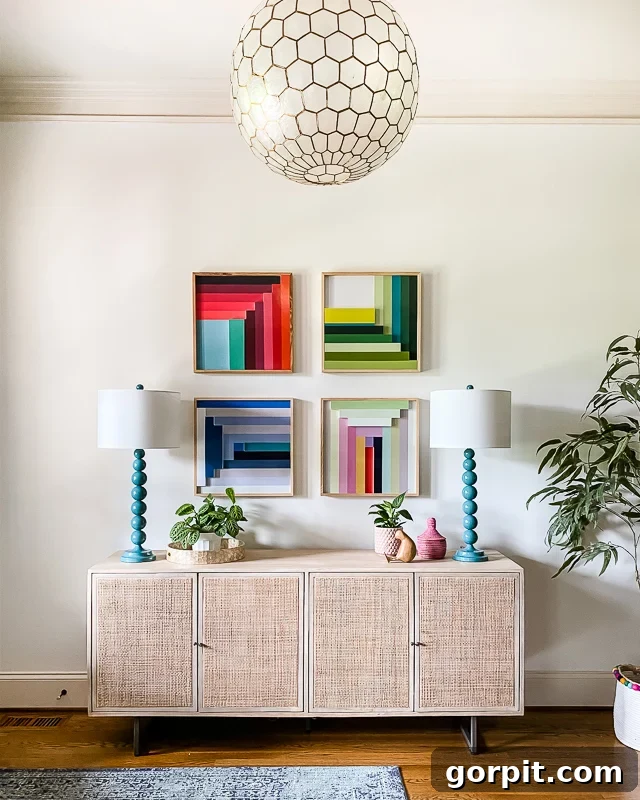
2) A consistent neutral wall color. This crucial color serves as a unifying element throughout your home, bringing everything together and offering a versatile canvas for your decor. This can be a beautiful tan, a sophisticated gray, a subtle greige, or even a soft blue (yes, certain beautiful blue paint colors can function as incredibly versatile neutrals – think of how jeans go with everything!). This neutral wall color is your go-to shade for connecting spaces, such as hallways, entryways, or open-concept living areas, where you want to ensure a smooth transition between rooms. For instance, we have extensively used Pure White by Sherwin-Williams in most of the rooms of our current home. It’s a fantastic, crisp white that creates a bright and inviting atmosphere. Other popular and equally versatile white paint choices that designers often recommend include Sherwin-Williams Alabaster (a softer, warmer white) and Benjamin Moore Swiss Coffee (a warm, creamy white with subtle depth). You can see the elegance of Pure White in our entryway below, serving as a perfect neutral backdrop that allows for vibrant pops of color through our colorful artwork and carefully selected decor pieces.
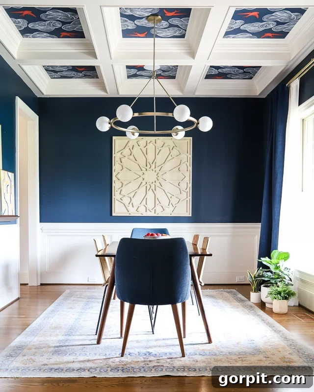
3) No more than three additional accent colors. These are the colors that inject personality, create focal points, and add depth to individual rooms. By limiting these to three or fewer, you prevent your home from feeling disjointed or overly busy. So far in this house, we’ve successfully utilized just two additional accent wall colors to create impact without overwhelming the overall neutral scheme. We transformed our dining room with a dramatic, dark navy blue, specifically Gale Force by Sherwin-Williams, creating a sophisticated and intimate atmosphere. Additionally, we painted the striking DIY board and batten accent wall in our upstairs hallway with Refuge by Sherwin-Williams, a calm and inviting blue-gray that adds architectural interest. These deliberate accent choices complement our neutral foundation beautifully.
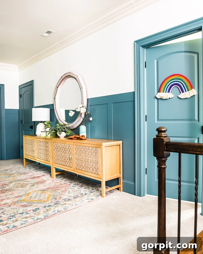
I genuinely hope these comprehensive tips for picking paint colors leave you feeling more confident and empowered as you embark on your next home decor project! Choosing paint colors doesn’t have to be a source of stress; with these strategies, you’re well on your way to creating beautiful, harmonious spaces.
More Paint Posts
SEE ALL PAINT POSTS
-
9 Life-Changing Painting Hacks Everyone Should Know
-
How Durable are DIY Painted Kitchen Cabinets?
-
How to Paint Kitchen Cabinets (From a DIYer Who Has Done it 3 Times)
-
How Have Our Painted Countertops Held Up?
-
The Best Neutral Paint Colors for Kitchen Cabinets
-
How to Paint IKEA Furniture and Mistakes to Avoid
-
Benjamin Moore Swiss Coffee- Is it Right For You?
-
How Much Paint Do I Need for My Room?
-
How to Touch Up Wall Paint
If you’re eager to learn my proven approach to transforming rooms and spaces throughout our home with confidence and ease, I invite you to explore Designer in a Binder®. It’s the system that consolidates all my expertise into a simple, actionable framework.
And for those who desire exclusive content, behind-the-scenes sneak peeks, and direct insights, be sure to subscribe to my newsletter before you head out! Don’t miss out on more valuable design tips and inspiration.
